


We’ve had an exciting few days last week during the Microsoft Data Insights Summit! Hopefully you were able to attend in person or watch some of the sessions online. Throughout the conference we announced a number of big features that everyone has been asking for, and hopefully gave you a few great surprises as well.
If you missed some of the news or are looking for more details, read on to learn about all of the great features that we announced during the conference and a few other small features we released since our last update as well. We hope you enjoy this update, and if you have any new feature requests, please let us know on our UserVoice site.
Here’s a summary of the new features we released over the past few weeks:
Dashboards
Featured dashboard
We’ve heard from many of you that when you visit the Power BI service, you typically have one dashboard that you visit more than any of your others. This dashboard could be the main dashboard you use to run your business, or it might contain an aggregation of tiles from many different dashboards and reports.
To make it easier to reach the dashboard you care about most, we added the ability to feature a dashboard in your workspace. Once you mark a dashboard as featured, you will always land on it first when you log into Power BI, instead of the last dashboard you visited. Also, you can reach your featured dashboard at any time by clicking on the Featured dashboard button in the left navigation pane.
Once this feature has been released, the first time you log into Power BI you will see a pop-up notification letting you know how it works.

Also, your navigation pane will automatically be updated with a Featured dashboard section. It will remain greyed out until you set a dashboard as featured.

You can set a dashboard as featured by clicking the ‘…’ on the top right of the dashboard and selecting the Set as Featured dashboard option.

Once you do this, you will see a confirmation message.

After you set the dashboard as the featured dashboard, you will see a confirmation toast.

And the Featured dashboard option in the navigation pane will now be available.

Of course, if you change your mind later you can set a new dashboard as the featured dashboard, or you can remove the featured dashboard all together. To remove the featured dashboard, select the ‘…’ and select Disable Featured dashboard.

You’ll get a confirmation message, and if you select Confirm, the Featured dashboard option will be disabled in your left navigation pane.

Filter dashboard list
Many of you have a long list of dashboards, some you created yourself and others that were shared with you. We want to make it easier to find the content that matters to you, so we added the ability to filter the list of dashboard you have in your left navigation pane. To do this, select Show: All Content and choose if you want to see all your content, the content you created or the content shared with you.

Enterprise features
Admin Usage Reporting
One of our most requested features is getting insight into the usage of Power BI in an organization. In our first step to providing companies and creators more insight into who is using Power BI, we added a Usage Report to the Power BI admin center. The Usage report gives an admin the ability to track the importance and use of reporting in their company and see which users and groups are the most active with Power BI. If you want to learn more about the admin center in general, you can check out our February blog.
If you are an O365 Global Admin, you can access to this report from the Admin Portal. To open the admin portal, select Settings > Admin Portal.

The Admin Portal will now open to the Usage Report (although you’ll likely see a loading screen while we load the dashboard). This may be a bit slow the first time you use it.

Once the dashboard loads, you will see two sections of tiles. The first section includes usage data for individual users. The first three tiles in this section show how many dashboards, reports, and datasets exist in your tenant. In the tables on the right, you’ll also be able to track how many reports and dashboards individual users can access, allowing you to know which users are most active in Power BI. The bottom two tiles in this section show which dashboards are distributed the most often across your organization through sharing, and which content is most connected to through the Get Data flow.

The second section shows the same type of information, but this time based on groups. This will let you see which groups in your organization are most active and what kind of information they are using.

With this information, for the first time you will be able to get real insights into how people are using Power BI across your organization, and be able to recognize those users and organizations who are very active in Power BI.
We will continue to improve the information we are sharing with you and expand who has access to it. If you have suggestions as to what we should do next in this area, let us know by suggesting them on our UserVoice site!
Row-level Security
Row-level security (RLS) is one of the top requests we have heard from customers, especially large enterprise customers. A typical use of RLS is the following: A company has multiple sale territories, and all sales are recorded in one central SQL Server DB. This company is monitoring the sales metrics using Power BI dashboards. They want to reuse the same Power BI dashboard for all regional sales managers, while restricting each regional sales manager to see data only in his/her own region. e.g., sales managers in Canada can only see sales data in Canada.
Currently this can be achieved in Power BI by leveraging on-premises Analysis Services tabular models, where access restriction logic is located at the database tier. However, not all companies are investing or have the plan to invest in SSAS, so to empower our customers, we’ve extended the RLS support to cloud models.
Assuming you already created a simple sales dashboard below to share with regional managers:

To start, select the ellipses (…) to the right of the dataset name and choose Security.

In the RLS setting page, select Create New Role > Continue to create a role.

Let’s call it “CanadaSalesManager”.

Enter the email addresses for the Canada sales managers into the input box, and select Add > Save.

Next, we’ll define a data filter for Canada only. Select Rules.

We’ll create the rule using DAX expressions. DAX is a collection of functions, operators, and constants that can be used in a formula. To learn more see our documentation on DAX. In this example we are using Adventureworks as sample data, and we’ll enter the following DAX: [SalesTerritoryCountry]=”Canada”

Now that access is restricted to Canada, share the dashboard with the regional sales manager you added to the role. This manager will see a filtered view of your dashboard.

NOTE: The RLS preview is intended to let interested customers try out the features, and allow us to collect feedback for improvements. It is not intended for operational usage. In fact, you might lose the rules you defined for your datasets when we go to GA. There are also several restrictions during the preview which you can learn about in the documentation.
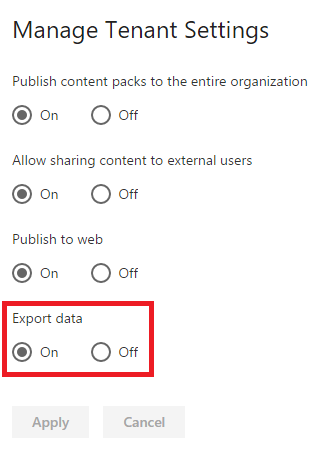
Disable exporting data
Last month, we released three tenant settings in the Admin Portal to give you more control over what features are available to your organization. Since then, we have added another setting that will allow you to disable exporting of data. If you disable this feature, users in your tenant will no longer be able export tile and visual data to a CSV. This gives you even more control over what users can do with their data.
Q&A
Auto-complete for “is”
Last blog, we talked about our recent improvements to auto-complete for Q&A. Taking that another step forward, we are releasing another small but neat addition to Q&A auto-complete: Q&A is now able to suggest the values in the auto-suggest list if you type column name followed by “is”. For example, if you want to see the gross margin trend chart for various customers, but don’t know most customer names, you can type “gross margin trend where customer name is…” and the Q&A auto-complete feature provides a list of customer names.

Mobile
KPIs on your Apple Watch
We are very excited to announce that you can access your data in seconds using our new Power BI app for the Apple Watch! The Apple Watch app will let you monitor you KPI and card tiles at a glance anywhere at any time without even having to open the Power BI app.

You can learn more at the dedicated blog for the Apple Watch.
Excel
Analyze in Excel
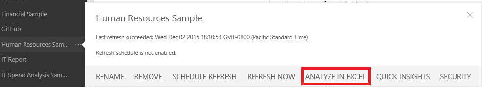
At the Microsoft Data Insights Summit we announced one of the ways we are deepening our integration with Excel: the ability to analyze Power BI data in Excel. With this week’s update you can now use this feature yourself to connect your Power BI data model to Excel and create Pivot Tables and Charts off of it. This means your data models are no longer restricted to Power BI. If you happen to be more comfortable in Excel or need to use Excel’s features, you can do that now. While this feature today only works with Excel, we may extend it later to work with other 3rd party vendors, such as Pyramid Analytics, who has been partnering with us, or any other 3rd party vendor that does advanced analytics.You can learn more about the feature by reading our documentation.
To analyze your data in Excel, pick the dataset or report you are interested in and open the menu under the ‘…’, and select Analyze in Excel.
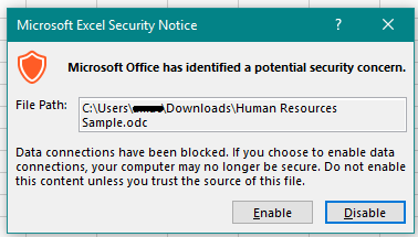
This will start a download of an odc file.

When you open this file in Excel, you may need toEnable the connection.
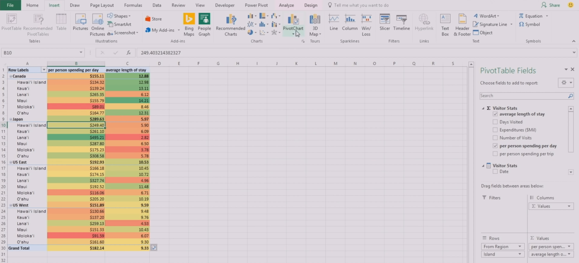
Once the file is opened, you will be authencated to Power BI to make sure you have permission to the dataset. From here you can create Pivot Tables or Charts and save the file as an Excel file. You can learn more by watching our video from the Data Insights Summit.
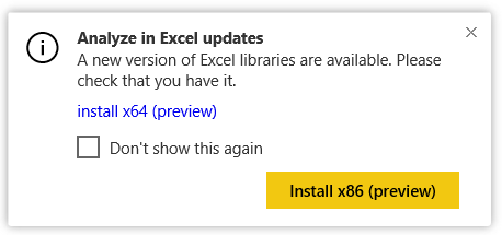
NOTE: You may need to install updates to Excel for this feature to work. When you use the feature for the first time, you will see a toast notification reminding you of this.
Other
Power BI in Australia
We want to unlock the power of data for everyone, no matter where they are located. Previously, Power BI was available in over 140 markets, but potential customers in Australia couldn’t sign up. Now, anyone in Australia, either individually or through an organization, can go to powerbi.microsoft.com and sign up for Power BI. Welcome to all our Aussie friends!
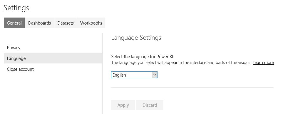
Language Settings
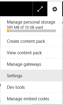
Power BI detects your language based on your language preferences on your computer. However, we know many users want to override this setting, so we have added the ability to set the language for Power BI. To do this, you can go to the site Settings.
From here you can select to view the site in any of our supported languages.
That’s all for this month. We hope that you enjoy this new update and continue sending us valuable feedback about our product. Please don’t forget to vote for other features that you would like to see in the Power BI service in the future.