


There are two themes for this month’s Power BI Desktop update. The first is a focus on some of your major asks including multi-selecting data points across multiple charts and syncing slicer values across multiple pages of your report. We also have a major update to our SAP HANA connector. Our second theme is a focus on performance improvements across three different areas of our product.

Don’t forget you can now get Power BI Desktop from the Windows Store if you’re on Windows 10!

Here’s the complete list of February updates:
- Multi-select data points across multiple charts
- Sync slicers across multiple pages of your report
- Numeric range slicer improvement – whole number snapping (preview)
- Faster geocoding for Bing maps (web preview)
- Overflow data labels for bar and column charts
- Search the formatting and analytics pane
- Organizational custom visuals (preview)
- Network Visualization and Filter
- Slope Chart by MAQ Software
- Filter by List
- as Timeline
- as T-Accounts
- DirectQuery performance improvements
- Open and save performance improvements
- “Show items with no data” improvements
- Persistent filters control for up coming Power BI service feature
- Consulting Services quick link
For a summary of the major updates, you can watch the following video:
Reporting
Multi-select data points across multiple charts
We are very excited to announce the release of one of our most highly asked for features! You can now ctrl+click on data points in multiple charts and have the cross filters applied to your entire report. As you select data points across multiple charts, we will apply both those filters together. For example, if you select Computers in a column chart and Regular in a pie chart, then all the charts on your report page will be filtered to products that are computers and regular.

Watch the following video to learn more about multi-selecting data points:
Sync slicers across multiple pages of your report
Another huge ask from the community is to have slicers that apply to multiple pages. To meet this request, we’ve added a “Sync slicers” pane that will let you select slicers to stay in sync across multiple pages. For instance, selecting “Red" on a product color slicer on page 1 will be reflected in the product color slicer on page 2 if the two pages are synced. You can reach the Sync slicers pane from the View tab.
Once you’ve opened the pane, select a slicer to see the options. You can quickly make the slicer apply to every page by clicking the ‘Add to all’ link. A hidden slicer will be put on every page, synced to the currently selected slicer. You can also use the right column to pick if the slicer is visible on each page or not.

Watch the following video to learn more about syncing slicers:
Numeric range slicer improvement – whole number snapping (preview)
We also have a minor improvement to our numeric slicer preview visual. Now if you create a range slicer using a whole number column, it will snap to rounded values and not apply decimal filters.

Watch the following video to learn more about syncing slicers:
Faster geocoding for Bing maps (web preview)
Starting this month, we are planning on flighting a new, faster way to geocode your map data. This new method can have up to a 6x improvement on your geocoding speed depending on the amount of data you have. While you shouldn’t notice any changes to the actual location results you are getting back, the results will come back much faster. We wanted to be very safe with this change, so we are choosing to flight this feature. This means we will be releasing it to a small group of users and will over time slowly increase the number of users getting the feature. When we flight features, they only affect the Power BI service, not your Desktop reports, but we wanted to share the feature details here so everyone is aware of the changes.
Overflow data labels for bar and column charts
By default, Power BI will hide your data labels if you place them inside the data points and they don’t fit. This month we added a formatting option that lets the data label overflow past the edge of the data point, like the experience you’d see in Excel. Note that we will still automatically hide data labels that would collide with others to prevent overlapping text.

Watch the following video to learn more about the overflow formatting option:
Search the formatting and analytics pane
We have so many options now in our formatting and analytics pane that it can sometimes be hard to find the option you are looking for. To help with this, we’ve added a search box that will filter down the options to only those that match your search terms.

Watch the following video to learn more about searching the formatting pane:
Analytics
Mark custom date table
Until now, you could only bring your own date tables by importing from Excel (using PowerPivot) or through LiveConnect (SSDT). Now in Power BI, you can mark a table as a date table. This will enable date hierarchies and time intelligence for the selected table.
In order for a table to be marked as a date table, it must contain at least one column of type 'Date', or 'Date/Time'.
You can mark your own table as a date table either through right-clicking on the desired table or using the ribbon button.

When marking a table as a date table, you must select a date column to be used as a primary date column. Make sure that the column you pick for this:
- Contains no null values
- Contains unique values
- Contains contiguous date values (from start to end)
- If it is a date/time column, the timestamp must be the same across each value

When a table is marked as a date table, all our built-in date tables associated with this table will be removed. If you later un-marked it as a date table, our built-in date tables will be re-created for the date columns in the table.
Watch the following video to learn more about marking a custom date table:
Quick measures are now generally available
Our quick measures feature is now generally available and no longer requires the preview feature switch to be turned on. Additionally, thanks to the above feature to mark your own custom data table, you no longer need to use Power BI's date hierarchy for the time intelligence quick measures. You can use the date field from your own date table in any quick measures.
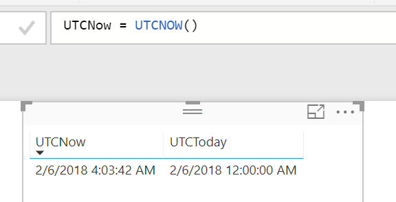
UTCNOW() and UTCTODAY()
We've added two new DAX functions this month that help if you're working with date-time data across timezones. DAX has long supported the NOW() and TODAY() functions that return time and date in the timezone that the function's being used – so if a .pbix file is passed to someone in a different timezone they'll see different results. UTCNOW() and UTCTODAY() will always return the current time or date in UTC so you can guarantee consistent results wherever you are (and also when you upload the workbook to the Power BI service).
Custom visuals
Organizational custom visuals (preview)
Custom visuals enable developers and users to visualize their data in the way that best helps them understand the data and gain insights from it. Often, these visuals are specific to the organization's needs and the way that it runs its business. The organization typically doesn’t want to publish the visual to the public. Nevertheless, there is a real need to get those visuals into the hands of data analysts inside the organization, the ones that build and maintain the analytics reports and dashboards. It’s especially important that it’s easy for them to discover the appropriate visuals and to know they don’t need to maintain and update these visuals to use them.
Your organization’s Power BI admin can deploy specific visuals as part of your organizational repository. This means you’ll see these deployed visuals under a new section of the Power BI custom visual store integrated into Power BI Desktop called My organization. Since these visuals have been vetted by your company, you can have confidence that they are well made.

This feature is currently in preview, so you’ll need to enable it from the Options menu (File->Options and settings->Options->Preview features).
Learn more about organizational custom visuals.
If you are a Power BI admin, you can add new custom visuals to this part of the store by going to the Admin portal in the Power BI service and selecting Organization visuals tab. From there you can click the Add a custom visual button and upload the .pbiviz file for the custom visual you want.

Learn more about deploying and managing organization custom visuals.
Watch the following video to learn more about organizational custom visuals:
Network Visualization and Filter
The Network Chart by ZoomCharts has the ability to visualize data as a network structure and filter data through a variety of gestures and smart touches on all devices. The network structure lets you have multiple vertice types (more than two), making it possible to see the connections among many categories. The box select feature lets you easily select multiple nodes within the chart to filter your other visuals. Visualizing the data as a network structure lets you see the implied connections in data making important decision making more efficient and obvious.

Some practical use cases of the interactive Network Chart and Filter visual are:
- Customer segmentation
- Cost and revenue analysis
- Log/Event analysis
There are two versions of this chart. The free version is available on Microsoft AppSource and the customizable paid version can be purchased on the ZoomCharts website.
Features of the free Network Chart visual include:
- Fully depict data as a network structure with the ability to filter the data from within the visual
- Smooth connecting visuals
- Cross-category filtering
- Dynamic force feedback layout
- Expanding/collapsing vertices
- Hide/Unhide vertices
- Select one or multiple vertices
- Category-coded colors for vertices (non-configurable)
- Inner and outer labels for vertices (non-configurable)
- Dynamic radius for vertices (non-configurable)
Paid features include:
- Legend control
- Customizable vertices
- Support for images inside vertices
- Value-based gradient colors for vertices and edges
- Inside/outside label configuration
- Configurable dynamic radius for vertices
- Configurable dynamic width for edges
- Edge decorations
- Up-to 9 categories
Watch the following video to learn more about the Network Chart:
Slope Chart by MAQ Software
Slope Chart by MAQ Software allows you to analyze trends in data at a glance. This visual is useful for comparing interactions between two data points based on time or other user-chosen parameters. A slope chart is most useful if there are notable changes to highlight or for showing comparisons between groups.
Some key features of the visual include:
- Quick comparison of indicator growth or loss across categories
- Easy interaction with many data points using zoom functionality
- Quickly download an image of the chart with the capture image widget

Watch the following video to learn more about the Slope Chart:
Filter by List
The Filter by List visual lets you bulk apply filter values for a report. Currently if you want to filter a report with a large number of categories, such as 100 products, you’d need to check each box in the filter pane one by one. With this visual you can do this immediately by pasting the entire list of products into the slicer visual.

Watch the following video to learn more about the Filter by List visual:
as Timeline
This visual helps you find overlaps and gaps of dates in your data. This is useful for showing things such as team vacation schedules or project plans.

Watch the following video to learn more about the as Timeline visual:
as T-Accounts
T-accounts are used by most accounting professionals to understand difficult accounting journal entries and with this visual you can now create T-accounts in Power BI directly.

Watch the following video to learn more about the as T-Accounts visual:
Data connectivity
Improvements to DirectQuery over SAP HANA (preview)
Power BI has long supported SAP HANA, both for import and DirectQuery. However, the DirectQuery support largely treated SAP HANA as a relational source, meaning that care had to be taken to ensure that measures aggregated correctly when dealing with non-additive SAP HANA measures like Counters or ratios and to ensure that the reports had good performance.
There is now a preview of a new approach to SAP HANA that will treat it as a multi-dimensional source by default, in a similar manner to SAP Business Warehouse or Analysis Services. You’ll need to turn on the “New SAP HANA connector” preview feature switch under File > Options and Settings > Options > Preview features.
When connecting to SAP HANA using this approach, a single analytic or calculation view is selected, and all the measures, hierarchies, and attributes of that view will be available in the field list. As visuals are created, the correct aggregate data will always be retrieved from SAP HANA.
It is still possible to use the old approach to DirectQuery over SAP HANA. This is controlled by selecting File > Options and settings and then Options > DirectQuery, then selecting the option Treat SAP HANA as a relational source. Check this option to create a DirectQuery report over SAP HANA using the old approach.
Note that this option controls the approach that will be used for any new connections created. It has no effect on any existing SAP HANA connections in the current report, nor on connections in any other reports that are opened. This means that any reports connecting to SAP HANA that were created prior to February 2018 will continue to treat SAP HANA as a relational source.
Given the completely different behavior between the two approaches, it’s not possible to switch an existing report from one approach to the other.
The two approaches are described in detail in our documentation.
While in preview, reports created using the new multi-dimensional approach can’t be published to the Power BI service. Doing so will result in errors when opened within the service.
Other
DirectQuery performance improvements
This latest update includes a large number of improvements to the performance of reports using DirectQuery. We expect some improvement to many queries and substantial improvement in particular cases. The key performance improvements are:
- Combining additive and non-additive aggregates into single query. Power BI will now combine both additive aggregates (e.g., SUM, MIN) and non-additive aggregates (e.g., DISTINCTCOUNT) into a single SQL query to the underlying source, rather than sending two queries. This will improve the performance of any visual containing both DistinctCount and another additive aggregate.
- Improved handling of queries with a large number of literals. The performance of any query involving a large number of literals has been improved, such as queries that involve measure filtering, TopN filtering, or bi-directional relationships.
- Use of a single SQL query rather than multiple for some visuals and calculations. Power BI used to send several SQL queries using DISTINCTCOUNT for certain kinds of visuals and calculations. For example, this could occur when using bi-directional relationships, or using a quick measure, or in a measure using CALCULATE of DISTINCTCOUNT. Now, a single SQL query is sent, resulting in an order of magnitude improvement in some cases.
- Optimized queries to reduce post-aggregation. In some scenarios, Power BI used to send SQL queries at a lower granularity than needed for the visual and perform post-aggregation locally. Now, it pushes all the joins and post-aggregations down to the underlying source, improving performance. For example, this applies to any visual where the underlying measure column is directly related to only a subset of the columns being grouped by (and there is some non-trivial filtering), and most quick measures.
- Optimized use of TREATAS in calculations. Power BI will optimize common patterns for the use of TREATAS in calculations to combine into a single query. For example, a visual containing the following two measures:
CALCULATE(SUM(Table1[Col1], TREATAS(VALUES(Table2[Col3]), Table1[Col3])) and
CALCULATE(MIN(Table1[Col2], TREATAS(VALUES(Table2[Col3]), Table1[Col3]))would previously have resulted in two separate SQL queries, but will now result in just one.
- Fewer SQL queries are sent when there is multi-column tuple filtering. For example, if Include or Exclude is used to filter out data items based on multiple columns, e.g., to exclude the items (“USA”,”Old”) and (“France”,”Young”) from a visual.
Open and save performance improvements
We’ve made improvements to our performance when opening and saving files, especially when your files are quite large. In some cases, you can see between a 40% and 60% performance improvement.
“Show items with no data” improvements
We’ve done some work to improve the Show items with no data feature.

Some visible improvements you’ll see are:
- For visuals that have Show items with no data enabled, you’ll see major performance improvements for visuals with columns or filters directly related in the model (as in they have one to many relationship). On average we improved the performance by 100%.
- Filters related to columns that have Show items with no data enabled now respect model bidirectional cross filtering
Persistent filters control for up coming Power BI service feature
We are planning to release a new feature for reports in the Power BI service very soon where we will persist filters, slicers, and other data view changes as your report consumers last left them. This will be unique to each of them, so they will no longer need to spend their valuable time setting up or filtering the reports on every visit. Instead, they can pick up right where they left off!
In order to give you more control over this feature when it does get released in the service, we have added a new option under Report settings called “Persistent Filters” in this month’s release. The feature is on by default, but you can choose to disable it here.

Watch the following video to learn more about the persistent filters option:
Consulting Services quick link
From the new Consulting Services resource on the Help ribbon, you can explore a wide variety of curated fixed price, fixed scope, and fixed duration consulting services from our vibrant partner community. These affordable packaged briefings, assessments, workshops, proof-of-concept, and implementation offerings can help you get started with Power BI, take your skills to the next level, or help set you on the path to solve difficult business problems.
Watch the following video to learn more about the Consulting Services resource:
That’s all for this month! We hope that you enjoy these updates and continue sending us your feedback. Please don’t forget to vote for other features that you’d like to see in the Power BI Desktop.