


Today, we’re pleased to announce the August update of Power BI Report Server! This release contains several new features, including some highly anticipated items like report theming, conditional formatting improvements, and report page tooltips. Read on to learn more about these and many other new capabilities we’ve added in this release. Please note: For those users who are upgrading their report server from a previous version, we recommend clearing your browser cache before viewing your reports.
Reporting
- Report Theming
- Buttons to trigger actions
- Combo chart line styles
- Improved default sort for visuals
- Numeric slicer
- Advanced slicer syncing
- Log axis improvements
- Data label options for funnel chart
- Set line stroke width to zero
- High contrast support for reports
- Donut radius control
- Pie and donut detail labels position control
- Format data labels separately for each measure in a combo chart
- New visual header with more flexibility and formatting
- Wallpaper formatting
- Tooltips for table & matrix
- Turn tooltips off for visuals
- Slicer accessibility
- Formatting pane improvements
- Stepped line support for line and combo charts
- Sorting experience improvement
- Print reports through Export to PDF (in Power BI Desktop)
- Create bookmark groups
- Slicer restatement
- Report page tooltips
Analytics
- New DAX function: COMBINEVALUES()
- Measure drillthrough
- Conditional formatting by a different field
- Conditional formatting by values
Modeling
- Filtering and sorting in data view
- Improved locale formatting
- Data categories for measures
- Statistical DAX functions
Reporting
Report Theming
We are very excited to announce we’ve added report theming to this release of Power BI Report Server, which will allow you to quickly color your entire report to match a theme or corporate branding. When you import a theme, all your charts will automatically update to use the theme colors, and you’ll have access to the theme colors from the color palette.
You can upload a theme file using the Import Theme option under the Switch Theme button.

A theme file is a JSON file that includes all the colors you want us to use in your report along with any default formatting you want to apply to visuals.
Here is a simple sample JSON theme that just updates the default colors of the report:
{
"name": "waveform",
"dataColors": [ "#31B6FD", "#4584D3", "#5BD078", "#A5D028", "#F5C040", "#05E0DB", "#3153FD", "#4C45D3", "#5BD0B0", "#54D028", "#D0F540", "#057BE0" ],
"background":"#FFFFFF",
"foreground": "#F2F2F2",
"tableAccent":"#5BD078"
}
When the theme is uploaded, the colors will automatically be applied to all charts.

You’ll also see the colors in the color palette, so you will be able to use them in other places as well.

Applied theme colors will follow your reports when you save them to Power BI Report Server.
If you are looking for some examples to get started, you can download the theme I used in this example, a theme that is more color blind user friendly than our default, or if you are feeling nostalgic, a zip file of all the Power View themes. You can find other themes or submit your own theme on our report theme gallery in the Power BI Community. You can also read our documentation to learn more about all the properties you can control through theming.
Buttons to trigger actions
Now that we have several different actions that can be triggered by just a click on a shape or image, we decided it was time to add a button control to Power BI as well. These new buttons are geared towards letting you create an app-like experience with interactive elements in your report.
A button can be inserted from the ribbon, by picking on of several icons or selecting a blank button. Once on your page, you can choose to add text, change the icon, add a fill color or give your button an outline. You have lots of control around the look of the icon and text including size, color, and alignment. Once you pick your default look for your button, you can then use the dropdown to change how it looks on hover or when it is being clicked on.

As with images and shapes, you can pick the action that will be performed on click through the Action card. Currently these actions include ‘back’ and a specific bookmark. For certain icon types, we will have a default action assigned.
Combo chart line styles
You can now change your combo chart lines to different styles and have that optionally reflected in your legend.

Improved default sort for visuals
One of our goals is to make it fast and easy for you to create beautiful, well formatted reports. We’ve improved our default visual sort, so you won’t need to change it nearly as frequently.
Our new logic for sorting visuals is:
- If your visual uses a column that has an associated order-by column, we will sort by that by default (you can set this up using the Sort by column feature)
- Otherwise, if your field is a date field, we will sort in chronological order
- Lastly, if you don’t have an order-by column or date field, we will sort by the measure descending.
Of course, as always we will always respect any sort order you manually pick.
Numeric range slicer
The numeric range is generally available to use, and therefore, is now part of the Power BI Desktop for Report Server. You’ll see it a slicer type option for numeric column without needing to turn on a preview feature. Additionally, any newly created slicers using numeric columns will default to the between mode of the numeric range slicer.

Advanced slicer syncing
The Advanced section of Slicer syncing pane allows you to create custom groups of slicers to sync. By default synced slicers will be put a group with a name that matches the field used in the slicer but you can override this with any name you want. This means you can create separate groups to sync slicers that use the same field; for example you’ve got two slicers using the same field on the same page, and you want to sync one of them with a slicer on another page.
You can also put slicers that use different fields in the same group; for example you’ve got two different date fields and you want to have the selected date sync between the slicers. If the value selected in the first slicer doesn’t exist in the second slicer, you’ll see it appear at the bottom of the list of values.

You can also check the Sync field changes to other slicers. With this option checked, if you swap the field used in the slicer, all the synced slicers will update to use the same field.
Log axis improvements
We’ve greatly improved log axis in your cartesian charts.
You should now be able to select log scale for the numeric axis of any cartesian chart, including combo chart, when you have data that is completely positive or completely negative. Reference lines should also observe the log scale and will cause the scale to resize to accommodate them.

If you have data that crosses zero, you’ll now get a helpful warning in the property pane, and the scale type will revert to linear. Once your data is updated to no longer include both positive and negative values, the visual will start to use the log axis again.

Data label options for funnel chart
We've added more control for data labels in funnel chart. You can now pick if each bar shows the actual value, the percentage of the first bar, the percentage of the previous bar, or the actual value and one of the two percentage options.

The first bar will always show only the data value since the percentages are always 100%.
Set line stroke width to zero
Another small formatting option we added is the ability to set the stroke width of lines to 0.

This works for combo charts as well as line charts.

High contrast support for reports
If you're using the high contrast mode Windows settings, your Power BI reports will now respect the color palette you're using. When using Power BI Desktop, we'll automatically detect which high contrast theme you're using and apply those colors across your report, similar to the experience you're used to with other Microsoft products, such as Excel.

In Power BI Report Server, we'll also try to detect which theme you're using and automatically apply it to your report, but depending on what browser you are using, we may not be able to. If you want to change the theme manually, you can select a high contrast theme under the View dropdown.

Note that if you're using high contrast themes on Power BI Desktop, you’ll still see some areas of the product that aren't using your theme’s colors. We’ll be adding more support for high contrast in future releases.
Donut radius control
We’ve added the ability to control the inner radius of your donut chart. This lets you make the donut slimmer or thicker to get the style you want. You’ll find this option under the Shapes card in the formatting pane.

Pie & Donut detail labels position
Pie and donut charts now support moving your detail labels inside. You can pick between forcing the labels to always be outside or inside or to prefer one position over the other.

If you choose to move your labels inside the pie or donut chart, you can also choose whether the text can overflow past the edge of the shape and if the labels have a background or not.

Format data labels separately for each measure in a combo chart
There’s an update to data labels in combo charts in this release. Now you can customize individual series. In the Data labels card of the formatting pane, you can turn the Customize series option on to format an individual measure’s formatting options, such as color, display units, and the number of decimal points.

New visual header with more flexibility and formatting
A common request we’ve heard from report authors was that the visual’s header took up a lot of space and that it didn’t fit with the design of their reports. Based off this feedback, we have completely revamped our visual header.
Since the new visual header is detached from the visual, it can adapt its position based on the layout of the visual. By default, the header will appear inside the visual in line with the title.

If your visual doesn’t have a title, it will instead float on top of the visual, unless the visual is all the way to the top of the report, in which case it snaps to the bottom of the visual.

Every visual now has a new card in the formatting pane, called visual header. In this card, you’ll find options to format the icon color, the background and border colors, and their transparency. You can also choose to turn off individual icons or the whole header for viewers of your report.

Note that the visibility toggles do not affect your report when authoring it. You’ll need to publish your report and view it in reading mode to see the effect. This is because many of the options in the visual header are important during editing, especially the warning icons.
This new visual header is on by default for all new reports. For existing reports, you will need to enable it in the Options dialog under the Report settings section. Depending on your report’s layout, you may notice some shifts after upgrading reports to the new header, especially with background images.

Wallpaper formatting
With our new wallpaper feature, we now let you format that grey area outside your report page. This lets you theme the entire report area and gives it a more cohesive feel. The formatting options you have are similar to what you currently have for report pages, including color, transparency, and uploading an image. You can set the wallpaper per page or use our theming feature to set a new default experience for all your report pages.
This feature can be used to extend the main color of any background images you are using for layouts to the rest of the space.

You can also make your report page transparent and have your charts float on top of the wallpaper.

Which can give your report a very different feeling depending on the image used.

You’ll notice that when the page background has a transparency higher that 50%, we’ll add a grey dotted line in editing mode to help you see where the edge of your page is.
As part of this update, we’re also updating the default report page experience to have a completely transparent page background and a white wallpaper, which has a nicer feeling than a white page and grey wallpaper.
Tooltips for table & matrix
Based on the interest we heard from the community, we decided to close the gap between table and matrix and other visuals in terms of tooltips. We now support the standard tooltips on both the table and matrix visuals.
You’ll be able to turn tooltips on for table and matrix using the new tooltip card. Tooltips will be default to off, so you don’t need to worry about your reports changing without you knowing.

Once the tooltip card is turned to on, you’ll get the standard Power BI tooltip for your visual.

Turn tooltips off for visuals
While we are making updates to tooltips to support table and matrix, we also added the same on/off toggle for tooltips all visuals that support tooltips. If you go to the same tooltip card you use to control report page tooltips, you’ll see a toggle has been added to the card. If you turn the toggle off, you’ll receive no tooltip at all when hovering over the visual.

Slicer accessibility
Being able to interact with and change slicer values is one of the most important tasks for any report consumer, and for a while this wasn’t available to users who relied solely on a keyboard to navigate. We’re very happy to announce that keyboard and screen reader users can now go beyond consuming a report as is and can start interacting with slicers on their reports.
When you want to explore the current state of a slicer using just a keyboard, the first thing you’ll need to do is enter into the slicer. You can do this with the Ctrl+Right Arrow keyboard shortcut. This will move your focus to the first element inside the slicer. You can then tab around the various components of the slicer, such as the clear icon, dropdowns and text fields to update values, and the slicer type dropdown. As your focus moves, helpful information is also read out by the screen reader, if you have one on.
This is a big step forward in terms of accessibility and we have even more accessibility features planned for the coming months.
Formatting pane improvements
If you are a report author, you probably spend a lot of time in our formatting pane updating the design of your visuals. Given its usage and the fact that it was originally designed when we didn’t have very many formatting options available, we’ve been wanting to revamp it for quite a while. Luckily, we recently had a new developer join our team, so as an introductory task, we had her update the style of our formatting pane.
The updates include:
- A lighter grey color used inside cards, so the entire pane doesn’t blend together
- Animations and hover effects give the pane a more modern and polished feel
- Titles show above a given control to improve readability and reduce truncation

These updates should make the time you spend in the formatting pane a little bit nicer!
Stepped line support in line and combo charts
As a small formatting improvement, we now support changing the line in combo charts to a stepped format. You’ll find this toggle in the Shapes card. The type of stepped line we currently support changes height at the midpoint between two data points.

Sorting experience improvement
We’ve found through user testing that our sort experience wasn’t very clear or easy to use and wasn’t accessible to keyboard users. We've improved this by separating the controls to change sort direction from the control to pick the field to sort by. With this change, you can now also fully navigate this options flyout using only a keyboard.

Print reports through Export to PDF
We’ve heard loud and clear from you that we needed an option in Power BI Desktop to easily print or email copies of your reports out to others in your company. We’ve been working on a solution to this problem for awhile now and are glad to share that with this month’s update you can now export all visible report pages to PDF. You’ll find this new option under the File menu.

Once you select Export to PDF, we will start generating the PDF. While we’re doing this, we’ll show you a dialog letting you know we are working on it, and you’ll see each non-hidden page loading in order behind it. During this process, you won’t be able to interact with the report. If you need to interact with your report again before we’ve finished you can cancel the export through the dialog.

Once the PDF has been created, it will open in your default PDF viewer, which in my case is Microsoft Edge. From there you can save it wherever you like, email it as an attachment, or print it!

Currently, we don’t support printing wallpaper color or images, only page backgrounds or images. If you have a dark wallpaper color and a transparent page color, you may want to temporarily set the page background to match the wallpaper’s color to improve readability.

Create bookmark groups
If you are using bookmarks extensively, you like have sets of bookmarks with different purposes. For example, you may have different bookmarks per organizational division using your report, or perhaps you have a set of bookmarks for navigation and several sets of bookmarks for different presentations.
In these cases, it’s important to clearly separate out each group of bookmarks, and this month, based on your feedback, we’ve made this much easier to do with the introduction of bookmarking grouping. Bookmark grouping lets you collect a set of bookmarks together and give it a name. Each group can be expanded and collapsed for easy viewing.

To create a bookmark group, click the first bookmark of the group and then ctrl+click the other bookmarks you want to group with it. Then select the “…” menu for any of the bookmarks to group and pick the group option.

If you decide later you don't want that group anymore, just use Ungroup to stop grouping that set of bookmarks.

When you use View to play a bookmark group, it will only include the bookmarks in that group.

Playing from a bookmark at the root level, such as Default View in this example, will still play through all bookmarks in your pane.
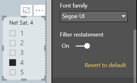
Slicer restatement
If you are using the list slicer, you can now add a restatement, similar to the restatement in the dropdown slicer, to the slicer header through an option in the Slicer header card in the formatting pane.
Report page tooltips
We are very excited to announce that our report page tooltips feature is included in this update of Power BI Report Server. This feature lets you design a report page to be used as a custom tooltip for other visuals in your report. This gives you full flexibility to design whatever kind of custom tooltips you want, from using cards to show detailed information to miniature drillthrough pages shown on hover.
To start creating your custom report page tooltips, first you have to design the tooltip you want to show. We recommend you use a smaller page size, so you don’t have to worry about the tooltip being too large to show on your normal report pages. We have added a new page size template called Tooltip to use as a starting point, but you can use any page size you want.

While designing your tooltip, we recommend viewing it in Actual size, so you know exactly what your tooltip will look like on hover.

Once you’ve finished creating your tooltip report page, you’ll need to mark the page as a tooltip so we know you want to use it as such.

From here, there are two ways you can start using this tooltip in your report. The first is to tie it to a specific field using the Tooltip fields bucket below the Filters pane. This behaves similarly to the drillthrough fields bucket. Any fields you put into the tooltip fields bucket will be tied to this tooltip. If you use this field in charts throughout your report, this tooltip will be used instead of the default Power BI tooltip. You can put both categorical and numerical fields in this bucket, including measures.
For example, if I put SalesAmount in the Tooltip fields bucket…

That page will be used as a tooltip in other visuals using the SalesAmount field.

The other way you can tie a custom tooltip page to your visuals is to manually set it through the Tooltip card in the formatting pane. In the card, you can set any page that’s marked as a Tooltip page, even if it doesn’t have anything in the Tooltip field bucket, to be the tooltip for this visual. This is useful if you want to design a tooltip to be used for a specific visual.

Another use case is to manually override the automatically selected tooltip if we picked the wrong one to use. For example, in the chart above, if I had one tooltip tied to the Units field and one tied to the Category field (the two fields used to create the chart), we’d pick one of these tooltips to use automatically. If you didn’t like the tooltip we picked, you can use this manual override to pick the other one.
If you manually override the tooltip in this card, you can always go back to our “automatic” selection by selecting Auto in the dropdown list. You can also completely turn the report page tooltips off for a chart by setting the tooltip type dropdown to Default. This will force a chart to use Power BI’s default tooltip, even if there are matching report page tooltips in the report.

There are a couple of other things to consider when building report page tooltips. First, when using these custom tooltips for line charts, you will only get one tooltip for all lines in the chart, as you do today. The field in the legend does not get passed through as a filter on the tooltip. In the example below, the tooltip is showing all units sold on that day across all three classes: Deluxe, Economy, and Regular.

Second, when a chart is being cross-highlighted, the report page tooltips will always show the cross-highlighted data, even if you are hovering over the “faded out” section of the data point. To see the unfiltered data in the tooltip, you will need to clear the highlighting.

Analytics
New DAX function: COMBINEVALUES()
This month’s update adds a new DAX function COMBINEVALUES(), that allows multi part keys to be handled in a more efficient way when using DirectQuery.
Power BI doesn’t directly support relationships that use multi-part keys. For example, consider the relationship between Shipment, and OrderLine. If an OrderLine is uniquely identified by a combination of OrderID and LineID, then the relationship from Shipment to OrderLine would need to use those pair of columns. The common workaround is to create a calculated column on each table, that combines the values with some separator. For example:
Key = CONCATENATE(CONCATENATE([OrderID],":"),[LineID])
Then the relationship can be defined as normal. The problem with this workaround is when you're using DirectQuery since now cases which require a join between the two tables will send a SQL query that joins on an expression. This often results in indexes no longer being used, and therefore a less efficient query.
Our new COMBINEVALUES takes as arguments a separator (e.x. “:”) and one or more expressions. It will concatenate the values of all the expressions, with the given separator. For example, in the case above, the calculated column can now be defined using the expression:
Key = COMBINEVALUES(":",[OrderID],[LineID])
This is still simply a DAX expression, and the calculated columns are still used in the relationship as before. The difference is that this is then optimized, such that upon joining using this relationship, the condition defined in the SQL query decomposes back to use the underlying columns [OrderID] and [LineID] directly. This generally results a much more efficient SQL query.
As another use case for this new DAX function, you might also want to use this function to join a set of values with a common delimiter without having a set of nested CONCATENATE() functions.
Measure drillthrough
In our previous Power BI Report Server release, we added a drillthrough experience that allows you to move from one page to another carrying specified filters through. You’d set this up by creating your drillthrough page (i.e. the page you want to land on) and then adding any categorical fields to the Drillthrough filters bucket in the filter pane as you want.

Any fields you put in this bucket would be tied to the page. Any chart in the rest of the report that uses that field could be right-clicked on to move to the drillthrough page.
This is a very powerful feature but was limited that only filters on the fields explicitly placed in the Drillthrough filters bucket would be carried through. There was no way to carry the entire filter context of your data point through the drillthrough page.
We are closing this gap by allowing you to carry all filters through. When you are setting up your drillthrough page, if you want all filters to pass through and not just the fields placed in the bucket, you can turn the Pass all filters toggle on.

Once the toggle is on, whenever you right click on a data point and drillthrough, all filter context from the source page is passed to the drillthrough page. You’ll be able to see a restatement of all these filters in the Drillthrough bucket.

With the toggled turned off, only filters on the columns specified will be carried through.
With this drillthrough update, you can also now use measures and summarized numeric columns in the drillthrough bucket. You can pick if you want to allow drillthrough on numeric columns when used as a category (e.g. a chart showing number of reviews by rating) or summarized (e.g. a chart showing average rating by category).

The Pass all filters option is on by default for new drillthrough pages and off by default for existing pages.
Conditional formatting by a different field
We are very excited to announce a major improvement for our conditional formatting experience, the ability to formatting a column by a different field in your model.
Now, whenever you open the conditional formatting dialog, you’ll see two new dropdowns. The first, Based on field, is where you can pick what field from your model to base your rules on, and the second, Summarization, is where you’ll pick the aggregation type for that field. You'll be able to see what field in your table or matrix is being formatted currently through the title of the dialog.

The field and summarization type to color by are auto-populated with the same column in your table you’ve chosen to format, so you won’t have to do any extra configurations unless you want to customize it.
When you do customize the field for the color to be based on, you’ll get a similar experience to the field list where you can expand and collapse tables in your model and search to help you find the field you’re looking for.

In the below example, I’m using showing the total sales by product and coloring that column by the average net satisfaction of the product.

You can also pick a new source of formatting when using the Color by rules version of conditional formatting.
With this update we are also opening up conditional formatting to text and date fields as well, as long as you choose a numeric value to format on.

A common use case for this would be to create a measure in your model that does your custom business logic, such as comparing target vs. actuals and the use Color by rules to format the text based on the result. For example, you could create a measure to return a -1, 0, or 1 if a product is under, at, or above its sales expectations, and then in Color by rules mode chose to format the product name red if the measure returns -1, yellow if it returns 0, and green if it returns 1.
Conditional formatting by values
Another new conditional formatting type we have this month is Format by field value. Format by field value will let you use a measure or column that specifies a color, either through a hex code or name and applies that color to the background or font color.
For example, each product in my model has a color. Instead of showing the color name, I’d prefer if the cell was filled with the color instead.

With this feature all I have to do is pick to format that color by the color name. I’ll do that by opening the conditional formatting dialog for the Color column in my table.

And then in the dialog, pick to format by Field value. The dialog defaults to the color column with First for summarization. Since I’m always only going to have one color value per table row, this is exactly what I want and I just need to select okay.

If I repeat this for font color as well, the whole column will be filled with the product color, which makes it easier for me to identify with a glance which product color I’m currently looking at.

Another great use case for this is to set up a DAX calculation based on your business logic that outputs different hex codes. You can then format by that calculation without having to worry about creating a bunch of rules in the conditional formatting dialog.
For example, you could use a switch statement to create your KPI…

… pick to conditionally format by that measure…

… and see the results in your table or matrix.

Modeling
Filtering and sorting in data view
We are very excited to announce the addition of filtering and sorting in the data view. For every column in your model, you can now see the sort direction if it is applied on that column and either filter individual values out or using advanced filtering options for that column type.

Improved locale formatting
We are vastly increasing the number of specific locales we support for formatting when viewing your reports in Power BI Report Server. With this update we are adding support for a total of 670 locales. For example, you’ll now see support for Mexico’s variant of Spanish along with many other Spanish variants. In Desktop, we detect and use the "date, time, and number formatting" format set for the operating system. IE and Edge will pass this same OS locale through, but other browsers often have their own, separate, language and region settings.

Make sure to use the default data format for your field if you want the the system locale settings to flow through. You can tell you are using system locale formatting by the * next to the format.
Data categories for measures
You can now pick data categories for measures. This means you can do things like use measures to dynamically create URLs and mark the data category as a Web URL. Then when you display it in tables, you’ll be able to click on the URL that’s created based on your selection!

Another great use case for this feature is to create DAX measures to create interesting insights such as sparklines using SVG images. If you are interested in doing this, but aren’t sure how, you should watch our Quick measures gallery in the Community, as I know some members of the community are planning on adding examples there soon.

Statistical DAX functions
We’ve added several new functions that expand the statistical capabilities of DAX.
- NORM.DIST
- NORM.S.DIST
- NORM.INV
- NORM.S.INV
- T.DIST
- T.DIST.RT
- T.DIST.2T
- T.INV
- T.INV.2T
These match the behaviors of their Excel counterparts, so it should be easy to migrate to if you’re used to doing these statistic operations there.
That’s all for this release! We hope that you enjoy these updates and please don’t forget to leave your feedback in the comments below.
Additional Resources: