


This month we are very excited to integrate our Q&A experience into the reporting canvas, offering a whole new way to create your visuals. We are also updating our bookmarking preview with new features that provide you much more flexibility. A highly requested feature, the ability to drill to filter other visuals on the page, is also coming out this month. You can take advantage of several new connectors and major updates to existing ones.

Don’t forget you can now get Power BI Desktop from the Windows Store if you’re on Windows 10!
![clip_image004[7]](https://powerbicdn.azureedge.net/mediahandler/blog/media/PowerBI/blog/003c6541-690b-4fef-aad3-28981197f13c.jpg "clip_image004[7]")
Here’s the complete list of December updates:
- Q&A for report creation (preview)
- Cross-highlighting for bookmarks
- More bookmark flexibility
- Field properties pane and field descriptions
- Scatter visual from x- & y-axis groupings
- High density sampling for maps based on latitude and longitude
- Responsive slicers
- New custom visuals
- Adobe Analytics connector (preview)
- HDInsight Interactive Query connector
- Data.World connector
- SAP BW connector improvements:
- IBM Netezza connector is now generally available
For a summary of the major updates, you can watch the following video:
Reporting
Q&A for report creation (preview)
Our goal is to answer questions about your data as quickly and easily as possible, and our Q&A feature can make that easier than ever. For a while now, Q&A has let you ask questions about your data using natural language on your dashboards and get a visual back that answers that question. Then you could pin those answers to the dashboard. This month we are also unlocking this powerful feature on your reports. Double clicking on a blank area of your report page or clicking the Ask a question button on the ribbon gets you a question box to type your question.

As you type, a visual is created in real-time answering the question and updates as you modify or add to your question.

Once your visual is made, you can use it the exact same way as a normal Power BI visual, changing fields around and formatting it to match your report’s style.
With Q&A now built into the report experience, you can get answers to your questions just by typing them. It also lets you quickly create an entire report without needing to use the field well or list. Q&A is currently a preview feature, so you will need to enable it through our Options dialog the first time you want to use it.
Watch the following video to learn more about Q&A integrated into the report canvas:
Bookmark cross-highlighting
We have two exciting updates for our bookmarking preview this month, the first of which is the ability to bookmark your cross-highlighted state in addition to your filters, slicers, and other bookmarkable features. Cross-highlighting is an important part of any analysis and can often reveal interesting insights. Now that you can bookmark cross-highlighting, you can easily share these insights with everyone who uses your reports.

More bookmark flexibility
Some of the early feedback we received for bookmarking was that you needed more flexibility in what is bookmarked. You wanted to be able to control the types of properties that were bookmarked and what visuals on a page were affected by the bookmark. This month, we're adding two new sets of controls to let you do just that.
The first lets you pick if the bookmark will apply the “data” properties such as filters and slicers, the “visual” properties such as spotlight and the visibility, and/or the page change that moves users to the page that was visible when the bookmark was added. You can mix and match any of these group of properties to bookmark just what you need. A common use case for this feature is when you are using bookmarking to switch between visual types, as I showed in the October blog post. When you are doing this, you likely want to turn the data properties off so that filters aren’t reset as users change visual types.

The second lets you pick what visuals the bookmark is applied to. By default, bookmarks apply to the entire page. However, if you want the bookmark to apply to only part of the page, for example because you divided your page in half to do a side by side comparison, you can now do that.
You’ll set up the bookmark how you want it to look and then multi-select the visuals you want included in the bookmark. Then create or update your bookmark while the visuals are still selected. You can now change the bookmark through the bookmark’s menu to Selected visuals instead of All visuals, and it will only apply the bookmark to those visuals you selected. As an example, in the image below, you can see that since I only selected the four visuals on the right and not table and other visuals on the left, the bookmark will only apply to those visuals on the right half of my page.

Watch the following video to learn more about these bookmarking enhancements:
Field properties pane and field descriptions
The field properties pane allows you to change the name and description of a field from your fields list. You can access this pane by selecting Properties from the field menu.

In the pane, you’ll be able to rename the field and give it a description.

Once, you give a field a description, you can see if anytime by hovering over the field in the list.

If you have multiple people editing your reports, this is a great way for everyone to understand what fields they should use and how measures are being calculated.
The description is also shown if you’re using a connection to an external Analysis Services model. This means you can see this information from centralized IT-developed models if the developer set the description there as well.
Watch the following video to learn more about the field properties pane:
Create a scatter visual from x- & y-axis groupings
Until now, the way to create a scatter visual was to use two measures, one for each axis, and a categorical value in the details bucket to group on. Now, you don’t need to add a category to the details bucket. We will instead plot all the x- and y- pairs that you have in your model. To create your scatter visual this way, just pick Don’t summarize as the aggregation type. As a reminder Don’t summarize is only an option for numeric columns. This won’t work for measures.

Watch the following video to learn more about this scatter chart improvement:
High density sampling for maps based on latitude and longitude
This month we are extending our high density sampling algorithm, which we already support in scatter and line visuals, to maps using latitude and longitude. This new algorithm will better preserve the shape of your data while also surfacing outliers. To do this, we prioritize showing points that aren’t going to be hidden by neighboring points. With this change, you should see a noticeably improved experience with any map visuals using latitude and longitude that exceed the data point limit. This sampling algorithm allows you to represent a large number of data points without sacrificing performance and load time.
If you would like to use the previous sampling algorithm or test out the improvements, you can turn off High Density Sampling in the General card of the formatting pane. We will continue to invest in this area and improve other visuals as well, so be sure to give us feedback on the new experience!

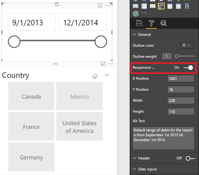
Responsive slicers
Responsive slicers are the latest update to our responsive visuals work. With responsive slicers, you can resize them to a variety of different sizes and shapes, from horizontal to square to vertical, and the vales in the slicer rearrange themselves as you do. You can make both horizontal slicers and date and range slicers responsive. Both the date and range slicers also have the added benefit of improved touch areas so it's easier to change them with a fingertip. As with all our responsive visuals, the benefits are best seen when you use them on the Power BI mobile apps as well, since they resize automatically to fit well on all platforms. You can read our documentation to learn more.
New custom visuals
Card Browser
The Card Browser visual is a document set viewer featuring flippable, double-sided thumbnails for natural navigation of media collections.
The Preview face of each card renders the headline image, title, and origin of the story with a text sample, enabling rapid discovery of documents of interest.

Flipping the cards reveals the MetaData face, which lists document properties. Clicking a card expands it in place for detailed reading.

Watch the following video to learn more about the Card Browser visual:
Table Heatmap
The Table Heatmap visual is a great way to compare data values in an easy and intuitive way. You can give it a category and all the measures you want to compare. The visual will then color the matrix in a stepped color gradient. You can either pick your own start and end color or from a list of predefined color palettes and also how many steps you want to have.

Watch the following video to learn more about the Table Heatmap visual:
Data Image by CloudScope
The Data Image visual by CloudScope is great visual for displaying dynamic web images. You can pick to crop the image into a circle and to add a border.

Watch the following video to learn more about the Data Image visual by CloudScope:
Power KPI Matrix
The Power KPI Matrix visual enables balanced scorecards in Power BI and displays an unlimited number of metrics and KPIs in a single, customized list. Power KPI Matrix is similar to the Power KPI custom visual in supporting the creation and display of KPI indicator symbols and values along with current and historical trends of actual and target values, but it has the added benefit of the tabular format that allows for an unlimited number of metrics and KPIs in a single matrix. This visual is very flexible and customizable with fine grain control of many formatting options.

Watch the following video to learn more about the Power KPI Matrix visual:
Text Filter
The Text Filter visual is a search box that can be used to filter all the visual on your report page to any categories in a given field that contains the text you specify.

Watch the following video to learn more about the Text Filter visual:
ChartAccent – LineChart
The ChartAccent visual’s line chart is filled with rich annotation features, including highlighting individual data points, data series, points within a range, or even points above the average value. You have fine-grained control over the data label formatting, the ability to define ranges on the axis, and the ability to annotate the chart with shapes, text, and images. Each annotation is listed on the top right section of the pane, so you can see what you’ve done and easily make edits to or remove annotations.

ChartAccent – BarChart
The ChartAccent visual’s bar chart is just as flexible as the line chart version. It’s goal is still to provide you an easy way to highlight your data points by providing advanced formatting options.

Watch the following video to learn more about the ChartAccent visuals:
Analytics
Drill filters other visuals
This month we are adding one of the most popular drill features, the ability for other visuals on your report to be filtered as you drill down in a visual. Now, as you drill down in a given category in your visuals, you can have it also filter all visuals on your page by that same category. This new option is on by default for all new reports, but you can turn it off (or turn it on for older reports), through the option in the Format tab.

Watch the following video to learn more about drill filtering other visuals:
Data connectivity
Adobe Analytics connector (preview)
This month we’re releasing a new connector for Adobe Analytics. This connector allows you to easily import and analyze your Adobe Analytics data within Power BI.
The connector is currently available as a Beta connector in Power BI Desktop. Note that end-to-end support for this connector in the Power BI Service will become available in a few months.
The new Adobe Analytics connector can be found in the Get Data dialog, under the Online Services category.

After selecting the Adobe Analytics connector, you can authenticate using your credentials.


Once the connection has been successfully established, you can preview and select multiple dimensions and measures within the Navigator dialog to create a single tabular output. As part of this selection, you can also provide any necessary input parameters for the selected items.
After selecting the desired information, you can decide to directly load your query into Power BI Desktop or perform any additional data transformations and filters within the Query Editor UX upfront, via the Edit option in this dialog.

This connector is in preview, so you will need to enable it through our Options dialog the first time you want to use it.
HDInsight Interactive Query connector
Another new connector in this month’s Power BI Desktop release is a new connector for HDInsight Interactive Query. Interactive Query leverages Hive on LLAP in Apache Hive 2.1, bringing the interactivity to your complex data warehouse style queries on large datasets stored on commodity cloud storage.
The new HDInsight Interactive Query connector can be found under the Azure tab in the Get Data dialog:

Upon selecting this connector, you can specify which HDInsight Interactive Server and Database to connect to, as well as the connectivity mode. This connector supports both Import and DirectQuery modes.

Once connection details have been provided, you can authenticate using user name/password, then navigate, preview, and select one or multiple tables from your database, just like you would do for other data sources.

Data.World connector
In partnership with Data.World, we have shipped a new connector that allows you to import Data.World datasets into Power BI. The new Data.World connector can be found under the Online Services category in the Get Data dialog.

This connector requires you to provide an Owner and Dataset ID and, optionally, a query to run.

After specifying these fields, you will be able to preview the dataset and load it directly into Power BI Desktop or leverage the Query Editor to apply data transformations and filters before the data is loaded.
SAP BW connector improvements
We've made a couple of significant improvements to the SAP BW connector in this release, including:
Support for connecting to an SAP BW Message Server
One common request from SAP BW connector users was being able to specify a Message Server rather than an Application Server when setting up the connection from Power BI. To achieve this, we have added a new SAP BW Application Server connector under the Database category in the Get Data dialog.

This new connector allows users to specify a Server, System ID, Client ID, and Logon group for the Message Server to connect to. Both Import and DirectQuery connectivity modes are supported.

Support for Windows Authentication
Windows credentials are now supported when connecting to either SAP BW Application or Message Servers. The extra Windows Authentication option can be found in the Credentials dialog after specifying a server to connect to. This new authentication type allows you to connect using the “current user” or specifying “alternate credentials,” as well as their SNC partner name. You can also specify which SNC library to use.

Please note that these two new features for SAP BW are only available in Power BI Desktop at this point. Support for them in the Power BI service, via the On-premises data gateway, will be added in the future.
IBM Netezza connector is now generally available
We’re glad to announce that the IBM Netezza connector is now GA. This connector has been available as a Beta connector in Power BI Desktop since June and is supported end-to-end in the Power BI service (via the On-premises data gateway) since August. We have received very positive feedback from users during this period, helping us get to this GA release.
The IBM Netezza connector can be found within the Get Data dialog, under the Database category. The connector allows you to import data or create DirectQuery-based reports on top of IBM Netezza databases.
That's all for this month! We hope that you enjoy these updates and continue sending us your feedback. Please don't forget to vote for other features that you'd like to see in the Power BI Desktop.