


This month’s update for Power BI Desktop filled with both small and large improvements across the entire product. One huge update is support in the Power BI service for both our composite model and aggregation previews. This really enables you to start using these preview features end-to-end for your normal reports. We also have two significant data prep features this month as well: fuzzy matching capabilities when merging queries and data profiling to help identify quality issues.

Here’s the complete list of October updates:
- Search in filter cards
- Improved accessible authoring experiences
- Performance improvements for ArcGIS Map
- Composite models & Aggregation support in the Power BI service (preview)
- Explain the increase for non-additive measures
- Mapbox updates – 3D extrusion on fill maps & more
- Various bar & column chart visuals by Akvelon
- 3AG Systems – Column chart with small multiples
- 3AG Systems – Bar chart with absolute variance
- 3AG Systems – Column chart with relative variance
- Web By Example connector is now generally available
- SAP BW Connector implementation v2 is now generally available
- SAP BW Message Server Connector is now generally available
- Vertica connector is now generally available
- Dynamics NAV and Dynamics 365 Business Central connectors are now generally available
- New Dynamics 365 Business Central On-premises connector
For a summary of the major updates, you can watch the following playlist. We are trying something a little different this month. Instead of one long video, we made a video per section and connected them with a playlist. Let us know what you think of the new format!
Reporting
For a summary of the reporting features you can watch the following video:
Search in filter cards
We’ve had search in our slicers since our June 2016 update, and now with this month’s update, we’ve added it into our basic filter cards as well. This functionality is much loved and used in our slicers, and we think this will be a welcome update to our filters as well.

Improved accessible authoring experiences
As part of our continuing accessibility work on the Power BI team and across all of Microsoft, this month we have lots of improvements related to authoring and modifying reports. Our field well can now be navigated using just a keyboard and interacts well with screen readers. To help improve the usability of editing charts with screen reader and keyboard, we have also added new options to the context menu of fields to move fields up and down within a well or move to other wells.

Q&A always worked very well with keyboard navigation, and now it also works well with screen readers. This update is for both Power BI Desktop and the Power BI service and applies to all the places Q&A shows up, including the Q&A explorer and using Q&A to create visuals in reports. This is a great way for users to create visuals quickly and easily while using assistive technology and will really open up report creation to everyone.
Performance improvements for ArcGIS Maps for Power BI
With a recent update to ArcGIS Maps for Power BI, all maps will load up to 50% faster. Cross-highlighting, filtering, panning and zooming also have major performance improvements. Thanks to these performance improvements, the map can also support drawing many more locations on the map. For latitude/longitude point locations, each map now supports 30,000 points. For standard boundaries (for example, ZIP codes, provinces, etc.) maps can now draw up to 15,000 areas. Read more about these updates on Esri’s blog post.
Modeling
For a summary of the modeling features you can watch the following video:
DAX editor improvements
We’ve enhanced our DAX editor to make it much more powerful! The new editor has new keyboard shortcuts, line numbers, and indent lines. The experience will be very similar to what you have for other Microsoft editors, such as VS Code.

Some of the less well-known keyboard shortcuts you might find useful are:
| Alt+ ↑ / ↓ | Move line up/down |
| Shift+Alt + ↓ / ↑ | Copy line up/down |
| Ctrl+Enter | Insert line below |
| Ctrl+Shift+Enter | Insert line above |
| Ctrl+Shift+\ | Jump to matching bracket |
| Ctrl+] / [ | Indent/outdent line |
| Alt+Click | Insert cursor |
| Ctrl+I | Select current line |
| Ctrl+Shift+L | Select all occurrences of current selection |
| Ctrl+F2 | Select all occurrences of current word |
Analytics
For a summary of the analytics features you can watch the following video:
Composite models & Aggregations support in the Power BI service (preview)
Our composite models and aggregation previews have a huge update this month! You can now publish files that are using composite models or aggregations to the Power BI service, and they will work as expected there. This should open you up to start testing composite models and aggregations end to end.
Composite models has been updated in a few other ways as well. The “blank query” experience received an overhaul based on feedback from users in the forums at community.powerbi.com. And of course, we have continued to harden the feature, improving its reliability. Based on all these changes, we are getting very close to the point where we can make composite models generally available, so if you have any more feedback, please let us know!
Explain the increase for non-additive measures
Our ‘Explain the increase’ and ‘Explain the decrease’ insights questions are now available on all measure types, not just sums and counts! It works the same way as it did for sum and count measures, so from a visual, just right click on a point and select Analyze > Explain the increase.

The visuals you get back will depend on the type of measure you are using. You will continue to get the waterfall chart showing the breakdown for additive measures (sum and count). For measures that are averages or ratios, you will see a dot plot visual, and for everything else, you will see a clustered column chart. No matter what, they will all be geared to answering the question you asked: why did this measure’s value increase or decrease.

The dot plot you get for averages and ratios shows the measure plotted for two periods you selected. The periods will be on the x-axis and measure on the y-axis. The size of the bubble reflects the weight of the measure.
Custom visuals
For a summary of the new custom visuals you can watch the following video:
Below jumping into the new custom visuals for the month, I wanted to let you know about our deep dive blog on organizational custom visuals. If you are interested in that feature and want to know more, make sure to check it out.
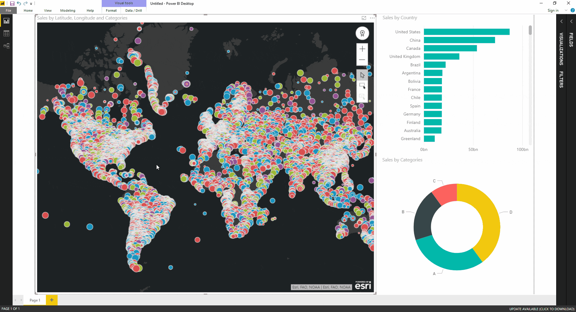
Mapbox updates – 3D extrusion on fill maps & more
Mapbox is back with another list of major improvements for their custom visual this month!
With the lastest version of their custom visual, you can add an extra dimension to your fill maps by using 3D extrusions. In addition to dynamic fill color, you can now add data-driven heights to the polygons as well. All you have to do is drop a measure into the Size bucket and set the relative extrusion height.
To go along with 3D extrusions, they’ve added an option to set the default map pitch, which is usually needed in order to get the most context on polygon heights.
Mapbox has also delivered some of their top requests:
- Autozoom to selected shapes – Now, whenever you filter your fill maps, the map will autozoom to the selection.
- Ability to turn off map controls – You can also add a little more real estate on your maps by turning off the map controls for zooming and selection if you don’t need to use them.
- Smarter tooltips – Tooltips will now automatically display the underlying dimension’s format, and tooltips are now smart enough to only show if something is specified.
Lastly, you can now add a search bar to your map. This is very useful if you have a lot of data across a lot of locations, allowing you to jump quickly to any part of the map. All you need to do is start typing a location and Mapbox will autofill suggested locations for you. You can even optionally drop a pin at the location.
Make sure to try the lastest visual from AppSource.
Various bar & column chart visuals by Akvelon
Akvelon recently released a set of new bar and column chart custom visuals. They are similar to our built-in bar and column with the additional functionality of supports rectangle lasso selection. You can click and drag to select multiple bars within rectangle area and cross-filter the rest of the report based on that selection.

They have a version for each of the 6 configurations that exist, which you can check out on AppSource:
· Stacked Bar Chart by Akvelon
· Stacked Column Chart by Akvelon
· Clustered Bar Chart by Akvelon
· Clustered Column Chart by Akvelon
· 100% Stacked Bar Chart by Akvelon
· 100% Stacked Column Chart by Akvelon
3AG Systems – Column chart with small multiples
The column chart with small multiples custom visual by 3AG Systems allows you to create multiple overlapped column charts for each element in a group. It compares two scenarios, such as actual vs. forecast, and displays overlapped column charts. From there it will break that down by each value of a category you pick and visualize the charts next to each other.

While the visualization is geared for showing Actual, Forecast, Planned, and Previous Year data across different categories (for example departments, regions, products etc.), you can also use small multiples if you only have actual values as well.

This custom visual can be found on AppSource.
3AG Systems – Bar chart with absolute variance
The bar chart with absolute variance custom visual by 3AG Systems automatically calculates absolute variance and displays an overlapped bar chart with the variance. The visual calculates absolute variance between two scenarios and generates an overlapping bar chart that displays two scenarios with a variance bar chart situated parallel to the chart. The visualization is meant for comparing Actual, Forecast, Planned, and Previous Year data, and works best with categorical data on the y-axis.

Check out this custom visual on AppSource
3AG Systems – Column chart with relative variance
The column chart with relative variance custom visual by 3AG Systems calculates percentage change and displays an overlapped column chart with lollipop variance. It calculates relative or percentage variance between two scenarios and generates an overlapping column chart that displays the relative variance with a lollipop chart situated parallel to the chart. The visualization is meant for comparing Actual, Forecast, Planned, and Previous Year data and works best when using a time series variable on the x-axis.
The visual has lots of formatting options including inverting the colors for red and green, resizing the data label font sizes, hiding data labels, and adjusting units (to thousands-K, Millions-M, Billions-B).

Download this custom visual on AppSource.
Data connectivity
For a summary of the data connectivity features you can watch the following video:
Web By Example connector is now generally available
The Web By Example connector was released a few months ago as a Preview feature. With this month’s release of Power BI Desktop, we’re making the connector GA.
Please note that in order to be able to refresh datasets that leverage this connector in the Power BI service, you will need to upgrade to the October release of the On-premises data gateway.
SAP BW Connector v2 is now generally available
We’re happy to announce that the recently added “v2” implementation of the SAP BW connector is now GA. You can access this new implementation from the SAP BW connector dialog under the “Implementation” section. “v2” implementation is now the default setting for new connections against SAP BW. If you want, you can learn more about the SAP BW Connector in our documentation.

SAP BW Message Server Connector is now generally available
This month we’re also making the SAP BW Message Server connector generally available. We want to thank everyone who has used it and provided us feedback during the Beta phase, which helped us getting this connector to general availability.

Vertica Connector is now generally available
This month we’re making the Vertica connector GA, after being in Beta for a few months. The Vertica connector allows you to build Import-based or DirectQuery-based reports against your Vertica databases. Please note that in order to refresh datasets based on Vertica data in the Power BI service you will need to upgrade to the October release of the On-premises data gateway.

Dynamics NAV and Dynamics 365 Business Central connectors are now generally available
After a few months in Beta, we’re excited to make the Dynamics NAV and Dynamics 365 Business Central connectors generally available. These connectors can be found under the Online Services tab within the Get Data dialog. They allow you to easily import data from their Dynamics NAV or Dynamics 365 Business Central accounts.
Please note that in order to be able to refresh datasets that leverage this connector in the Power BI service, you will need to upgrade to the October release of the On-premises data gateway.
New Dynamics 365 Business Central On-premises connector
In addition to all the previously mentioned connector enhancements, this month we’re also releasing a new connector, allowing customers to import and build reports on top of their Dynamics 365 Business Central On-premises data.
The new Dynamics 365 Business Central On-premises connector can be found under the Online Services category in the Get Data dialog.
Please note that in order to be able to refresh datasets that leverage this connector in the Power BI service, you will need to upgrade to the October release of the On-premises data gateway.

Data preparation
For a summary of the data preparation features you can watch the following video:
Data Profiling in Query Editor (preview)
The Power Query Editor offers hundreds of data transformations for you to transform, filter and prepare your data for analysis. However, identifying quality issues such as errors, empty values and outliers can be quite difficult.
With this month’s release of Power BI Desktop, we’re adding Data Profiling capabilities into the Power Query Editor, allowing you to easily identify errors and empty values in your data previews. You can enable Data Profiling from the Preview features tab in the File -> Options dialog.
After enabling the feature, you should be able to see the quality bar below the column headers indicating whether there were any error values found or not.

Note that you can also enable further Data Profiling information by turning on the “Column quality” option under the View tab. This allows you to see counts for errors, valid or empty values. In addition, you can take action directly from the fly-out menu to Remove Errors.

Another Data Profiling capability added in this release is the “Column Distribution” (which can also be enabled from the View tab). Column Distribution allows you to get a sense for the overall distribution of values within a column in your data previews, including the count of distinct values (total number of different values found in a given column) and unique values (total number of values that only appear once in a given column).

You can also take action directly from this view, in order to Remove Duplicates.

We’re very excited about releasing this new Data Profiling capabilities in the Power Query Editor. We have many new capabilities planned for the future in this area, including the ability to see more detailed value distribution information, as well as being able to apply filters on specific values (equivalent to cell-level context menu filters currently available).
Fuzzy Matching options for Merge Queries (preview)
Merge Queries allows you to easily combine data from multiple tables within the Power Query Editor. In this month’s releasing, we’re adding the option to compare values in the columns to match by using Fuzzy Matching logic, in addition to the existing “exact match” option.
You can enable Fuzzy Merge from the Preview features list in the Options dialog. Once you have done this, you’ll be able to access the new Fuzzy Matching options from within the Merge Queries dialog. Once you’ve selected the Fuzzy Matching option, you can also (optionally) further tweak the fuzzy matching settings.
This includes configuring:
- Similarity Threshold – This option indicates how similar two values need to be in order to match. The minimum value of 0.00 will cause all values to match each other, and the maximum value of 1.00 will only allow exact matches. The default is 0.80.
- Ignore case – This option indicates whether text values should be compared in a case sensitive or insensitive setting. Default behavior is case insensitive (ignore casing).
- Ignore spaces – This option indicates whether text values should be compared taking into account spaces or not, such as “Some value” vs. “Somevalue”. Default behavior is to ignore spaces.
- Maximum number of matches – This option controls the maximum number of matching rows that will be returned for each input row. For example, if you only want to find one matching row for each input row, specify a value of 1. The default behavior is to return all matches.
- Transformation table – This option allows users to specify another query that holds a mapping table, so that some values can be auto-mapped as part of the matching logic. For example, defining a two-column table with a “From” and “To” text columns with values “Microsoft” and “MSFT” will make these two values be considered the same (similarity score of 1.00) by the matching logic.

Selecting this option allows non-exact matches to be performed as part of Merge, like the ones showed in the following example (matching “Will” with multiple variations: Bill, bill, Will, will, etc.)

Please note that in order to be able to refresh datasets that leverage this feature in the Power BI service, you will need to upgrade to the October release of the On-premises data gateway.
Other
For a summary of the other features you can watch the following video:
Control over export data options for your reports
You now have the flexibility to control what types of data export options are available for your consumers when the report is published to the Power BI service. You can choose to:
- Allow exporting only of summarized data (this will be the new default for reports)
- Allow exporting of summarized and underlying data (this is the default for all old reports)
- Don’t allow exporting of any data
You can set this in Power BI Desktop through the options dialog under Report settings.

You can also update this setting in the Power BI service through the report settings pane.

Transport-layer security options
Security is a priority for Microsoft, and we have company-wide programs in place to ensure customers have control over the security of communications with Microsoft services. IT and network security admins may want to force usage of more recent versions of TLS (transport layer security) for any secured communication on their network, and Power BI Desktop now respects the Windows registry keys you use to manage this. For example, you can disable client applications from using the older TLS 1.0 by setting the following in the Windows registry:
- [HKEY_LOCAL_MACHINE\SYSTEM\CurrentControlSet\Control\SecurityProviders\SCHANNEL\Protocols\TLS 1.0\Client] “Enabled”=dword:00000000
- [HKEY_LOCAL_MACHINE\SYSTEM\CurrentControlSet\Control\SecurityProviders\SCHANNEL\Protocols\TLS 1.0\Client] “DisabledByDefault”=dword:00000001
Power BI Desktop will respect the registry keys specified on those pages, and only create connections using the right version of TLS. There’s more information on the Windows TLS documentation sites here:
https://docs.microsoft.com/en-us/windows-server/security/tls/tls-registry-settings
Coming soon
This month, I wanted to focus the “Coming soon” section on a visual related feature, a huge update for our color saturation feature in visuals. For quite awhile now, we’ve had two different ways to dynamically color a visual’s data points depending on the visual type. Our cartesian charts had a color saturation option in the field well that gave you basic controls, and the table and matrix visuals had conditional formatting. We’ve added a ton of functionality to the conditional formatting experience for table and matrix over the last year, but the color saturation feature for cartesian charts hasn’t received much love. That is changing soon though, as we are actively working on an upgrade for all visuals using color saturation that will switch them over to also use the conditional formatting experience you are already used to on tables and matrices. Once we finish up the feature, you’ll be able to use the same dialog and same options (including the Rules sections!) for all visual types. This also means that as we continue to improve conditional formatting, all visuals will benefit!
That’s all for this month! We hope that you enjoy these updates and continue sending us your feedback. Please don’t forget to vote for other features that you’d like to see in the Power BI Desktop. For any preview features, you can always give us your feedback in our active community. You can also download the .pbix file I used, and if you’re looking for a similar design for your reports, I was using the Microsoft layout from PowerBI.Tips.