This month we are very excited to release our What if feature, which we previewed in the Data Insights Summit keynote back in June. We’ve also added even more features for our table and matrix visual, including a formatting option to show values on rows of your matrix. We also have several new analytics features, such as symmetry shading and ratio lines for scatter charts.
 And don’t forget to also check the Power BI service and mobile July feature summary.
Here’s the complete list of August updates:
- Show values on rows for matrix
- Color scales on font colors for table & matrix
- Custom subtotal settings per level of matrix
- Line styles and legend options
- Scatter chart performance improvements
- New custom visuals
For a summary of the major updates, you can watch the following video:
Reporting
Show values on rows for matrix
Following on our announcement last month that the new table and matrix visuals are generally available, we’ve added even more new features to these visuals.
The first is the ability to show the values as row headers instead of column headers.
If you have multiple values in the Values field well bucket, they will by default show as column headers in the matrix.
If you would prefer for them to show as row headers instead, we now have a formatting option, Show on rows, that when switched to On will show each of the values on the rows of your matrix.
Find more details about showing values on rows in the following video:
Color scales on font color for new table & matrix
You can now apply conditional formatting to your column’s font color instead of the background of cells.
You can reach this new option either from the value’s menu….
Or in the formatting pane…
Once you select Font color scales, you’ll see a dialog similar to the background color scales that lets you customize what colors you use and the range.
Once you have the style you want and close the dialog, you’ll see the formatting applied to that value’s text.
Find more details about color scales on font colors in the following video:
Custom subtotal settings per level of matrix
Another great new feature for the matrix visual is the ability to customize whether subtotals are displayed for each level of the matrix hierarchy for both rows and columns. You’ll find this option in the Subtotals card of the formatting pane.
Another new subtotal customization is an option to move the row subtotals to the bottom of the group instead of the top. You can also find the Row subtotal position option in the Subtotals card of the formatting pane.
Find more details about customizing subtotals in the following video:
Line styles and legend options
This month we are adding even more formatting options for your line charts. You can now set the style for line charts to dotted and dashed in addition to the standard solid line style. This feature is great not only for styling your charts, but also for accessibility, as you now have even more options to format each line differently without having to rely on color.
This month we are also letting you customize how your line chart’s legend is styled. You can pick between markers only, the line style only or a combination of line and marker. This lets you pick the legend option that best communicates which category pairs with which line.
If you pick the marker only option for the legend, you’ll also be able to pick whether the legend colors match the line or the marker. You can also choose if a line or circle is used for the default icon when no marker is applied to a specific line.
Find more details about line styles in the following video:
Scatter chart performance improvements
We’ve made changes to how we are rendering the scatter chart. Now you should see up to a 30% performance improvement to your scatter chart’s load time. If you’re showing a large number of data points in your scatter charts, this should result in a significant performance improvement.
New custom visuals
This month we have four new custom visuals we want to share with you.
Dot Plot by MAQ Software
The dot plot by MAQ Software visual plots individual data points on a simple scale, and is often considered one of the most useful chart types by many data visualization experts, including Steven Few.
This visual is useful in many scenarios where you want to see the distributions of individual values, such as student scores, customer revenues, employee salaries, city population, movie ratings, or sport player scores. This custom visual also allows you to view your data across several different categories, enabling effective comparisons.
As an example, the dot plot below shows annual sales data by state (each dot) and its region (the x-axis). The legend is used to quickly tell which states perform better (blue) and which ones need attention (red), and the size of the dot shows profit margin.
You can also have multiple categories on the x-axis, allowing you to explore the data split by an additional category. In our example, we also want to explore the seasonality of the data, we added the quarter field to the chart.
This visual also has tons of features in the formatting pane, including chart orientations, label controls, background shading, gridlines thickness and colors, and bubble colors and thickness.
Test out this visual by downloading it from the custom visual store.
Find more details about the Dot Plot by MAQ Software in the following video:
Power KPI
The Power KPI visual is useful for presenting your key performance indicators (KPIs). The visual can include:
- Title and subtitle
- The KPI status and date
- A line chart with the KPI trend, forecast line, and other comparison lines
This visual has tons of formatting options such as options for KPI symbols and control for the line chart in the KPI similar to the standard line chart visual in Power BI.
Try out this visual by downloading it from the custom visual store.
Find more details about the Power KPI custom visual in the following video:
Funnel plot
The funnel plot is an R custom visual that helps you not get distracted by statistical noise. It helps you compare samples and find true outliers among the measurements with varying precision.
To use this visual you start by defining two required fields to be analyzed in the chart, such as occurrences and population. The y-axis can show either a percentage or ratio, and a “funnel” is formed by confidence limits and shows the amount of expected variation. The dots outside the funnel are outliers.
Download this visual from the custom visual store to test it out.
Find more details about the funnel plot in the following video:
Beyondsoft Calendar
The Beyondsoft Calendar visual gives you a heatmap-like view of a value across all the days of a month. You can give the visual a date field and the numerical value you want to visual. From there, you can format the colors used and the layout of the calendar. This is very helpful if you have a measure you are tracking across time.
Check it out in the custom visual store!
Find more details about the Beyondsoft Calendar custom visual in the following video:
Analytics
What if parameters
We’ve heard from many of you that you’d like to interact with controls on a report to change a variable in your data. An example of one of these scenarios is in a mortgage calculator report, you’d want to change the % rate, borrowed amount, and term to see projected repayments.
To allow you to create these type of reports, we’ve added a new section to the Modeling tab, called What If. Using this new feature, you can create new parameters that you can use in your DAX expressions.
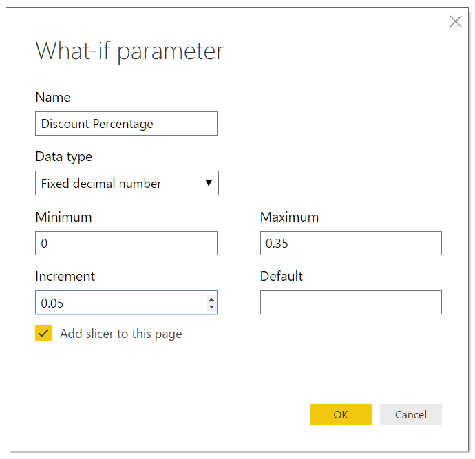
When you select to add a New Parameter, you’ll open a dialog where you fill in all the details about the parameter:
- Name
- Data type
- Minimum and maximum value
- Increment to increase by
- Default value
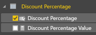
Once you finish filling out the dialog and click OK, we will use that information to create a new table with two fields. The first is a column with all the possible values for the parameter. It’s very useful for putting in a slider for viewers to use when using the report. The second field is a measure that will also be equal to the currently selected value of the parameter column. This is what you’ll want to reference in your other calculations.
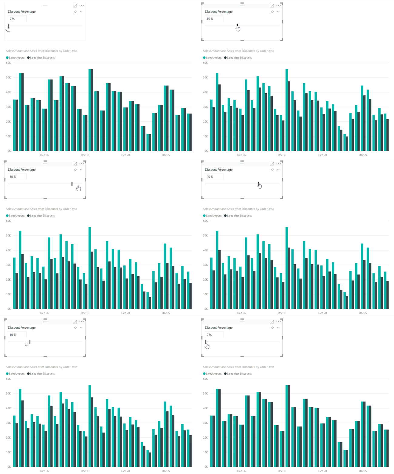
Once you use the parameter measure in your calculations, you can use those measures in your charts and have them update as you move the slider with your parameter column.
Find more details about what if parameters in the following video:
New scatter chart analytics features
For scatter charts, we’ve added two new options in the Analytics pane: symmetry shading and ratio line.
Symmetry shading
Symmetry shading is a new analytics feature that allows you to easily see which points have a higher value of the x-axis measure compared to the y-axis measure and vice versa. When you turn symmetry shading on in the Analytics pane, we’ll shade the background of your scatter chart symmetrically based on your current axis bounds. This is a very quick way to identify which measure a data point favors, especially when you have a different axis range for your x- and y-axis.
Ratio line
The ratio line feature plots the ratio of the subtotals of x-axis and y-axis measures to let you see overall which measure has a higher value. When comparing data points to this ratio line, it allows you to see how much any given point deviates from overall. Points to the left of the ratio line favor the y-axis measure more than overall, and points to the right favor the x-axis more than overall.
Using these two features together you can find some very interesting insights, such as in the example below. You can see from the shading that A. Datum in general has a higher net satisfaction score than its likelihood to be purchased again. However, when you compare it to the ratio line, you can see that it doesn’t favor NSAT compared to overall.
Find more details about the scatter chart analytics features in the following video:
New quick measure: weighted average
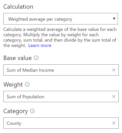
We’ve added another quick measure this month, weighted average per category. This measure calculates a weighted average of the base value for each category. We will multiply the value by the weight for each category, sum the total, and then divide by the sum of the total of the weight. You’ll find it under the aggregate by category section in the quick measures dialog.
Find more details about the weighted average quick measure in the following video:
Data connectivity
Live connect to the Power BI service is generally available
We are very excited to announce that our Power BI service connector is now generally available. Now everyone can start using this feature to connect to any of their datasets in the Power BI service. This makes it very easy to create a model once and reuse it in many reports.
Along with making the connector generally available, we have two new improvements this month as well.
First, in addition to giving you a status indication in the bottom right section of Power BI Desktop, we also let you know the dataset and workspace you are currently connected to.
Second, we now let you update what dataset you are connecting to. This is a very useful feature if you want to use a staging or development environment when building your reports and then switch it to point to the production dataset right before publishing and sharing. You’ll be able to switch out what dataset you are connecting to using the Data source settings option under Edit Queries in the Home ribbon.
Google BigQuery connector (beta)
We’ve released a new beta connector this month for Google BigQuery. This connector allows you to easily create reports on top of Google BigQuery databases, either by using Import or DirectQuery mode.
The new Google BigQuery connector can be found under the Database category within the Get Data dialog.
With this connector, you can select data from the bigquery-public-data project and any other project associated with your Google BigQuery account.
That’s all for this month! We hope that you enjoy this new update and continue sending us valuable feedback about our product. Please don’t forget to vote for other features that you would like to see in the Power BI Desktop in the future.


