July is a big release for us on the Power BI Desktop team! Our most exciting feature this month is a preview of Composite models. This feature lets you seamlessly extend your DirectQuery models with other DirectQuery sources or even imported data. We have heard from many of you, especially those in larger enterprises, that this is an essential feature and are glad to share it with all of you. We also have many reporting features this month, including an update to our visual header that lets you not only put visual all the way to the top of your canvas, but also have extensive control over the functionality and formatting of the header.
Here’s the complete list of July updates:
- New visual header with more flexibility and formatting
- Wallpaper formatting
- Theming update – more visual and page control (preview)
- Tooltips for table and matrix
- Turn tooltips off for visuals
- Slicer accessibility
- Formatting pane improvements
- Stepped line support for line and combo charts
- Turn off combo chart data labels for individual series
- Sorting experience improvement
- Power BI certified category
- Disabling specific organizational visual
- Visio custom visual generally available
- Mapbox custom visual generally available
- DataText Box custom visual
- China Scatter Map custom visual
- IBM DB2 DirectQuery connector (preview)
- Improvements to Web By Example connector
- SAP HANA – Default values for variables in Variable Input experience
For a summary of the major updates, you can watch the following video:
Modeling
Composite models (preview)
Up until now in Power BI, when you connect to a data source using DirectQuery, it’s then not possible to connect to any other data source in the same report, nor to include data that has been imported, and this has been a common ask. Our new composite models feature removes this restriction, allowing a single report to seamlessly combine data from one or more DirectQuery sources, and/or combine data from a mix of DirectQuery sources and import data.
In addition to allowing DirectQuery and import sources to live together in the same file, composite models include a new feature called dual storage mode. If you are using DirectQuery currently, all visuals will result in queries being sent to the backend source, even for simple visuals such a slicer showing all the Product Categories. The ability to define a table as having a storage mode of “Dual” means that a copy of the data for that table will also be imported, and any visuals that reference only columns from this table will use the imported data, and not require a query to the underlying source. The benefits of this are improved performance, and lessened load on the backend source.
To enable these features in Power BI Desktop, you’ll need to enable the preview by going to File > Options and settings > Options > Preview features and select Composite models.
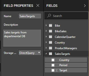
Once you do this, you’ll be able to start importing additional tables to your DirectQuery model with no additional changes to your report. If you want to take advantage of the dual storage model, you can set this for a table in the field properties pane.
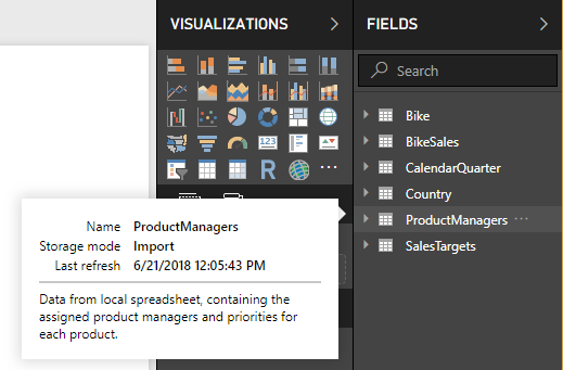
You’ll be able to see the storage mode in the tooltip for the table as well.
If your report has some DirectQuery tables and some import tables, the status bar on the bottom right of your report will show a storage mode of ‘Mixed.’ Clicking on this allows all tables to be switched to import mode easily.
While this feature is in preview, it is currently not possible to publish a model that uses any of these features to the Power BI service.
Watch the following video to learn more about composite models:
Reporting
New visual header with more flexibility and formatting
A common request we’ve heard from report authors was that the visual’s header took up a lot of space and that it didn’t fit with the design of their reports. Based off this feedback, we have completely revamped our visual header.
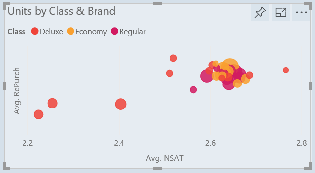
Since the new visual header is detached from the visual, it can adapt its position based on the layout of the visual. By default, the header will appear inside the visual in line with the title.
If your visual doesn’t have a title, it will instead float on top of the visual, unless the visual is all the way to the top of the report, in which case it snaps to the bottom of the visual.
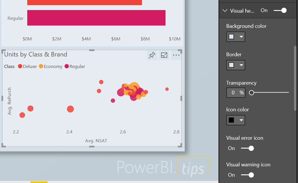
Every visual now has a new card in the formatting pane, called visual header. In this card, you’ll find options to format the icon color, the background and border colors, and their transparency. You can also choose to turn off individual icons or the whole header for viewers of your report.
Note that the visibility toggles do not affect your report when authoring it. You’ll need to publish your report and view it in reading mode to see the effect. This is because many of the options in the visual header are important during editing, especially the warning icons.
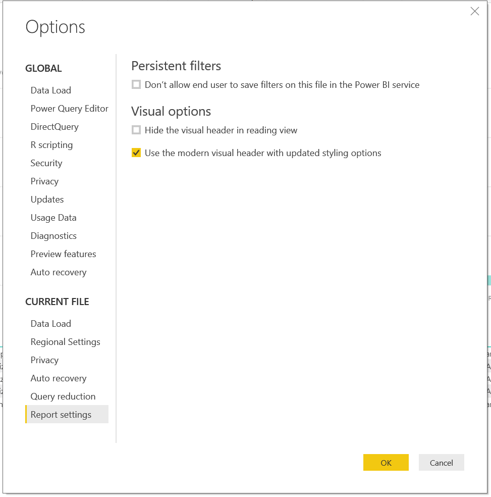
This new visual header is on by default for all new reports. For existing reports, you will need to enable it in the Options dialog under the Report settings section. Depending on your report’s layout, you may notice some shifts after upgrading reports to the new header, especially with background images.
Watch the following video to learn more about our new visual header:
Wallpaper formatting
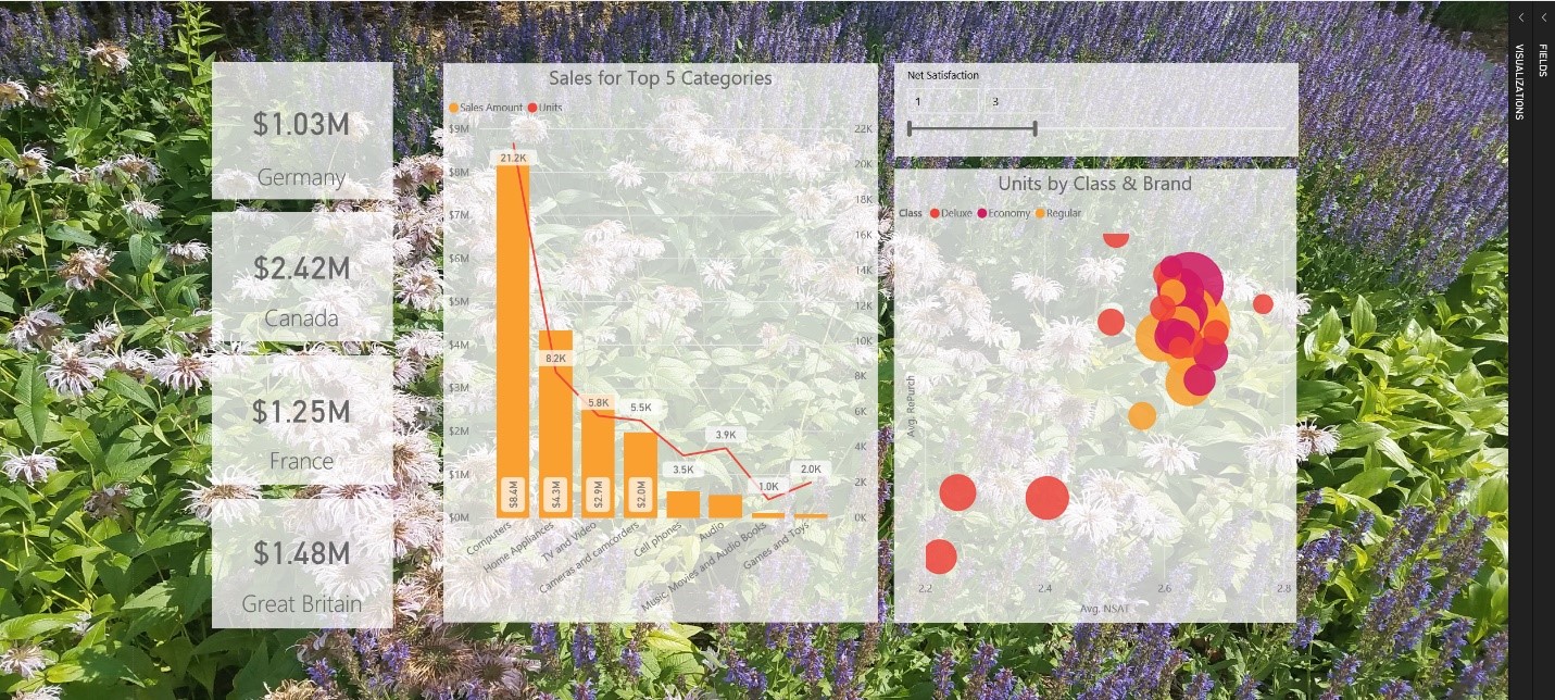
With our new wallpaper feature, we now let you format that grey area outside your report page. This lets you theme the entire report area and gives it a more cohesive feel. The formatting options you have are similar to what you currently have for report pages, including color, transparency, and uploading an image. You can set the wallpaper per page or use our theming preview to set a new default experience for all your report pages.
This feature can be used to extend the main color of any background images you are using for layouts to the rest of the space.
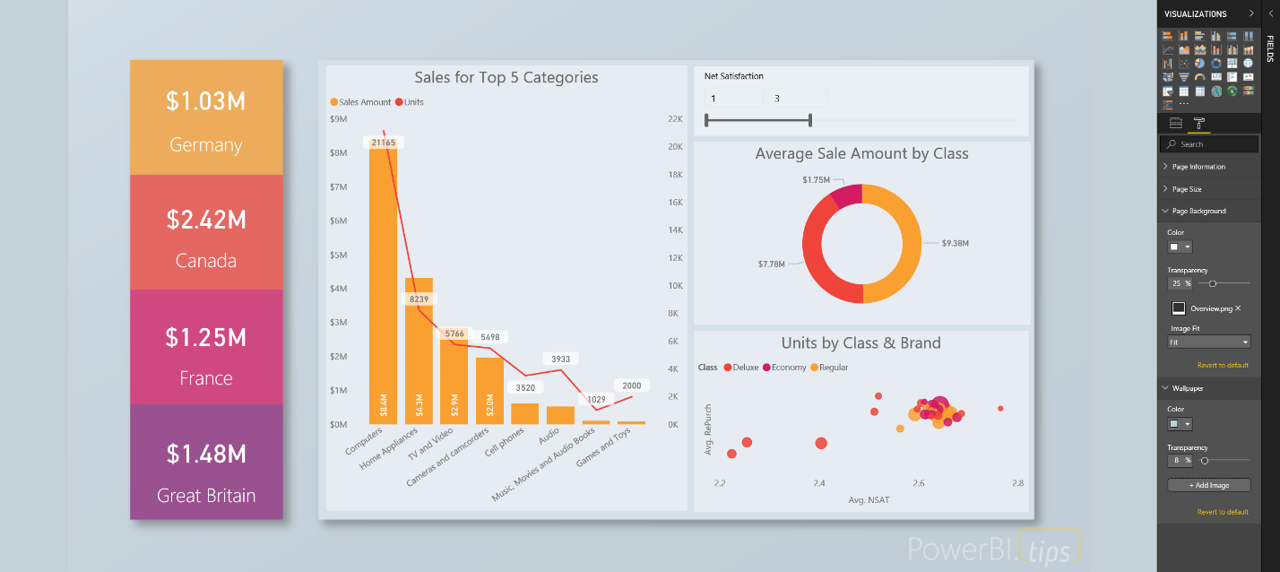
You can also make your report page transparent and have your charts float on top of the wallpaper.
Which can give your report a very different feeling depending on the image used.
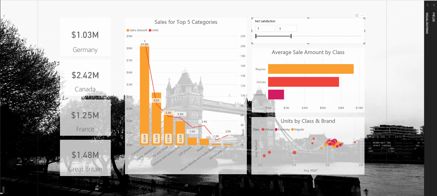
You’ll notice that when the page background has a transparency higher that 50%, we’ll add a grey dotted line in editing mode to help you see where the edge of your page is.
As part of this update, we’re also updating the default report page experience to have a completely transparent page background and a white wallpaper, which has a nicer feeling than a white page and grey wallpaper.
Watch the following video to learn more about the wallpaper setting:
Theming update – more visual and page control (preview)
We have an exciting update for our theming preview this month. Up until now, the majority of visual properties were able to be themed, but the visual’s “container” properties were not. These container settings are things that are standard across all visuals, such as the title, border, and background color. With this month’s update, all visual properties can be formatted through theming, with the exception of properties that require data in advanced (e.g. data colors).
This month we are also adding both page and wallpaper background color and transparency to the theme file as well.
Here’s an example of the visual style section showing the new properties:
“visualStyles”: {
“*”: {
“*”: {
“title”: [{
“show”: true,
“fontColor”: { “solid”: { “color”: “#F17925” } },
“background”: { “solid”: { “color”: “#FFFFFF” } },
“alignment”: “center”,
“fontSize”: 11,
“fontFamily”: “Arial”
}],
“background”: [{
“show”: true,
“color”: { “solid”: { “color”: “#FFFFFF” } },
“transparency”: 50
}],
“lockAspect”: [{
“show”: true
}],
“border”: [{
“show”: true,
“color”: { “solid”: { “color”: “#F17925” } }
}],
“visualTooltip”: [{
“type”: “Default”
}],
“stylePreset”: [{
“name”: “None”
}]
}
},
“page”: {
“*”: {
“background”: [{
“color”: { “solid”: { “color”: “#FFFFFF” } },
“transparency”: 25
}],
“outspace”: [{
“color”: { “solid”: { “color”: “#004753” } },
“transparency”: 0
}]
}
}
}
Do note that if you are wildcarding color (using a * on all 3 levels of the visual styles), that color property will start affecting the color settings for these new properties as well.
Also, make sure to check out our Themes Gallery in the Power BI Community.
Watch the following video to learn more about the theming update:
Tooltips for table & matrix
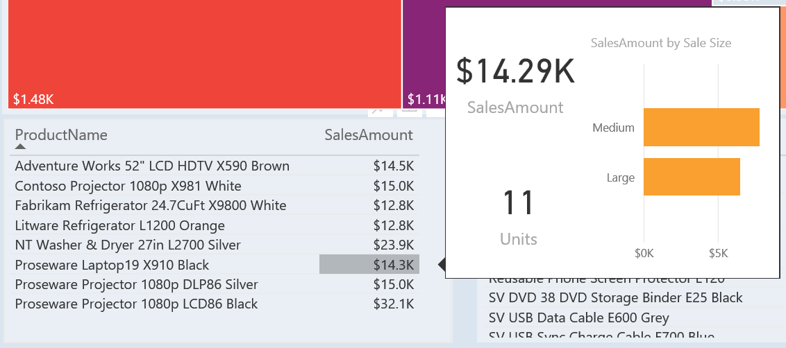
After releasing our report page tooltips preview back in March, one of the most common requests we heard was wanting to have them on the table and matrix visual. The main reason this wasn’t supported from the start was that our table and matrix visual didn’t support our standard tooltip that you see on all our other visuals. So based on the interest we heard from the community, we decided to tackle this gap and are excited to announce that with this month’s update, we support both the standard and report page tooltips on both the table and matrix visuals.
You’ll be able to turn tooltips on for table and matrix using the new tooltip card. Tooltips will be default to off, so you don’t need to worry about your reports changing without you knowing.
Once the tooltip card is turned to on, you’ll get the standard Power BI tooltip for your visual.
If you’re using the automatic linking for report page tooltips, those will automatically start working as well once you flip the tooltip card to on. You can also start manually assigning your report page tooltips through the tooltips card.
Turn tooltips off for visuals
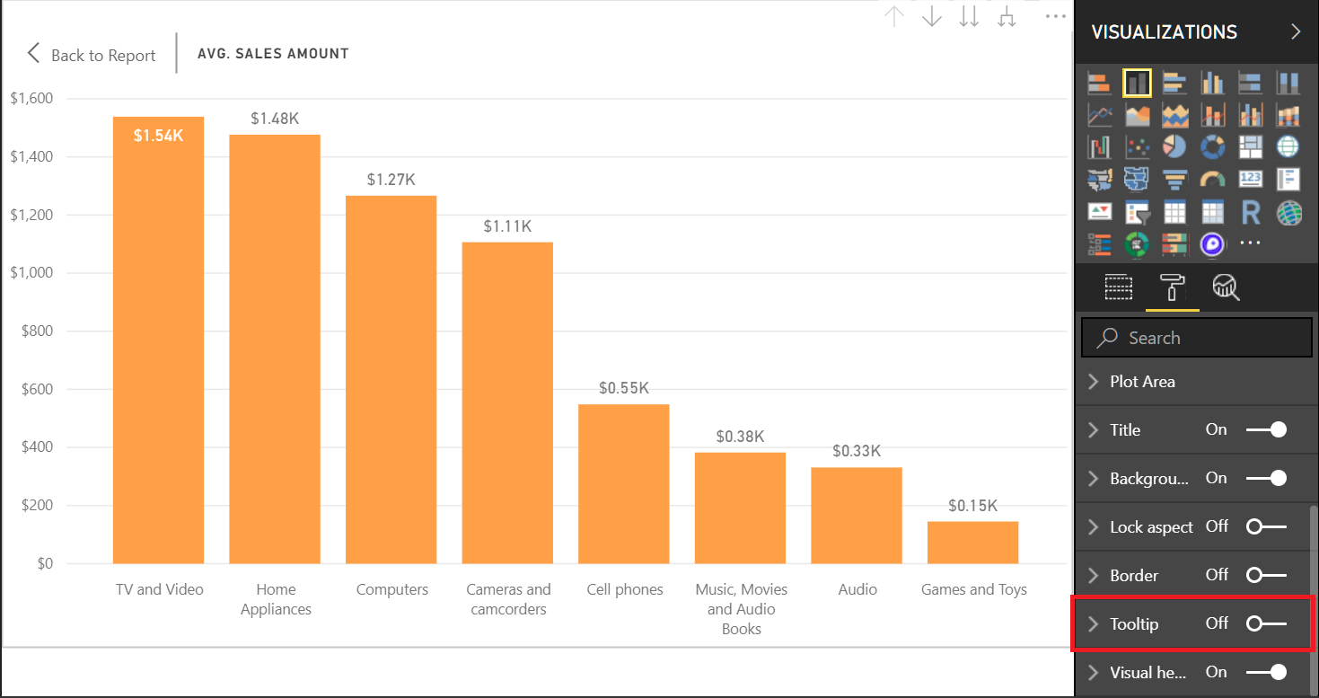
While we are making updates to tooltips to support table and matrix, we also added the same on/off toggle for tooltips all visuals that support tooltips. If you go to the same tooltip card you use to control report page tooltips, you’ll see a toggle has been added to the card. If you turn the toggle off, you’ll receive no tooltip at all when hovering over the visual.
Watch the following video to learn more about both tooltip updates:
Slicer accessibility
Being able to interact with and change slicer values is one of the most important tasks for any report consumer, and for a while this wasn’t available to users who relied solely on a keyboard to navigate. We’re very happy to announce that keyboard and screen reader users can now go beyond consuming a report as is and can start interacting with slicers on their reports.
When you want to explore the current state of a slicer using just a keyboard, the first thing you’ll need to do is enter into the slicer. You can do this with the Ctrl+Right Arrow keyboard shortcut. This will move your focus to the first element inside the slicer. You can then tab around the various components of the slicer, such as the clear icon, dropdowns and text fields to update values, and the slicer type dropdown. As your focus moves, helpful information is also read out by the screen reader, if you have one on.
This is a big step forward in terms of accessibility and we have even more accessibility features planned for the coming months.
Watch the following video to learn more about slicer accessibility:
Formatting pane improvements
If you are a report author, you probably spend a lot of time in our formatting pane updating the design of your visuals. Given its usage and the fact that it was originally designed when we didn’t have very many formatting options available, we’ve been wanting to revamp it for quite a while. Luckily, we recently had a new developer join our team, so as an introductory task, we had her update the style of our formatting pane.
The updates include:
- A lighter grey color used inside cards, so the entire pane doesn’t blend together
- Animations and hover effects give the pane a more modern and polished feel
- Titles show above a given control to improve readability and reduce truncation
These updates should make the time you spend in the formatting pane a little bit nicer!
Watch the following video to learn more about the formatting pane update:
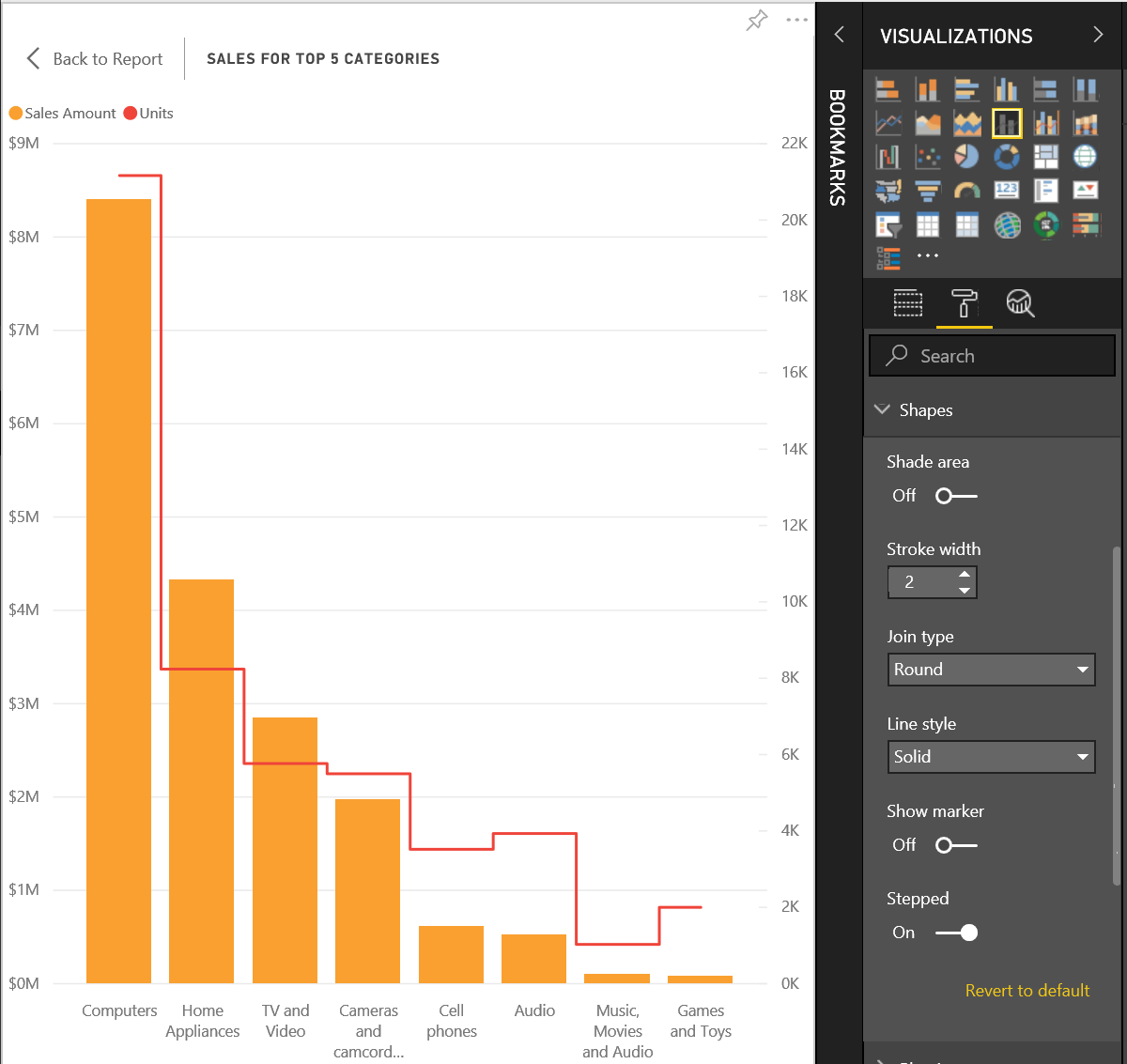
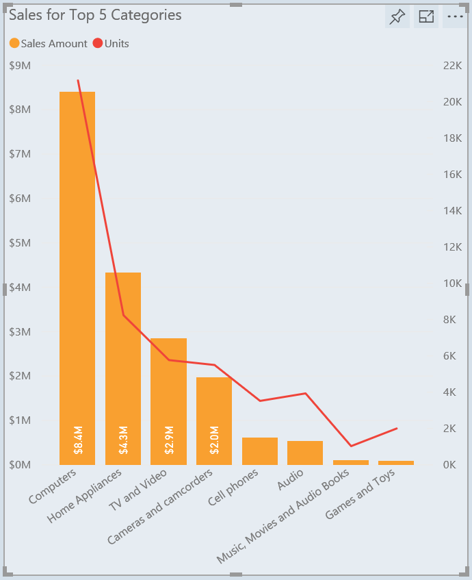
Stepped line support in line and combo charts
As a small formatting improvement this month, we now support changing the line in combo charts to a stepped format. You’ll find this toggle in the Shapes card. The type of stepped line we currently support changes height at the midpoint between two data points.
Watch the following video to learn more about the stepped line feature:
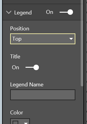
Turn off combo chart data labels for individual series
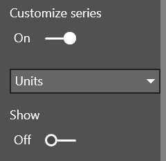
Last month we added the ability to customize the line and column data labels separately for combo charts, and immediately we heard feedback that you wanted to be able to turn the data labels off per series as well. This was a very quick change, so we added that option in this month.
When you turn the Show toggle off, that series’ data labels will turn off in the combo chart.
Watch the following video to learn more about the stepped line feature:
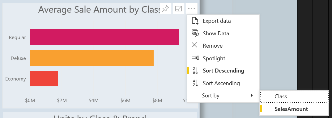
Sorting experience improvement
We’ve found through user testing that our sort experience wasn’t very clear or easy to use and wasn’t accessible to keyboard users. For our July update, we’ve improved this by separating the controls to change sort direction from the control to pick the field to sort by. With this change, you can now also fully navigate this options flyout using only a keyboard.
Watch the following video to learn more about the sorting update:
Analytics
Distribution factor insights
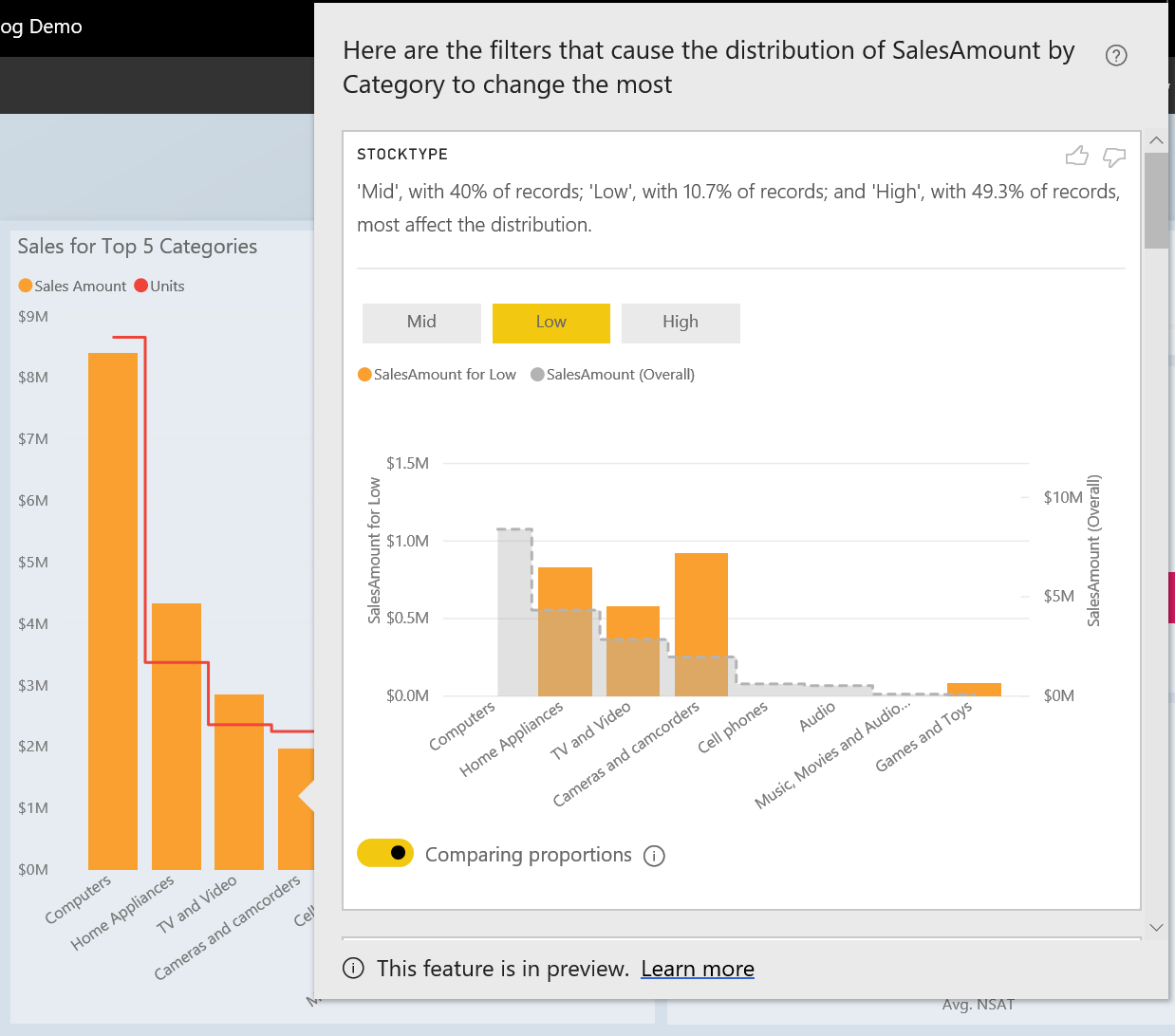
We have a new type of insight that you can find through our Insights feature, which finds different filters that create significant different distributions compared with the original graph. You’ll notice in the insights, we use the stepped line to represent the original chart and the bars of the combo chart to represent the new distribution.
You can switch between different categories of the filter using the slicer above the visual.
In addition, for additive measures, you can use the toggle below the chart to switch between viewing the graph as proportions, using a dual axis, or as absolute values, using a shared axis for both values.
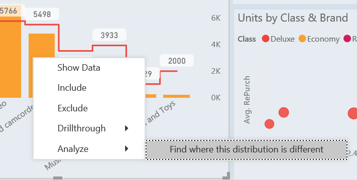
As with our other insights, you can find insights through the Analyze option after right-clicking on a data point. This option is called Find where this distribution is different.
Watch the following video to learn more about the distribution factor insight:
Custom visuals
Power BI certified category
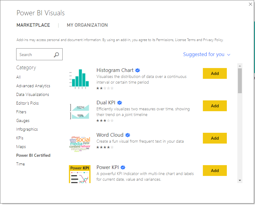
Certified custom visuals are visuals in the marketplace that meet code requirements and additional code-check by the Power BI team. To make it easier to find these certified custom visuals, we have updated the Power BI custom visual store to better tag and filter to certified visuals.
Once you open Power BI store, you’ll see the new category: “Power BI Certified”
Once you select a certified visual, you’ll see a message in the “Additional Information” section letting you know it’s certified.
Watch the following video to learn more about the certified visual category:
Disabling specific organizational visuals
In April, we announced that organizational visuals, which are a simple way to deploy and manage custom visuals, were generally available. Now Power BI administrators can disable specific organizational visuals. Once the administrator disables an organizational visual, it will immediately stop showing in existing reports and will display a message letting users know their admin disabled it. The admin’s change will take effect when users restart Power BI Desktop or refresh their browser when using the Power BI service.
Bookmarks that were saved with the disabled visual will still be valid.
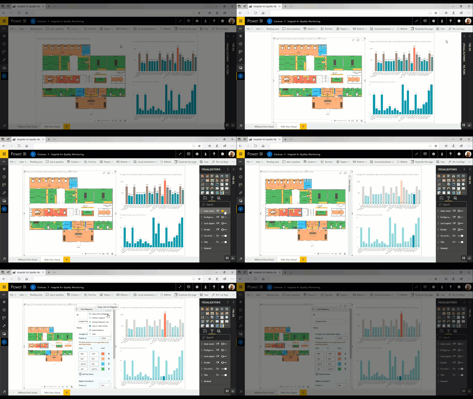
Visio custom visual generally available
The Visio custom visual lets you combine the power of Visio with Power BI, allowing you to illustrate and compare data as both diagrams and traditional Power BI visualizations in one place. This integration gives users the ability to combine business and operational intelligence in a single dashboard for unified data perspectives. The use cases for this are nearly endless, from building IoT-connected processes in manufacturing to visualizing store inventory in retail. We launched a public preview of this custom visual back in August and are excited to announce that it is generally available. This will mark the end of Public Preview. Learn more about the visual in the Visio’s team documentation.
Some updates to the Visio visual since the public preview launch include:
- Support for Power BI Mobile apps
- Change the embedded Visio diagram with another one
- Copy the link of the embedded Visio diagram
- Turn the auto-zoom settings on and off for cross-highlighting and cross-filtering
- Use a #layer to support complex diagrams and improve the performance of the Visio visual in your reports
Make sure to try out the Visio custom visual on AppSource and provide us any feedback you have by dropping us an email at tellvisio@microsoft.com
Watch the following video to learn more about the Visio custom visual:
Mapbox custom visual generally available
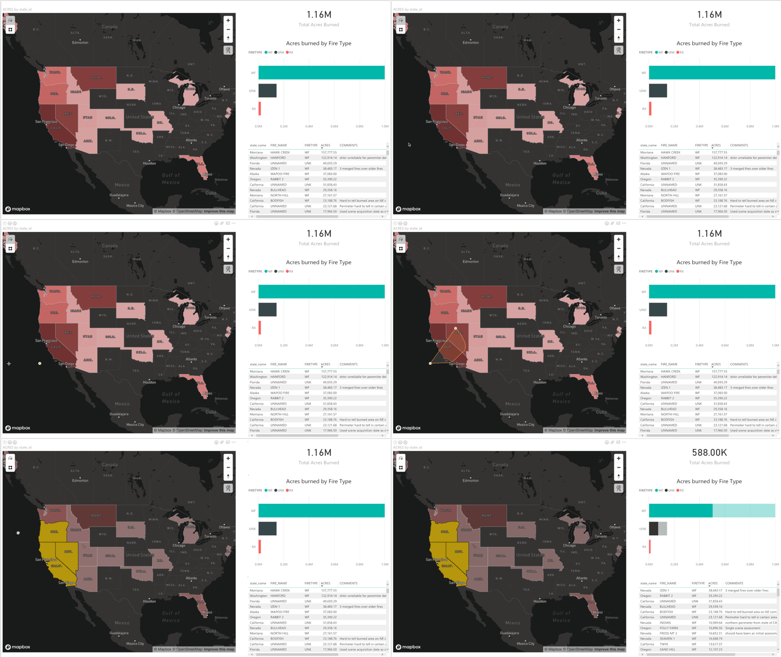
Mapbox provides powerful mapping and location tools for business intelligence. Their goal is to craft beautiful maps and developer-friendly location data, APIs, and SDKs so that you’re free to focus on designing, building, and developing your application. Back in March, they released a preview custom visual, so you could take advantage of their powerful mapping capabilities right in your Power BI reports. This month, they are extending their feature set and making the visual generally available for everyone to use.
Some of the new features included in this update are:
- Choropleth/Polygon maps – The visual has out of box support for Countries/Regions, US States, and US postal codes. You also can add custom polygons as well
- Cross-highlighting and filtering – In both the choropleth and circle layouts, you can use the Mapbox visual to filter or highlight other visuals on your page
- Support for Drilling – When using Choropleth maps, you can use Power BI’s drilling capabilities to move between levels of your hierarchy
- Lasso Select – You can use either a freeform lasso or a polygon selection mode to explore a subset of your data, and drive filters for other visuals on your report
- Support for IE11, Edge, and Safari
If you have suggestions for other features, you can let Mapbox know directly by creating an issue in their open source repo here. Check out the latest Mapbox visual on AppSource.
Watch the following video to learn more about the Mapbox custom visual or check out the webinar they did recently:
DataText Box custom visual
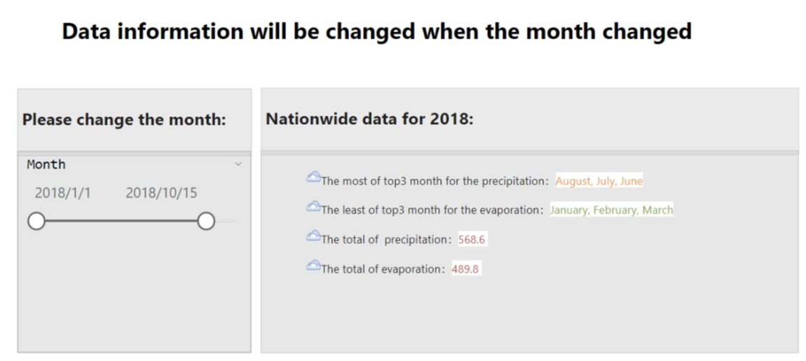
The DataText Box custom visual by Sharewinfo is a dynamic textbox that supports all kind of different configurations. With this custom visual, you can:
- Create dynamic content by combining static text with dynamic values from your data
- Customize the layout of your text to include tables, paragraphs, pictures, and videos
- Automatically wrap lines of text
Check out this custom visual on AppSource.
Watch the following video to learn more about the DataText Box custom visual:
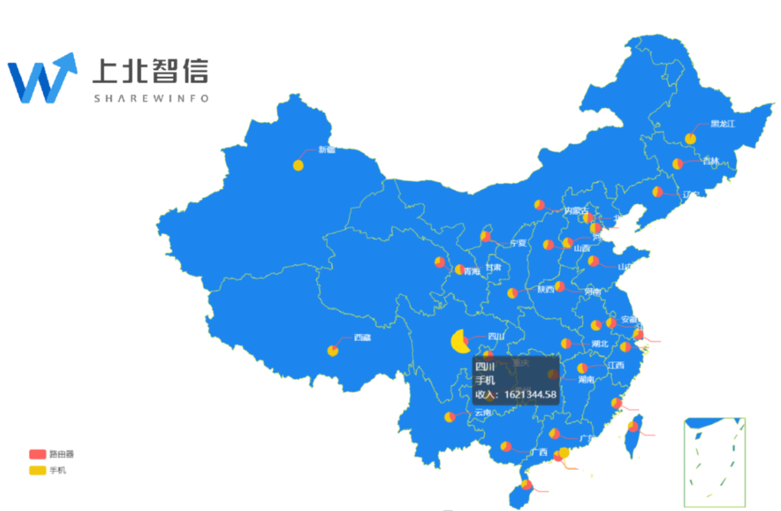
China Scatter Map
The China Scatter Map by Sharewinfo is a bubble map geared towards the Chinese market. With this map, you can display China location data with the size and color of the datapoint based off fields in your model. The map is very configurable and lets you switch to specific provincial maps.
Check out the China Scatter Map custom visual by Sharewinfo on AppSource.
Watch the following video to learn more about the China Scatter map custom visual:
Data connectivity
IBM DB2 DirectQuery Connector (preview)
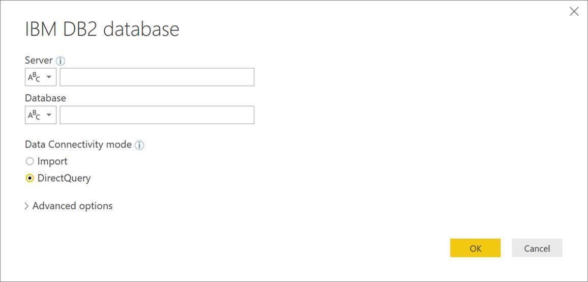
In this month’s release, we’re adding DirectQuery support to the IBM DB2 connector. This feature is currently available as a Preview feature, so you will need to enable it from the Options dialog first.
After enabling this preview feature, you’ll be able to find the DirectQuery option within the IBM DB2 connector dialog.
Improvements to Web By Example Connector
Two months ago, we introduced the new Web By Example connector, allowing any HTML data, not just tables, to be extracted. To do so, you can provide a few samples for the data that you want to extract, and Power Query will apply smart detection algorithms on top of the HTML page content to identify the entire set of rows to generate.
This month we are further enhancing this connector in multiple ways.
Support for importing multiple custom tables
It is now possible to enter the “Extract table using examples” dialog from the Navigator dialog multiple times, allowing you to create multiple custom tables in one pass and selecting one or more custom and out-of-the-box tables from the Navigator list.
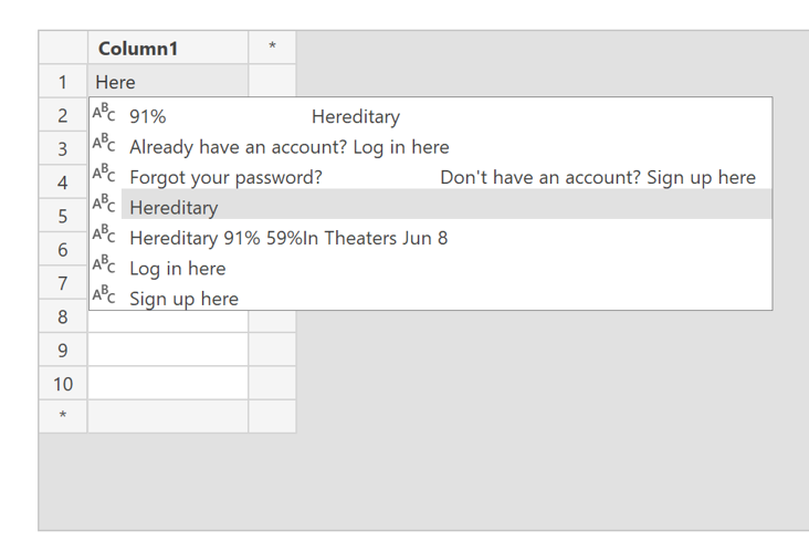
Automatic completions for specifying sample values
Similar to the “Add Column From Examples” experience, you now get automatic completions as you type sample values, making it easier for you to provide samples and discover what data values are recognized.
Exposure of attribute selectors in Html.Table function
Additionally, you can now import data from attribute selectors by using the Html.Table function.
SAP HANA – Default values in Variables experience
The SAP HANA Variables experience in the Navigator and Edit Variables dialog has been enhanced, by leveraging SAP HANA’s variable metadata regarding default values to auto-populate the variable input controls.
Coming soon
Every month, we walk you through all the new features for that month. However, we rarely talk about what’s in progress, outside of updating the status of ideas on UserVoice. We wanted to try something new this month and include a small section on a couple of features that, while not quite ready to release, we are working on and are excited to share as soon as we can.
This month, our first “coming soon” feature is related to the top idea currently on UserVoice, which is printing a report from Power BI Desktop. We started planning this feature a couple months back and based on that, are working on an export to PDF feature, which will let you export with one click all visible pages of your report to a PDF. From there, we’ll open the PDF in your default viewer and you can choose to save it somewhere or print it out to share with others. Expect to see this feature in a release very soon!
We also get a lot of questions around our plans and roadmap for theming. This month we had a major update in terms of functionality and are now very happy with our level of theming support across reporting features. Based on this, we are planning to make theming generally available very soon! And for those wondering, yes, that will be in time to make it into our next update of Power BI Desktop for Report Server. You should also not be worried if your feature request for theming has been completed yet. Just because we are making the feature generally available doesn’t mean we aren’t going to continue to improve and iterate on it!
That’s all for this month! We hope that you enjoy these updates and continue sending us your feedback. We’ll be back to your regularly scheduled programming next month. The next update for Power BI Desktop should be available the week of August 6th!
As always, please don’t forget to vote for other features that you’d like to see in the Power BI Desktop. You can also download the .pbix file I used, and if you’re looking for a similar design for your reports, I was using the Sunset layout from PowerBI.Tips.


