


Welcome to the November 2023 update. We’ve got a lot of great features this month including DAX Query view, Semantic Model Scale-out, and Advanced Filtering for Paginated Reports.
There is more to explore, please continue to read on.

Contents
- Reporting
- Modeling
- Data Connectivity
- Service
- Explore

- Copilot for Power BI in Microsoft Fabric
- OneLake integration for Import-mode semantic models
- RLS/OLS security and stored credentials for Direct Lake semantic models
- Sharable cloud connections for semantic models

- Semantic model scale-out
- Show visuals as tables
- Advanced Filtering for paginated reports
- Explore
- Visualizations
- Other
Reporting
Button slicer
In this update, we are beyond excited to finally show you Power BI’s latest innovation – the Button slicer, the ultimate tool for slicing data with ease and style! This is just the first step in a thrilling 5-stage journey that will revolutionize your data exploration experience, replacing the old tile slicer with a sleek, flexible alternative that lets you customize your insights and make data-driven decisions faster than ever! Brace yourself for the November upgrade, as it redefines customization and user-friendliness.

With so many upgrades and enhancements in the new Button slicer, we continue to go beyond the improvements you saw in the new card visual, and the following list of features will have you on the edge of your seat, so let’s have a look!
- Customize the shape and appearance of your design with more control to modify the corner radius.
- With an adjustable grid layout, you can now divide your design into rows and columns, and even use pixels to customize card spacing.
- When grid layouts have more buttons than rows and columns, use overflow styles, and choose Pagination or Continuous scrolling with vertical or horizontal direction – a big step forward in design flexibility!
- Just like the new card visual, the button slicer revolutionizes alignment and format properties, and the Label feature will spotlight crucial information from within your buttons.
- Image control allows you to infuse buttons with images creating endless possibilities with URL images.
- Interactive states make your designs more engaging with options including on hover, on press, and selected to engage users with responsive interactivity!
- Get ready for the new formatting settings that will open a world of versatility and a new era of data visualization!
- Single select has been updated with a Force Selection toggle, and a new Select All option!
- The new multi-select feature is a significant step forward in user convenience and efficiency!
- A new Tooltips experience awaits you as the new button slicer now supports both default and report page tooltips to enrich your data visualization skills.

With this preview update, the new Button Slicer feature has been toggled ON by default for your convenience and is found in either the Visual gallery on the ribbon, or by selecting Build a visual after right-clicking on the canvas, and then choosing the new slicer, or lastly, by selecting new slicer from the on-object dialog. You can also toggle this feature preview ON or OFF by looking under Options > Preview features > New button slicer.
What’s next?
Remember, this was only the first stage on the new slicer roadmap. So, fasten your seatbelt, and get ready for the exciting journey ahead as our next stage unfolds and reveals even more Power BI updates, enhancements, and features! Coming next, the List and dropdown slicer!
If you’re looking to learn more about the New button slicer, watch out for a dedicated blog post in the coming days. If you don’t want to miss it, make sure to subscribe to the Power BI blog or follow Power BI Visuals on LinkedIn.
Reference Labels
Just like the Button slicer update mentioned above in this month’s Feature Summary, we’re equally excited to share Power BI’s second exhilarating advancement – Reference labels, a versatile tool for adding custom labels to new cards, providing relevant information, comparisons, key metrics, benchmarks, goals, and more, in an appealing and concise manner! As the second step in our 5-stage new card visual journey, this November upgrade will keep you smiling from ear to ear!

With Reference labels offering an abundance of creative possibilities, you and your users will be astounded by the world of wonder they unlock. Here’s an overview of the available features!
- Not only can you Reference labels to your card visual, but you even add multiple data fields to your Reference labels.
- With three main components, Title, Value, and Detail, you can also choose Custom content using a different data field or measure and apply various styles to both Title and Value.
- Extra context is available for the Detail component, showing data from a single data field well, but also customizable with styles and colors.
- With an active Divider, Reference labels have their own area where you can modify the divider line and use color to differentiate callout and reference labels.
- Reference labels can have a horizontal or vertical layout and can have custom spacing and padding.

With this preview update, the new Reference Labels feature has been toggled ON by default for your convenience and is found in either the Visual gallery on the ribbon, or by selecting Build a visual after right-clicking on the canvas, and then choosing the new slicer, or lastly, by selecting new slicer from the on-object dialog. You can also toggle this feature preview ON or OFF by looking under Options > Preview features > Reference labels.
What’s next?
With the first and second stage of the new Card visual now delivered, you can imagine what exciting features are waiting for you as we continue this journey together.
If you’re looking to learn more about reference labels in the new card, watch out for a dedicated blog post in the coming days. If you don’t want to miss it, make sure to subscribe to the Power BI blog or follow Power BI Visuals on LinkedIn.
Enhance your Q&A visual with suggested synonyms from Copilot
The Q&A visual allows you to ask questions about your data and get answers in the form of visual. It provides any report viewer with an intuitive means to explore their data without requiring deeper knowledge of the model or report authoring.

Today, the Q&A visual doesn’t rely on generative AI to function. The Q&A engine processes your natural language input all inside Power BI algorithmically using a variety of linguistic principles, associating words and phrases you use with data in your model. This makes it good at answering precise questions about your data, but it may not be able to associate everything you input with data in the model. To help authors ensure that the Q&A visual provides consistent and accurate answers based on the unique language their report consumers actually use, we introduced Q&A setup tools with an emphasis on providing Q&A with synonyms for column and table names in the model. This way, authors can explicitly define different ways people might refer to their data, and users will always receive the correct answers when they ask similar questions in the future.

Power BI recognizes two types of synonyms: approved synonyms and suggestions. Approved synonyms either come directly from the names of fields themselves or are explicitly added by the author. When you uses an approved synonym in your Q&A input, it will be treated just as though you used the name of the field and the association will be presented with high confidence, signified by a solid blue underline.
Suggested terms are words Power BI thinks are likely to refer to their corresponding name. They come from a variety of sources – synonyms from the Office thesaurus show up by default, but you can also connect to your organization’s collection of approved terms and add those to your suggestions as well. Suggestions will still be used by Q&A, but with lower priority than approved synonyms, and the lower confidence will be signaled in the results with a dotted orange underline. In the Q&A setup menu, suggestions can be added to the approved synonyms list or removed entirely.

Managing synonyms is therefore an important part of improving the quality of the Q&A experience. However, coming up with synonyms for every data entity in your model can be mentally laborious and physically time-consuming. Copilot for Power BI streamlines this process by generating some for you!
If you have Copilot enabled, there are a few ways for you to get suggestions from Copilot. But first, you’ll have to enable the feature in Power BI Desktop in File > Options > Preview features > Improve Q&A with Copilot.
Then, you might be prompted to add synonyms with Copilot via a banner that shows up the first time you make a Q&A visual or open the Q&A setup menu:

You’ll also be able to get Copilot suggested synonyms via the Q&A setup menu. You can turn on Copilot as a source in the suggestion settings menu in the synonyms tab, then hit apply to get synonyms. Or, if Copilot is already enabled as a source, you can click the refresh button next to the suggestion settings dropdown.

After you’ve gotten these suggestions, you might be prompted to review them. You’ll find the new synonyms in the suggestions column in the synonyms page of the Q&A setup menu:

Copilot-suggested synonyms will function just like any other suggested synonyms. This means that they may be used by Q&A as a fallback when trying to determine what data fields a natural language input may refer to. Carefully review them in the suggestions column of the Q&A visual, remove the synonyms which are inaccurate, and approve the ones which best fit the data.
Keep in mind that as we scale out Copilot, you might run into throttling, which may cause Copilot to return incomplete results if you send too many requests in a short period of time. If that happens, you can wait a bit and try again. Copilot may also not return results for terms for which it cannot generate synonyms, or when its results are deemed inappropriate by our content filter.
Like we mentioned in our release of linguistic relationships for Q&A, we see our investment into both Copilot and the Q&A visual as mutually beneficial. There will be more features coming soon, so keep an eye out for the new ways in which we’re bringing the two together!
On-object Interaction Updates
“Always open in new pane” setting:
Most requested, this month we are bringing you the ability to configure your pane switcher to stack panes instead of swap. If you preferred the behavior from before where panes opened side-by-side by default, you can now configure this setting by checking the new option for “always open in new pane” from either the Options menu or the View ribbon.
To achieve the stacked behavior of panes as before:

Turn on the new option within the Options menu:

Or, select the new option from the View ribbon:

Resizing the data flyout:
Also highly requested, this month we’ve also added the ability to resize the data flyout (second flyout) from the build button when working with long field names.

Note we have a known bug: there may be cases where the resize handles appears to the left of the data flyout if there is not enough space to expand on the right side. We’re working on a fix! As a workaround in these cases, you can move the visual to left temporarily on the canvas to resize the data flyout.
Table’s add button is back!
Table has the add button again! Originally, we had to remove the add button from the Table visual type as currently the only chart element to add from this menu was the title that does not have a default value. This added confusion to the experience because simply turning on the title did not appear to have changed anything in the visual, and users had to go to the format pane to type in their visual title. Last month we shipped placeholder text which allowed us to bring back the add button for Tables. Now, when turning on title, a placeholder will appear to type directly onto the visual.

New on-object default setup coming soon!
Each month we’ve been working toward giving users more flexibility for how they prefer to work with the PBI editor. With this month’s addition of the new “always open in new pane” setting, next month we’ll be able to introduce a new default setup that feels closer to the previous classic look. With this new default, we help you preset the following options with just 1 click!
- Move the “build a visual” menu to the pane switcher by default
- Show both build and data panes expanded by default
- Format pane in the pane switcher by default
- “Always open in new pane” set to ON, thereby stacking panes by default
- Collapse panes to the pane switcher instead of close “X” by default
Azure Maps visual now aggregates multiple data points at the same location
Previously, when you had multiple data points with the same latitude and longitude field values, those points would be plotted separately, leaving them drawn one over the other at the same location. This could lead to some unclear data visualizations. For example, grouping the points by category using a legend field might leave just one category visible per location due to the overlap. This behavior was also different from visualizing those points using location names, which would aggregate the points together.

With this release, Azure Maps now aggregates points with the same latitude and longitude values in the same way that it does with location names, allowing you to see them as one bubble. These aggregated points can then be filtered or grouped as you would normally.

Narrative visual with Copilot
We’re excited to bring Copilot’s unique ability to summarize data to the rebranded Narrative with Copilot visual – formerly Smart Narratives. This visual allows you to use Copilot to summarize data across your report, or even specific pages or visuals you choose. We offer suggested prompts to get authors started, such as “Give me an executive summary,” “Answer likely questions from leadership,” and “created a bulleted list of insights.” Users can also type in their own custom prompts and questions that return summaries about their data.


Users have the ability to choose whether they want to summarize over the entire report, select pages, or even specific visuals across their report, giving them flexibility in what their summary looks like. Users will also see references for each portion of the summary that align to visuals on the various pages on the report, from which the summary lines were generated, making it easy to validate the summary’s accuracy and tie it back to the data.
The summary can be updated as the data is sliced and diced, so end users can interact with it, without editing the prompts themselves.
The narrative visual with Copilot makes it faster to communicate insights about the data that matters to you. The visual is available in the service and in Power BI Desktop.

Modeling
Datasets renamed to semantic models
We’re excited to share that datasets are being renamed to semantic models in Power BI and Fabric. This is necessary for disambiguation from other Fabric items and will make the product clearer and more usable. You will see this change in the most prominent UI elements in the product, and the documentation is being updated. APIs are not currently affected, and we will progressively roll out further changes. The timing of this change is driven by the upcoming general availability of Fabric and aligns with the rename for ML models. It reflects the immense progress that Power BI datasets have made in becoming an enterprise-grade semantic modeling technology. The semantic model name will help drive awareness of the unparalleled capabilities provided.

DAX query view to write and run DAX queries on your model
Quickly explore and analyze your semantic model with DAX queries. The DAX query view is a fourth view in Power BI Desktop which allows you utilize the powerful DAX query language using EVALUATE to discover, analyze, and see the data in your semantic model. Similar to the Explore feature above for the Power BI service, model authors can quickly validate data and measures in their semantic model without having to build a visual, publishing, or using an additional tool. Changes made to measures can be updated back to the semantic model. DAX queries are different from DAX expressions used to create model items such as measures, calculated columns, and calculated tables, and are more like SQL queries returning data in a table.
This powerful way to interact with your data model is now available in the new DAX query view. We give you several ways to be as productive as possible.
- Quick queries can generate DAX queries for you in the Data pane context menu of tables, columns, or measures gives you a head start by generating a DAX query to preview data or show summary statistics. Use DAX queries to help you understand the data without creating visuals and for DirectQuery you no longer must go back to Power Query to see some sample data.
- Quick queries to get the DAX expression of all, some, or a specific measure in a generated DAX query. It provides the DEFINE block with the measure’s DAX expression and an EVALUATE block to see the measure’s output. You can then add to the Dax query with any additional group by columns.
- Update the model options will be available to you with any DAX query updates to measures in DAX query’s DEFINE block.
- Measures that reference other measures can now be seen on the same screen and updated together. Preview the output of your changes then also update the model when ready.
- Report view’s Performance Analyzer already lets you copy the visual DAX query. Now you no longer need to take that DAX query and use another tool to view and run it – simply run it in DAX query view.
- All these features in a bigger DAX query editor similar to VS Code, including more keyboard shortcuts and the ability to improve readability by formatting any DAX query.
We plan to continue to add functionality to the DAX query view, so your feedback will be critical. We have previously shown a vision demo with a DAX query view copilot, and saw the excitement for this copilot, and it will be coming soon. We also have planned investments in bringing DAX query view to live connect reports and to the Power BI service, as well as building on it to give more insight into debugging and performance of DAX. Learn more about DAX queries at aka.ms/dax-queries and get started today by turning on this public preview feature in Options > Preview features.

Edit your data model in the Power BI Service – Updates
The new data model editing in the Service feature was released to preview in April. We’ve been busy reacting to your feedback and enhancing the experience. Below are the improvements coming this month:
Mark as date table
Within the Service, you can now mark a table in your data model as a date table. Marking a date table in your model allows you to use this table for various date-related elements including visuals, tables, quick measures, and more, with full Time Intelligence support. To set a date table in the Service, right-click on the desired table and choose ‘Mark as date table > Mark as date table’ in the menu that appears.

Next, specify the date column by selecting it from the dropdown menu within the ‘Mark as date table’ dialog. Power BI will then perform validations on the selected column and its data to ensure it adheres to the ‘date’ data type and contains only unique values.

Rename and delete tables and columns
Within the Service the following functionality is now supported:
- Renaming and deleting any table
- Renaming and deleting any column
Please continue to submit your feedback directly in the comments of this blog post or in our feedback forum.
Data Connectivity
Azure Resource Graph (New Connector)
We are excited to announce the release of the new Azure Resource Graph connector! Please find below release notes from the Azure Resource Graph team.
Empower your data insights with our cutting-edge Power BI data connector for Azure Resource Graph! Now, seamlessly transform your Azure Resource Graph queries into stunning visualizations within Power BI. Elevate your analytics game and make data-driven decisions with ease. Unlock the synergy of Azure Resource Graph and Power BI today!
Profisee (Connector Update)
The Profisee connector has been updated. Below are update release notes from the Profisee team.
Profisee’s Power BI Connector Version 3.0 exposes new information around data quality, enhancing analytics on data quality improvements for data managed in Profisee with detailed information regarding validation issues flagged within their data. Additionally, the data types have been refined streamlining the experience for users using the Profisee Connector to load data from Profisee to Microsoft Fabric using Data Factory Gen 2 Data Flows.
Bloomberg Enterprise Data and Analytics (Connector Update)
The Bloomberg Enterprise Data and Analytics connector has been updated. Below are update release notes from the Bloomberg team.
This version of the Bloomberg Data and Analytics connector for Power BI includes changes to support underlying infrastructure updates and back-end performance enhancements. All user-facing features remain unchanged.
Dremio (Connector Update)
The Dremio connectors have been updated to support additional optional values and parameters.
Celonis (Connector Update)
The Celonis EMS connector has been updated with minor changes.
Service
Explore
Within Power BI, many times users need to perform ad-hoc exploration of their data. This could be an analyst who just got access to a new dataset or data source and wants to spend time learning about the data before building a report off it. Or this could be a business user who needs to answer a specific question using the data to include in a PowerPoint presentation, but the report they’re using doesn’t answer the exact question they have. Creating a new report from scratch in these cases is a large hurdle, just to get a quick answer or screenshot for a deck.
Introducing the public preview of the new Explore feature, where users have a lightweight and focused experience to explore their data. Similar to exporting and building a PivotTable in Excel, now, directly within Power BI users can quickly launch Explore to begin creating a matrix/visual pair to get the answers they need without all the distractions and extra complexity of reports.
Simply find a dataset or report you’d like to explore:

Begin building your matrix/visual pair to get to the answers you need:

And, if you’d like to return to your work save it as an exploration:

Find more details in the Introducing Explore (Public Preview) blog post coming soon.
Copilot for Power BI in Microsoft Fabric Public Preview
We are thrilled to announce the public preview of Copilot in Microsoft Fabric, including the experience for Power BI which helps users quickly get started by helping them create reports in the Power BI web experience. We’ve also added the Copilot’s unique ability to summarize data to the Smart Narrative visual, now rebranded as the Narrative with Copilot visual. The visual is available in the Power BI service and in Power BI Desktop. Lastly in Desktop, we’ve added the ability to generate synonyms synonyms for their fields, measures, and tables using Copilot. To use Copilot you’ll need access to a workspace that has a P1 or higher or a F64 or higher capacity.

Head over to our Ignite blog Empower Power BI Users with Microsoft Fabric and Copilot to read all the announcements related to Copilot. We’ll share more details in a dedicated blog next week.
Check out the Copilot for Power BI Docs for complete instructions and requirements and don’t hesitate to leave a comment in the Fabric Community site if you have any questions.
OneLake integration for Import-mode semantic models
We are absolutely thrilled to introduce yet another groundbreaking semantic model technology to the world! We are announcing the public preview of Microsoft OneLake integration for import models. With the click of a mouse button, you can enable OneLake integration and automatically write data imported into your semantic models to delta tables in OneLake, as depicted in the following diagram. The data is instantaneously and concurrently accessible through these delta tables. Data scientists, DBAs, app developers, data engineers, citizen developers and any other type of data consumer can now get seamless access to the same data that drives your business intelligence and financial reports. You can include these delta tables in your Lakehouses and Synapse Data Warehouses via shortcuts so that your users can use T-SQL, Python, Scala, PySpark, Spark SQL, R, and no-code/low-code solutions to query the data.

OneLake integration can even help you if you don’t plan to query the data. Perhaps you only want to export the data to backup files. Thanks to OneLake integration, this is very straightforward now. Ensure that your import-mode semantic model is hosted in a workspace on a Premium or Fabric capacity and that the large dataset storage format is enabled. Then, enable OneLake integration and perform a manual or scheduled data refresh operation. That’s it! The semantic model writes the imported data to the delta tables as part of the refresh operation. Exporting import-mode tables has never been easier. The delta tables are kept up to date without requiring any ETL pipelines copying data.
Of course, you can also export the data programmatically via Tabular Object Model (TOM) and Tabular Model Scripting Language (TMSL) if you can access your semantic model through XMLA in read-write mode. For example, you can open SQL Server Management Studio (SSMS) and run the following TMSL command (see also the screenshot below):
{
  "export": {
    "layout": "delta",
    "type": "full",
    "objects": [
      {
        "database": "<Name of your database>"
      }
    ]
  }
}
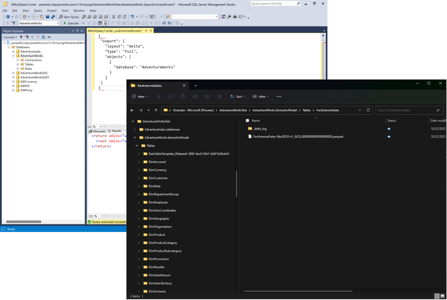
If you have installed the latest version of OneLake File Explorer, you can conveniently verify the success of the export process by using Windows File Explorer. In OneLake File Explorer, right click on the workspace folder and select Sync from OneLake. Then, in the workspace folder, look for a subfolder with a name that matches your semantic model and that ends with .SemanticModel, as in the screenshot above. In this semantic model folder, every import-mode table has a subfolder that contains the delta table’s parquet files and delta log.
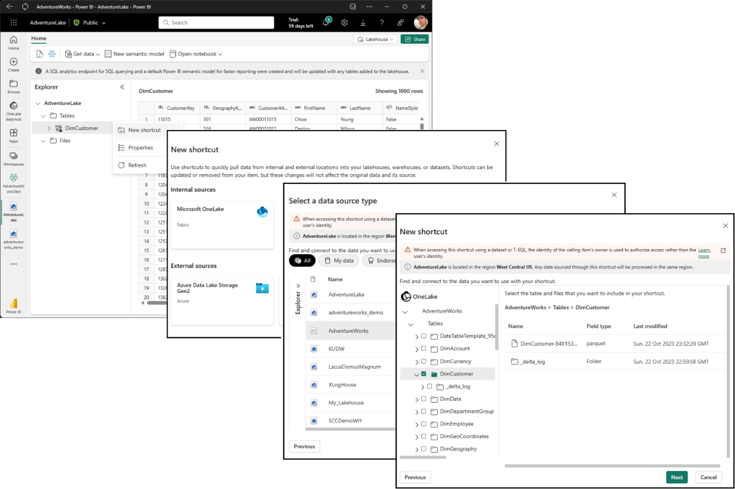
But you don’t need to know these file system details if you add shortcuts for your semantic model’s delta tables to other workloads in Fabric, such as lakehouses etc. Simply launch the Shortcut Wizard UI, pick Microsoft OneLake, select the semantic model, and then pick the tables you want to include, as in the screenshots below, and that’s it. You are ready to read and query the tables using your favorite data tools and APIs.
And there you have it! Now you can use Direct Lake mode to read delta tables directly from OneLake and write delta tables thanks to OneLake integration. Fabric is redefining how customers can build their BI solutions for faster performance at big-data scale while at the same time reducing Total Cost of Ownership (TCO) and infrastructure complexity. For example, you no longer need an entire portfolio of homegrown ETL solutions to get data volumes of any size in and out of semantic models. So, don’t delay and see for yourself how OneLake integration can help you maximize the return of your investments into semantic models by making the data instantaneously and concurrently accessible to data scientists, DBAs, app developers, data engineers, citizen developers and any other type of data consumer you may have in our organizations through delta tables added to your Lakehouses and Synapse Data Warehouses via shortcuts. And as always, provide us with feedback if you want to help deliver additional enhancements. We hope you are as excited about OneLake integration as we are. We think this is a massive innovation and are looking forward to hearing from you!
RLS/OLS security and stored credentials for Direct Lake semantic models
We are thrilled to announce the public preview of RLS/OLS security and stored credentials for Direct Lake semantic models. RLS/OLS security is a Power BI feature that enables you to define row-level and object-level access rules in a semantic model, so that different users can see different subsets of the data based on their roles and permissions. Stored credentials help reduce configuration complexity and are strongly recommended when using RLS/OLS with Direct Lake semantic models. The following screenshot shows how you can add users to RLS roles in a Direct Lake model by using the Web modeling experience. The web modeling security roles dialog will be fully deployed in the coming days or weeks. For more information about how to set up stored credentials, see the Direct Lake product documentation. For RLS and OLS, see the articles Row-level security (RLS) with Power BI and Object level security (OLS).

There is (almost) nothing special for RLS/OLS in Direct Lake models. You can define roles and assign users as for any other semantic model type. But keep in mind that by default Direct Lake models use single sign-on (SSO) authentication to the underlying data source. Using RLS/OLS in conjunction with SSO can be challenging because it involves multiple authorization layers—RLS/OLS in the semantic model and user authorization at the data source. For example, if you wanted to authorize a new user, you would have to add that new user to appropriate RLS roles and ensure that the user has access permissions to the underlying delta tables in the lakehouse or data warehouse.
Managing user authorization at multiple layers adds complexity and friction. That’s why we are excited to introduce support for stored credentials with Direct Lake semantic models. Your semantic models can now access the delta tables at the source with a single, fixed identity on behalf of the users instead of delegating the actual user identities via SSO. When adding new users to an RLS role, you are effectively authorizing them to use the fixed identity. Because this approach avoids SSO-related complexity and friction, we strongly recommend that you switch to a fixed identity whenever you add RLS/OLS to a Direct Lake model. Switching to a fixed identity is as easy as binding the Direct Lake model to a Shareable Cloud Connection (SCC) that has SSO disabled. For more information, see Connect to cloud data sources in the Power BI service in the product documentation.
Here are the steps to configure a Direct Lake model with a fixed identity:
- Display the settings of the Direct Lake model and expand the Gateway and cloud connections section. Note that your Direct Lake model has a SQL Server data source pointing to a lakehouse or data warehouse in Fabric.
- Under Maps to, open the listbox, and click on Create a connection. This will pull you to the connections management page with the new connection form opened and prepopulated with the data source information.
- Select OAuth 2.0 or Service Principal as the authentication method and provide the credentials of the fixed identity you want to use.
- Make sure you disable to checkbox labeled Use SSO via Azure AD for DirectQuery queries, as in the following screenshot.
- Configure any other parameters as needed and then click Create. This pulls you back to the Direct Lake model settings page. Verify that the data source is now associated with the non-SSO cloud connection.

The ability to set up stored credentials is available today! The RLS editor for Direct Lake datasets in the web modeling experience is being deployed and will be visible in the coming days or weeks.
And that’s it for this announcement of RLS/OLS with fixed identities for Direct Lake semantic models. For more information see the articles about Direct Lake semantic models in the product documentation. We hope that these exciting new capabilities enable you to create and migrate even more Power BI semantic models to Direct Lake mode so that you can take full advantage of all the data movement, data science, real-time analytics, and Office integration, and AI, and BI capabilities that Fabric and Power BI have to offer. And please provide us with feedback if you want to help shape the future on world’s best and most successful BI service – Power BI on the unified Fabric platform! We always love to hear from you!
Learn about Direct Lake in Power BI and Microsoft Fabric – Power BI | Microsoft Learn
Sharable cloud connections for semantic models
Along with the general availability (GA) of shareable cloud connections (SCC), we are happy to announce that SCC support for semantic models and paginated reports is GA as well. Now, you can use this modern connection type in conjunction with your production semantic models and paginated reports to access cloud data sources and centralize cloud connection management. In enterprise organizations, centralizing cloud connection management in addition to data gateway management can help to lower the overhead of maintaining data connections and credentials. SCCs let you securely share access to cloud data sources through an access-control list. The credentials are protected and cannot be retrieved from the SCCs, but Power BI users with at least Use permissions can connect their semantic models and paginated reports to the cloud data sources through these SCCs. You can also create multiple connections to the same data source, which is particularly useful if you want to use different connection settings, such as different credentials, privacy settings, or single-sign-on settings, for different semantic models, paginated reports, and other artifacts.
Semantic model scale-out
We are thrilled to announce semantic model scale-out is now generally available (GA). Large-scale production solutions will benefit from high user concurrency, as Power BI automatically scales out read-only replicas to ensure performance doesn’t slow down when lots of users are using the system at the same time. And of course, automatic scale out works for Direct Lake semantic models! Additionally, Import-mode semantic models will benefit from refresh isolation, ensuring business users are unaffected by resource-intensive refresh operations, and continue to enjoy enable blazing-fast queries for interactive analysis.
Here’s a quick summary of the benefits semantic model scale-out can provide to your reports, dashboards, and other BI solutions:
- Increased query throughput Power BI can automatically scale read-only replicas when query volume increases and fluctuates.
- Refresh isolation Refresh and write operations on the read-write replica do not impact the query performance on read-only replicas.
- More flexibility for advanced data refresh scenarios As a side-benefit of refresh isolation, you can now perform advanced refresh operations on the read-write replica without impacting the read-only replicas. Simply disable automatic replica synchronization, then refresh, refresh, refresh until the read-write replica is fully updated, and then synchronize the read-replicas manually.
Semantic-model scale-out is the last of the key features to make Microsoft Fabric and Power BI a superset of Azure Analysis Services (AAS) and is superior in Fabric compared to its equivalent in AAS. Unlike AAS, scale out takes place based on live user demand, and adjusts automatically to changes in usage patterns. AAS, on the other hand, requires detailed analysis to determine peak usage times, creation of automation scripts, and ongoing monitoring to ensure optimum set up. Additionally, cost in AAS increases linearly per replica, unlike Fabric that is usage based.
Please refer to the Configure dataset scale-out article in the product documentation for details on how to enable semantic model scale-out.
Show visuals as tables
Leveraging our previous accessibility improvements to table and matrix, we are now introducing a new view mode called Show visuals as tables which displays report visuals in a tabular format with a single action. Some users may prefer to consume data in a text-based or tabular format depending on their different learning styles and usage of assistive technologies. This provides a supplemental format for visuals that allows users to display the data in the way that best meets their needs.
This new view mode is similar to how Show as a table displays underlying data for individual visuals today. Show visuals as tables will display the underlying data for visuals for all pages in the current report, with the added functionality of interaction and cross-filtering capabilities.
To activate this view mode, navigate to the view dropdown menu and select Show visuals as tables.

To revert, select Show original visuals.

Or simply use the keyboard shortcut Control + Shift + F11 to toggle between the two views.
Learn more details about this feature, including limitations, in our documentation: Consuming reports in Power BI with accessibility tools
Advanced Filtering for paginated reports
You can now use “Advanced Filtering” while authoring paginated reports on the service. This allows you to define conditions such as contains or does not contain, is not equal or is equal, a specific value. You can learn more about creating paginated reports with filters on the service here.
Visualizations
Editor’s pick of the quarter
- Performance Flow – xViz
- Galigeo For Power BI
- Calendar by Datanau
- Image Pro by CloudScope
- Sparkline by OKViz
New visuals in AppSource
Zebra BI Tables 6.6: Introducing text columns
With Zebra BI Tables 6.6, you can add multiple text columns inside the table. Using this feature, you can bridge the gap in data visualization by having relevant information side by side in the world’s best table/matrix custom visual for Power BI.
Watch the video of the new functionality!

With this feature, you can now display multiple text columns in a tabular way, which leads to a better understanding of the data when displaying more attributes of the same Category. Additionally, there is no need to apply any complex DAX functions. Simply add additional text columns into the ‘Values’ placeholder.
SOME POPULAR USE CASES:
In one-to-one mapping, you usually need to add additional information next to the descriptive column to ensure data accuracy, consistency, and ease of reference.
- Product ID: Product name
- Product ID: SKU: Shipping/Order ID
- Job ID: Job title
The new feature also works in cases with one-to-many mapping. For example,
- Customer: Sales representatives because the same person can represent multiple customers.
You can also add multiple text columns when presenting data in a hierarchical table or using cross-tables for quarterly performance.
Try it on your data today for free.

Funnel Chart by Powerviz
The Funnel Chart by Powerviz is a stunning and informative visualization. It has 4 chart types in 1 visual, including a pyramid chart. The Power BI-certified visual is useful for tracking progress through different stages. It can also group data with legends for detailed insights.
Key Features:
- Funnel Settings: Multiple display types are available, including vertical and horizontal orientation.
- Data Colors: Offers 7 schemes and 30+ color palettes.
- Labels: Select from multiple display styles with a custom label option included.
- Conversion Rate: In a single click measure the percentage of top and bottom stages to identify bottlenecks.
- Fill Patterns: Highlight stages with custom or pre-filled patterns.
- Conditional Formatting – Create rules based on measure or category rules.
Many other features included are ranking, annotation, grid view, show condition, and accessibility support.
Business Use Cases:
- Sales Funnel Analysis: Track sales stages.
- Marketing Campaigns: Assess lead generation and conversion rates.
- User Onboarding: Monitor steps to product adoption.
- Website Traffic: Visualize visitor drop-offs.
Try Funnel Chart for FREE from AppSource.
Check out the visual features in the demo file.
Step by Step instructions and documentation.
To learn more, visit the Powerviz website.
Funnel Chart by Powerviz Feature Video on YouTube.


Create interactive timelines with full control
Drill Down Timeline PRO lets you easily create timelines with a date/time hierarchy. Click directly on the chart to drill down to examine specific periods in detail. Combine multiple series and choose between multiple chart types (line, column, area). Learn more.
Main features include:
- On-chart interactions – click on chart to drill down to months, days, hours, or milliseconds
- Customize up to 25 series
- DAX measure support
- Take customization to the next level with conditional formatting
- Use series defaults and value labels defaults to customize multiple series
- Static and dynamic thresholds – set up to 4 thresholds to demonstrate targets
- Full customization – colors, gradients, backgrounds, fonts, and more
- Touch device friendly – explore data on any device
Popular use cases:
- Banking & Finance – stock exchange indices, capital ratios, transaction volumes
- Sales & Marketing – web traffic, audience reach, sales revenue
- Information Technologies – network traffic, response times, syslog and error trends
- Manufacturing – quality metrics, uptime and downtime, production output and cost
Get Drill Down Timeline PRO from AppSource!
ZoomCharts Drill Down Visuals are known for their interactive drilldowns, smooth animations, rich customization options and support: interactions, selections, custom and native tooltips, filtering, bookmarks, and context menu.

Other
Enhanced accessibility in paginated reports authored in Report Builder
The StructureTypeOverwrite property has been added to the .rdl model. You can use it to improve accessibility for paginated reports in Microsoft Report Builder and Power BI Report Builder. You can then publish these reports to the PBI service. Read more about improving accessibility of paginated report.
Skill up on Fabric with the Microsoft Learn Cloud Skills Challenge
We are excited to announce the Microsoft Ignite: Microsoft Fabric Challenge as part of the Microsoft Learn Cloud Skills Challenge. Skill up for in-demand tech scenarios and enter to win a VIP pass to the next Microsoft Ignite. The challenge is on until January 15, 2024.
In this challenge, you will learn how to connect to data, ingest it with Data Factory and notebooks, store it in the lakehouse or data warehouse, and create Power BI reports to turn your data into competitive advantage.
The challenge will help you prepare for the Microsoft Certified: Fabric Analytics Engineer Associate certification and new Microsoft Applied Skills credentials covering the lakehouse and data warehouse scenarios, which are coming in the next months.
Dynamic dataset binding for paginated reports
Use dynamic binding to maintain a single template of an RDL report that can be connected to multiple datasets across workspaces, instead of copying and maintaining hundreds of report duplicates. You don’t need to create copies of the same report with a different dataset. You can bind datasets dynamically to a paginated report as outlined in the “Bind datasets dynamically to a paginated report” documentation.
You can also bind datasets dynamically to a paginated report visual as outlined in the “Bind datasets dynamically to a paginated report visual” documentation.
That is all for this month! Please continue sending us your feedback and do not forget to vote for other features that you would like to see in Power BI! We hope that you enjoy the update! If you installed Power BI Desktop from the Microsoft Store, please leave us a review.
Also, don’t forget to vote on your favorite feature this month on our community website.
As always, keep voting on Ideas to help us determine what to build next. We are looking forward to hearing from you!