Balanced Scorecards in Power BI
By Greg Koehler, Program Manager at Microsoft
“IMAGINE ENTERING THE COCKPIT of a modern jet airplane and seeing only a single instrument there.”
― Robert S. Kaplan, The Balanced Scorecard: Translating Strategy into Action
As a business intelligence (BI) professional at Microsoft, I’m often asked how to measure success for a given product, service, team, or organization. My usual answer is there’s not just one gauge. True success is broader and more holistic than a single metric can adequately represent. While I believe that everything can be measured, I advocate that only certain, key measurements be used to most effectively drive alignment across large organizations. This helps guide thousands of employees to focus on centralized strategy and goals over both the short-term and long-term.
“The Balanced Scorecard,” by Robert Kaplan and David Norton, was published by Harvard Business School Press in 1996. The book recommends a management approach based on key performance indicators (KPIs) tracking of strategic progress toward central goals across four perspectives, including financial measures, customer knowledge, internal processes, and learning/growth. Not long after publication, the management practices advocated by Norton/Kaplan began to be adopted by large businesses, including many Fortune 500 firms. According to past surveys from consultants including Gartner, Bain and a recent survey from 2GC, most large businesses today use a balanced scorecard approach. Today, we still see business information firms, such as the Wall Street Journal (WSJ) and the Drucker Institute, apply similar methodology when evaluating the performance of top companies (see the WSJ’s latest “Management Top 250”). My team at Microsoft, called CDnA for Customer Data and Analytics, is no exception. We measure a variety of key metrics, both financial and non-financial, including customer usage and satisfaction of Microsoft products and services.
While the Kaplan/Norton books (including sequels) may help enterprises and their MBA employees with the conceptual framework for translating strategy into a plan of action, the information technology is left up to each business to figure out. If you’ve been working for a while in business intelligence and analytics, you probably already know about some of the many challenges of implementing a measurement system that supports entirely different types of KPIs. Typically, financials are kept in completely different backend systems than customer usage data, which, if available, is still quite different from operational telemetry or sentiments expressed from internal employee surveys. The backend challenges are often addressed with a combination of aggregation layers and/or a middle tier to normalize metadata (such as for compliance standard geography and time dimensions).
After the backend data is aligned, an equally daunting challenge is the front end – the production and presentation of the scorecard. For years, and of course being at Microsoft, many people throughout the company naturally turned to Microsoft Excel and elaborate data-driven spreadsheets to provide such views. The flexibility and power of Excel was, and is still, difficult to beat. Along with the convenience of Excel were some inconveniences: with offline, disconnected spreadsheets being e-mailed around, data was often stale and multiple files often caused confusion as to the true version. Also, one could only drill so far into a single spreadsheet before running into the storage limits of Excel, especially when working outside the corporate network.
More recently, and especially with the rapid adoption of Power BI dashboards and reports by so many teams within Microsoft, my own team started to use Power BI visuals connected to on-premises SQL Analysis Services tabular models via the Power BI On-Premise Gateway to present balanced scorecard views for executive reporting and strategic management. We started by working with the Power BI team to develop a custom visual, called Power KPI, which we decided to make available to the public for free in the AppSource store. Power KPI presents detailed historical trend data and target comparisons for a single KPI.
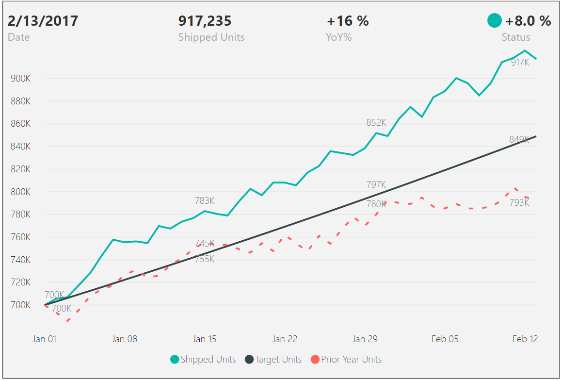
(above, the Power KPI custom visual)
The visuals may also be sized in a compact style, which makes it great for showcasing multiple KPIs on the same dashboard or report.
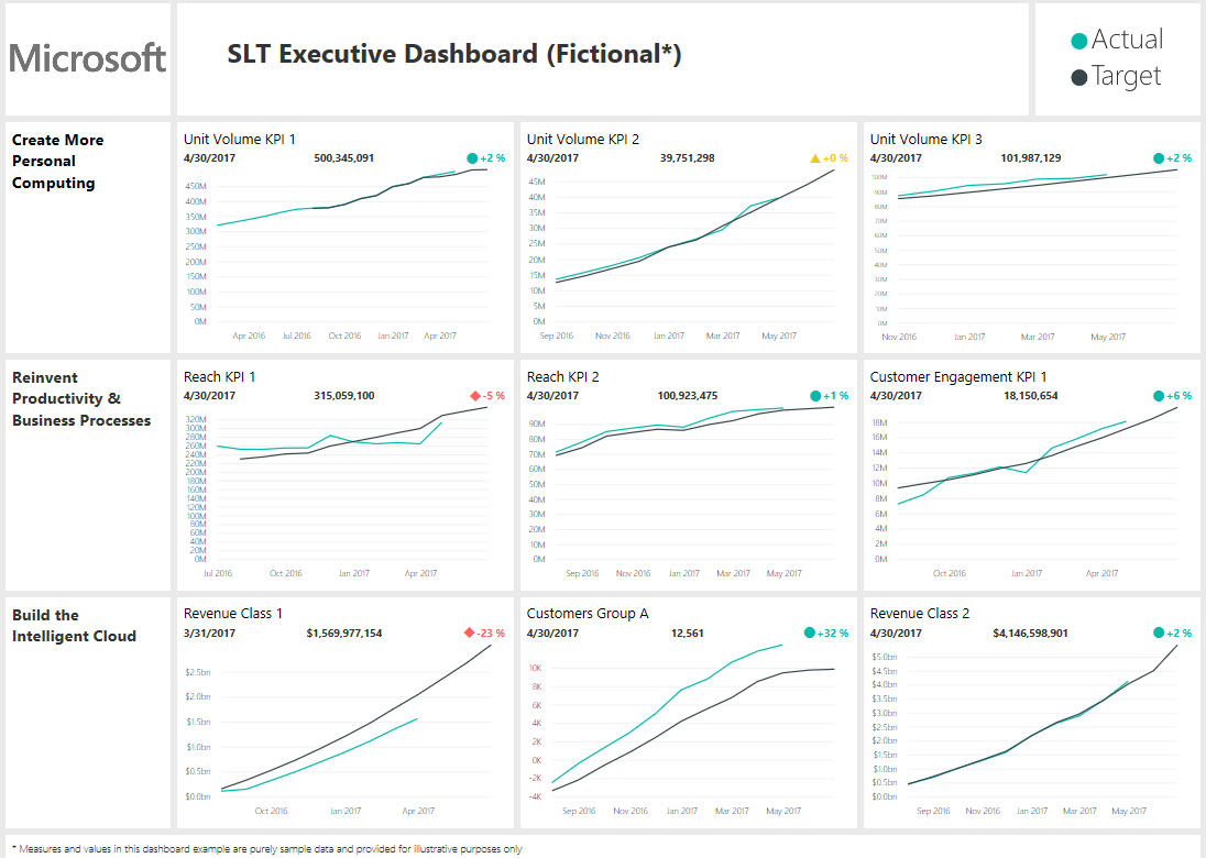
(above, multiple Power KPI custom visuals are pinned to a Power BI dashboard)
On the backend, we source multiple Analysis Services tabular models via the Power BI on-premises data gateway and link to a single dashboard by pinning visuals in the Power BI Service. End users access the latest KPIs by using a web browser or the Power BI app on any device, from anywhere with an internet connection.
Power KPI Matrix
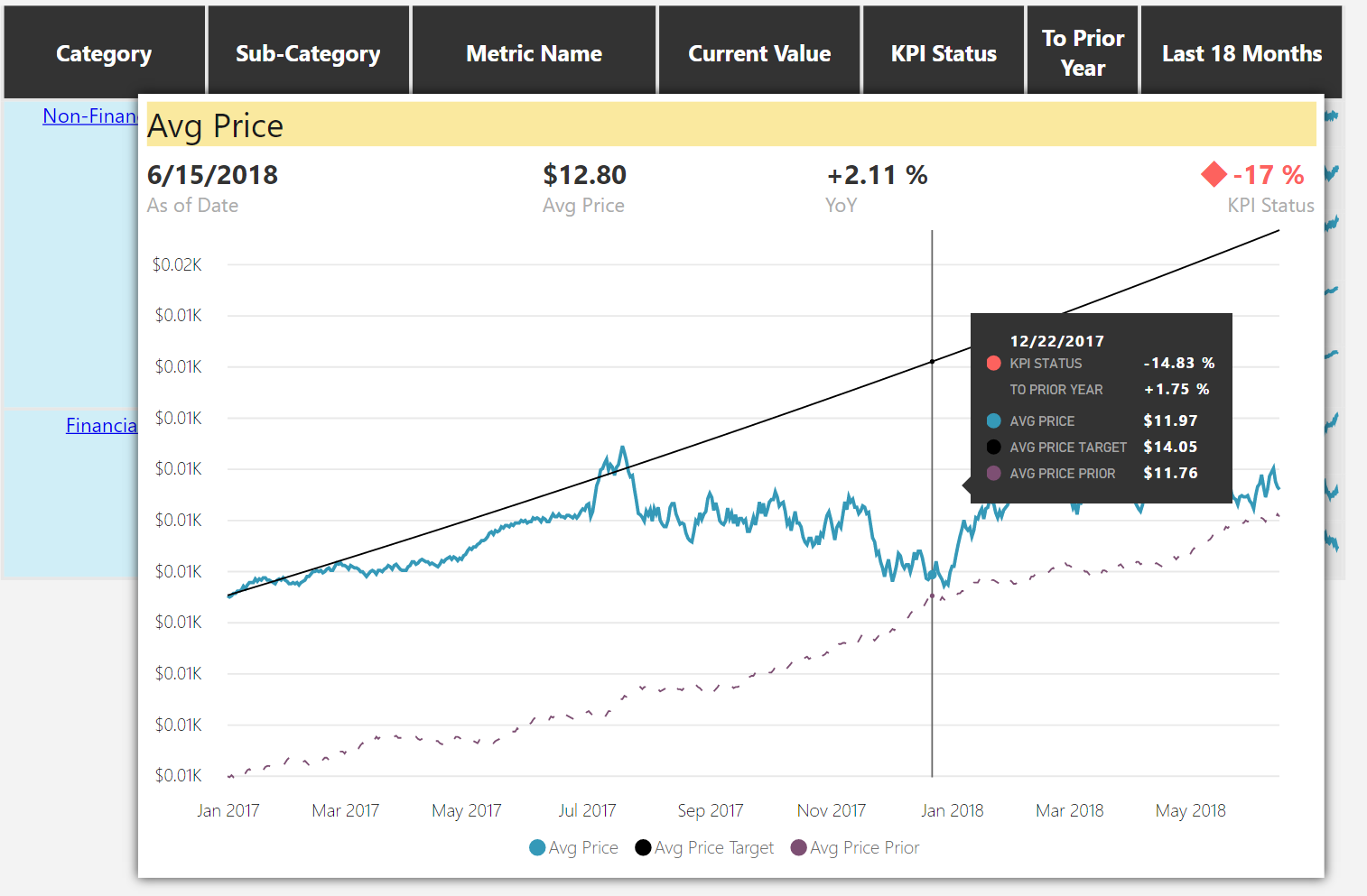
While the Power KPI visual has been a necessary building block for us in the presentation of KPIs, by itself it doesn’t provide a scorecard layout. Some users, including executives, really wanted a tabular, scorecard style of KPIs. For this, we developed a second custom visual called Power KPI Matrix. Power KPI Matrix supports an unlimited number of KPIs in a single visual, along with optional categorizations, images, and sparklines. With the latest version, 2.0, it also includes an interactive pop-out of the full Power KPI chart within the visual for a given selected cell. While we developed it primarily for our own team and purpose, it has also been made available for free to the public.
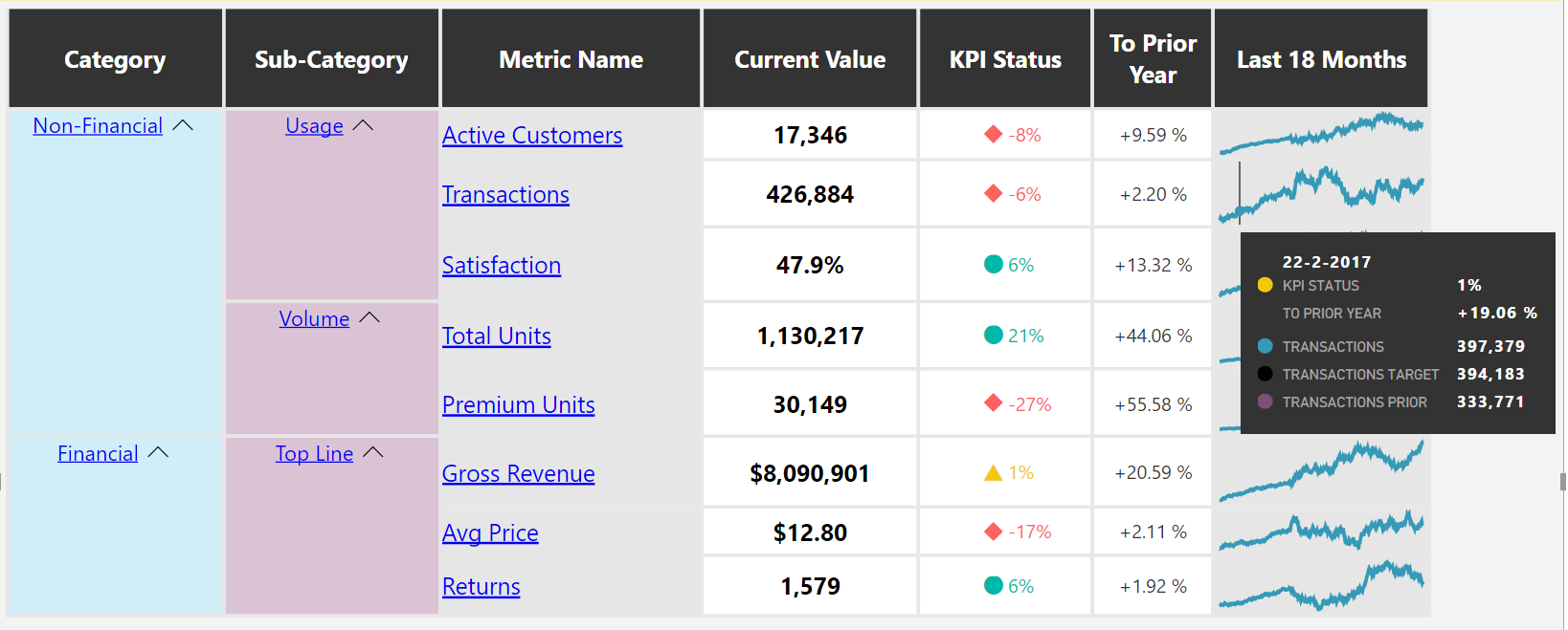
(above, the Power KPI Matrix custom visual)
Richa Yadav, a program manager with the CDnA team, has recently produced a Power BI dashboard to drive insights into Microsoft Office performance and customer usage. This dashboard includes 43 different metrics that all contribute to Microsoft’s business and decision making. As Richa explains, “with the increase in number of metrics each year, it was extremely important to have a view that not only ranks the KPIs but also includes the historic trends (actuals versus targets) in a single glance. Power KPI Matrix comes in handy as it serves as a balanced scorecard which perfectly captures our entire list of metrics in one single visual and enables drilling further into trendlines without moving away from the visual — a very unique feature.”
Below is a screenshot of the drilldown feature mentioned by Richa:
Beyond balanced scorecards, Kaplan and Norton have also focused on strategy map visuals, which are akin to flowcharts that tie together strategy with measurement. For those interested, the Visio visual (preview) custom visual offers a great option for lighting up strategy maps based on data.
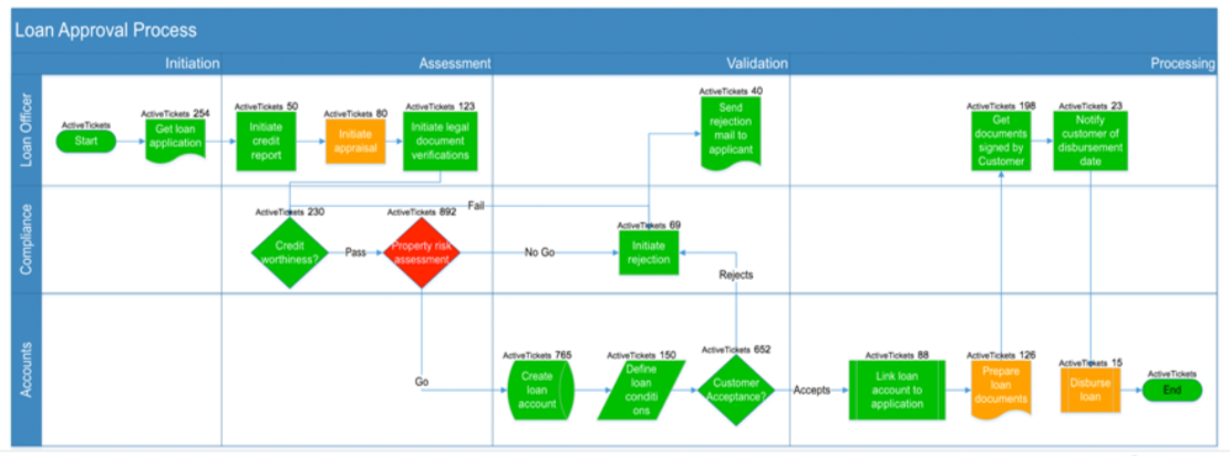
(above, the Visio preview custom visual with shapes linked to live data measurements)
The custom visuals shown here also work well within the mobile Power BI applications. Using Android or iOS mobile devices, end users are easily able to look up the latest information and interact with the data, at any time, from anywhere.
| Power KPI Matrix in a Mobile Dashboard (Android): | In-Focus Mode with Pop-Out Power KPI Visual (Android): | |
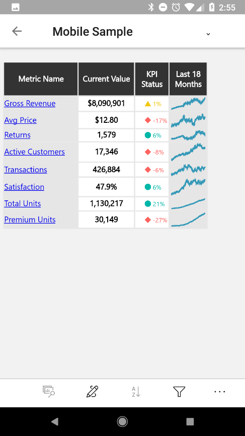 | 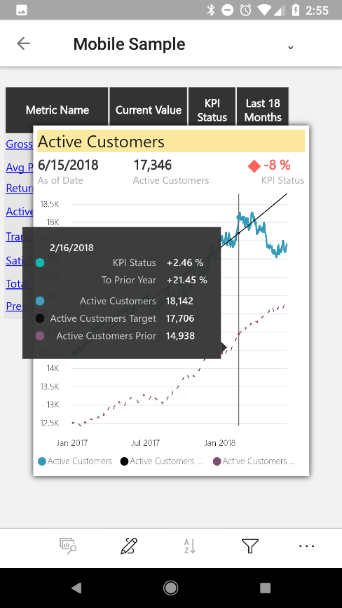 |
With Power BI and just a few powerful custom visuals, both large enterprises and smaller companies are now poised to achieve strategic alignment at a broad, pervasive level throughout the organization that Norton and Kaplan might only have dreamed of when they published “The Balanced Scorecard.” There is still some pesky backend data integration work, but that’s a story for another day.
Sources:
Kaplan, Robert and Norton, David. The Balanced Scorecard, Harvard Business School Press, 1996.
Keeping Score, The Drucker Institute. https://www.drucker.institute/thedx/keeping-score/
Management Top 250, WSJ. http://graphics.wsj.com/image-grid/management-top-250/
Methodology for the Management Top 250 Company Rankings, WSJ. https://www.wsj.com/articles/methodology-for-the-management-top-250-company-rankings-1512482700?mg=prod/accounts-wsj
Balanced Scorecard Basics, Balanced Scorecard Institute. http://www.balancedscorecard.org/BSC-Basics/About-the-Balanced-Scorecard
Related:
How Microsoft Executives are Using Power BI, Microsoft Power BI Blog. https://powerbi.microsoft.com/en-us/blog/here-s-how-microsoft-executives-are-using-power-bi/
Power KPI custom Visuals:
Power KPI, AppSource. https://appsource.microsoft.com/en-us/product/power-bi-visuals/WA104381083?src=office&tab=Overview
Power KPI Matrix, AppSource. https://appsource.microsoft.com/en-us/product/power-bi-visuals/WA104381299?src=office&tab=Overview
Visio visual (preview), AppSource. https://appsource.microsoft.com/en-us/product/power-bi-visuals/WA104381132?src=office&tab=Overview


