


Today we released the November update of the Power BI Desktop. It is filled with many exciting features including our newest analytics feature, clustering. We’ve also added several new table and matrix improvements based on the feedback you’ve given us on our UserVoice forum.

Here’s the complete list of November updates:
- Dropdown slicer
- Hierarchical axis
- Matrix conditional formatting
- Table & matrix column formatting
- Axis label and title color control
- Phone reports scrolling
- Spark DirectQuery
- OData connector – folding of expand record operations
- Enhanced “combine binaries” experience
- Azure Analysis Services
- Web connector updates
- Improved “function authoring” experience
- Support for percentage data type
- Maximize/Restore buttons in the Navigator and Query Dependencies dialogs
For a summary of the major updates, you can watch the following video:
Report View
Dropdown slicer
One highly requested feature is adding more types of slicers to reports. Last month, we released the date slicer, and this month we are adding another new slider type, the dropdown slicer. This slicer is very useful if you are tight on space in your report canvas or if you have a lot of category items in your slicer.
When you create a normal list slicer, you can turn it into a drop down by using the dropdown option next to the Clear button.

You can now use this dropdown slicer the same way you used your previous list slicer.

More details about the dropdown slicer in the following video:
Hierarchical axis
With this release, we are improving the experience around viewing visuals that contain a hierarchy through a new hierarchical axis. This allows you to clearly see the hierarchy within the visual. As you drill, you’ll be able to better understand where you are in the hierarchy.

You can use hierarchical labels by turning off the label concatenation experience in the formatting pane.

More details about the hierarchical axis in the following video:
Matrix conditional formatting
Back in May, we released the ability to conditionally format measures in tables. With this month’s update, we are expanding that experience to work for measures in matrices as well.
You can turn on conditional formatting by opening the field well menu for the measure and selecting Conditional formatting.

In the dialog, you can change various settings, including picking out colors to use.

Once you hit okay, you’ll see the formatting applied.

More details about matrix conditional formatting in the following video:
Table & matrix column formatting
In addition to adding conditional formatting for matrices, we are also adding the ability to format columns in tables and matrices. This lets you set the font and background color for any column.
In the formatting pane, you can now see the Column formatting card. When you expand it, you’ll be able to select a column in the dropdown list and pick the font color and background color. You can also choose if these settings apply to only the values or to the header and totals, too.

More details about column formatting in the following video:
Axis label and title color control
For a while now, you could change the colors of your axis labels in most charts. This support has been expanded to all charts. Additionally, you can now format your axis title color separately from the axis labels.

More details about axis color formatting in the following video:
Phone reports scrolling
In September, we released a preview of phone report layouts. Using this feature, you can create custom layouts of your report for your users to view when they are on their phones. With this release, we are making an update to this preview. You can now extend the length of your phone report and allow users to scroll to see the additional content.

More details about phone reports in the following video:
Analytics
Clustering (preview)
This month we are continuing to add more analytical features to Power BI with the addition of clustering. Clustering lets you quickly find groups of similar data points in a subset of your data.
You can use clustering on your scatter chart by clicking the “…” and then selecting Automatically find clusters.

When you select this, a dialog opens where you can decide how many clusters you want us to find. If you leave it blank, we will automatically find the number of clusters we think makes the most sense with your data.
After the clustering algorithm runs, we will create a new categorical field with the different cluster groups in it. This new field will be adding to your scatter chart’s legend field well bucket, which you can now use as a source of cross highlighting like any other legend field. You can also find it in your field list and use it in new visuals just like any other field.

You can select Edit clusters in the field list menu to configure it further.

In this dialog, you can rename the field, name each of the clusters, or adjust the number of clusters you want us to find.

If you want to find clusters using more than two measures, you can use a table to add all the fields you want to use and run the clustering algorithm using the same process.

We will add the new field to the table and the field list for you to use in your other charts.

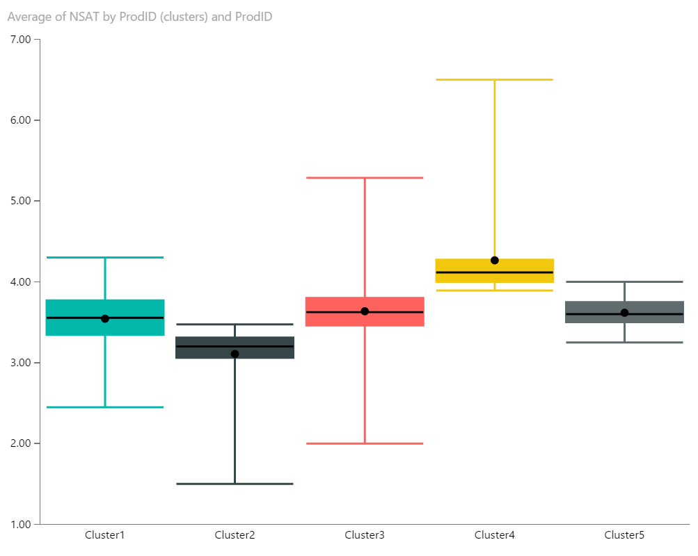
One way for you to use your newly created cluster field is a couple of our custom visuals to do further analysis and evaluate the clusters. For example, you could use the cluster column and each of the associated measures in a radar chart to see the aggregate of each measure for each cluster. You could also use the cluster column and one of the measures in a box and whiskers plot to see the distribution of values for that measure in each cluster. This can help you determine the min, max, and median values for that measure within each cluster.
Clusters are not re-evaluated on refresh, so you can easily save your clusters and re-evaluation when needed. New points will be assigned to a (blank) cluster.
Since this is a preview feature, you will need to enable it in the Preview Features tab in the Options dialog.
More details about clustering in the following video:
Forecasting – now available in the Power BI on the web
In September, we released a preview of forecasting. With this release, the feature is generally available to everyone, so you no longer need to enable it through the Options dialog. Additionally, you can now see your forecasting in reports on the web and pinned tiles. You can also create new forecasts in the web report editing experience.

More details about forecasting in the following video:
Groups – ribbon entry points
We added two new ways to create groups to make it even quicker and easier to use. You can create and edit groups from the Modeling tab.

You can also create a new group from the Data / Drill tab when you are on a chart.

More details about the new grouping button in the following video:
Data Connectors
Spark DirectQuery
We’ve added DirectQuery support when connecting to Spark. This includes the HDInsight Spark connector (under Get Data -> Azure) as well as the Spark connector for other Spark distributions (under Get Data -> Other). Note that this new DirectQuery mode is currently in Preview and not yet supported for Power BI web report consumption.
When using one of the Spark connectors, you’re now able to pick which Connectivity Mode to use, either Import or DirectQuery. You can read more about DirectQuery in this documentation article.

More details about Spark DirectQuery in the following video:
OData Connector – folding of expand record operations
This month we have a new feature to help improve the performance of complicated data models you are accessing through an OData feed. We are adding support for the underlying OData Service doing the expand record operation rather than having this operation done in Power BI. By having the underlying OData service handle this operation, the transaction is more efficient since less data is passed to Power BI.
More details about the OData connector improvements in the following video:
Enhanced “combine binaries” experience
One of the most popular scenarios in Power BI consists on leveraging one of the folder-like connectors (such as Folder, SharePoint folder, HDFS, etc.) to combine multiple files with the same schema into a single logical table.

Before this release, users could combine Text or CSV files by using the “combine binaries” transform. However, this transformation had a few gaps:
- It wouldn’t account for transformations required on each file before combining them into a single table. A typical example of this is Text/CSV files with column headers. You instead had to combine files into a single table first, then filter out the “header values” as a filter rows operation.
- This “combine binaries” transform only worked (with above limitations) for Text or CSV files, but not for any of the other supported file formats (such as Excel Workbooks, JSON files, etc.)
With this release, we’re enhancing the “combine binaries” transform so that:
- It analyzes the input files and detects the right file format to use (e.g., Text vs. Excel Workbook).

- It provides you the chance to select a specific object from the first file (for example, a spreadsheet to use).

- It automatically creates a few different artifacts:
- An example query that performs all required “extraction” steps in a single file.
- A function query that parameterizes the file/binary input to the exemplar query. Both the exemplar query and the function query are linked, so that changes to the exemplar query are reflected in the function query.
- It applies the function query to the original query with input binaries (i.e., the Folder query), so that it applies the function query for binary inputs on each row, then expands the resulting data extraction as top-level columns.


With this new approach, you can easily combine all binaries within a folder as long as they have a homogeneous file type and structure (i.e., columns). You can also easily apply additional transformation/extraction steps by modifying the exemplar query without having to worry about any additional function invocation steps, as they’re automatically generated for you.
More details about the "combine binaries" improvements in the following video:
Azure Analysis Services
Last month, the public preview of Microsoft Azure Analysis Services was announced. You can connect to Azure Analysis Services in the Power BI Desktop.
To connect, select Analysis Services in the Get Data experience.

In the dialog, enter your server name, which you can find in the Azure portal. You will need to use entire server name including asazure://. You can also include the name of the tabular model database or perspective you want to connect to. If you don’t include this, you can select the database or perspective on the Navigator dialog that follows. Also, be sure to leave the Connect live option selected.

More details about the new Azure Analysis Services connector in the following video:
Web connector updates
We are currently working on improvements to the refresh of cloud based data sources. As part of this, one of the changes we have made recently is that new datasets that leverage import from Web pages won't be automatically configured for refresh in Power BI on the web and will require the use of a gateway. Please consider using the Personal Gateway or On-Premises data gateway if you would like to use this capability. We are working on removing this restriction in the future.
Query Editing Improvements
Improved “function authoring” experience
As a general case for one of the capabilities described in the “combine binaries” scenario, we’re making it easier to update function definitions without the need to maintain the underlying M code.
When a function definition has been created based on another query (i.e., using the “Convert to Function” option on the Queries context menu), a link will be created between the original/exemplar query and the newly generated function, so that you can simply modify the exemplar query steps and the linked function will be automatically updated for them.
When using query parameters, creating a function out of a query will allow you to use function inputs to replace parameter values in the generalized function query.
More details about the improvements to the "function authoring" experience in the following video:
Support for Percentage Data Type
This month we’re adding support for Percentage data types so they can easily be used in arithmetical operations. An input value such as “5%” will be automatically recognized as a Percentage value and converted to a 2-digit precision decimal number (i.e. 0.05), which can then be used in arithmetical operations within the Query Editor or the Data Model.
Besides automatic type recognition from schemaless sources (such as Text, CSV or HTML), users can also convert any value to Percentage by using the Change Type options in the Query Editor: column header type indicators, “Change Type” menu under the Home or Transform column tabs, “Change Type Using Locale” transform via context menu, and more.

More details about the percentage data type in the following video:
Maximize/Restore buttons in the Navigator and Query Dependencies dialogs
The Navigator and Query Dependencies dialogs support window resizing by dragging the bottom/right edges of the dialog. In this release, we’re also making it possible to maximize/restore these dialogs by exposing Maximize and Restore icons in the top-right corner of the dialogs so that they behave like standard Windows dialogs.

More details about the maximize/restore buttons in the following video:
That’s all for this month! We hope that you enjoy this new update and continue sending us valuable feedback about our product. Please don’t forget to vote for other features that you would like to see in the Power BI Desktop in the future.