


This month’s Power BI Desktop update includes the general availability release of the new table and matrix visuals, an integrated experience with the custom visuals store, two community submitted quick measures, and more!
 And don’t forget to also check out the Power BI service and mobile June feature summary.
Here’s the complete list of July updates:
- New table & matrix visuals are now generally available
- Renaming fields in visuals
- Custom visuals store integration
- Relative date filters
- Responsive layout for visuals (preview)
- New waterfall chart option – breakdown
- Custom visual updates
- Quick measures from the community
- Bidirectional cross filtering for DirectQuery is now generally available
For a summary of the major updates, you can watch the following video:
Reporting
New table & matrix visuals are now generally available
We are very excited to announce that the new table and matrix visuals that we released as a preview a few months back are now generally available. These new visuals support cross highlighting and drill as well as many new formatting capabilities including data bars and word wrap. Now that the visuals are generally available, you’ll only see the icons for the new table and matrix visual. If you have a report that is still using the previous table and matrix visuals, you’ll get an introductory dialog encouraging you to upgrade your visuals to take advantage of all the new features.

We also made three more improvements this month.
First, we updated the drill experience to make it easier to drill on either the rows or columns. If your matrix only has a hierarchy on the rows or the columns, the drill buttons on the top bar will drill on the hierarchy you have. If your matrix has more than one level on both hierarchies, the drill bar will show a dropdown that lets you select which hierarchy to drill on.
Second, we updated the default style for the table and matrix visual. The new style makes it easier to read your visual and is based on best practices and feedback from you in the community. You can always go back to the “None” option in the formatting pane if you prefer the old appearance.

The final update is another update to word wrapping. We now honor new lines in content, either when it’s in the data you load from your source or if you specify it in a DAX function. For example:
Measure with newline = "This is the first line" & UNICHAR(10) & "This is the second line"
Thank you to everyone who tried out the new visuals during the preview period and gave us invaluable feedback! And of course, we will still continue to add more features to these visuals based on your feedback in future updates.
Find more details about the new table and matrix visuals in the following video:
Renaming fields in visuals
You can now rename fields for a specific visual! This lets you give an “alias” to the column in that specific visual while leaving the actual column name alone. To rename a field in a specific visual, just double click it (or right click and choose rename).

The field will be renamed everywhere it is used in the chart, including the tooltip. Hovering over the name in the field well will show you the original name if you need it for reference. If you want to go back to the original name, you can remove the field from the chart and add it back again. As always, if you want to rename the field for your entire report, instead of in a single visual, you can do that by double clicking that field in the field list.
Find more details about renaming fields in visuals in the following video:
Custom visuals store integration
This month we are bringing the custom visuals store into the Power BI Desktop. Right from the Home ribbon, you can open the store, browse visuals and add them to your Desktop. This makes it much easier to find new visuals and use them in your reports. All the custom visuals that are listed in the Office store are available directly from the Desktop.

Once you click the From Store option, you’ll see a dialog showing all the visual in the Office store. From here you can browse different visual types or search by name for a visual. Click any of the visuals to go to its details page, where you can see screenshots, a video, an overview of the visuals, and user reviews. Once you find a visual you want to use, all you need to do is click Add to include it in your report.
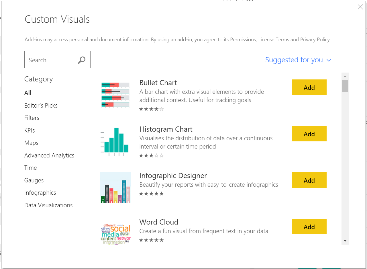
Find more details about the custom visuals store integration in the following video:
Relative date filters
We’ve gotten lots of positive feedback on our relative date slicer and heard that you’d like that same power in the filter pane as well. So this month, we’ve added the same functionality you have in the relative data slicer to date filter cards as well.

Find more details about the relative date filter in the following video:
Responsive layout for visuals (preview)
As a lot of our users view visuals on all screen sizes, it’s important to deliver rich visualizations on a large screen while preserving as much of that richness as possible on a small screen. To address this challenge, we’ve created responsive visualizations, which change dynamically to display the maximum amount of data and insight, no matter the screen size.
When your visuals are set to be responsive, they will dynamically update as you resize them, removing padding and other sections of the chart as necessary to make sure the most important information, the data itself, is preserved. This is particularly powerful when created phone reports and mobile dashboards. It allows you to use a full-size visual on the report and dashboard, while using a smaller version on your mobile device.

Right now, we are previewing this feature for the following visual types:
- Stacked bar chart
- Stacked column chart
- Clustered bar chart
- Clustered column chart
- 100% stacked bar chart
- 100% stacked column chart
- Line chart
- Area chart
- Stacked area chart
- Line and stacked column chart
- Line and clustered column chart
- Waterfall chart
- Scatter chart
Even though this feature is still a preview, we wanted to give as many of you the option to use this feature as possible, so you’ll see this new option automatically, without having to enable it in the Options dialog. You can turn it on using the (Preview) Responsive option in the General card of the formatting pane.

To learn more about this feature, make sure to read our full blog post.
Find more details about responsive visuals in the following video:
New waterfall chart option – breakdown
A common question when analyzing data is wanting to understand why something increased or decreased. Typically to answer this question, you’d need to either do some advanced calculations or spend lots of time trying different filters to get a sense for what values were most influential in the change.
To make this process easier, we are adding a new field well option to our waterfall chart, called breakdown. When you put a dimension field in this new bucket, we’ll show you what values in that field were the big causes of increase and decrease between each neighboring categories in the waterfall chart.

By default, we will show you the top 5 differences and an ‘Other’ bucket that groups all the other values together. However, you can adjust how many values you want to see before grouping into an “Other” bucket in the formatting pane.

Find more details about the updates to waterfall charts in the following video:
Custom visual updates
Starting this month, we are going to feature a few new custom visuals and other custom visual news in our blog, so you can stay up to date with all the exciting visuals being created.
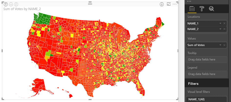
Drilldown Choropleth
First up is the new Drilldown Choropleth, which displays each location on a map filled with a color based on the value for each location. This is similar to our Shape map preview visual in that you use your own custom map files. This gives you full control over how the map looks. The most powerful part of this visual is that you can use drill to move between geographical hierarchies, showing different map files at each level.
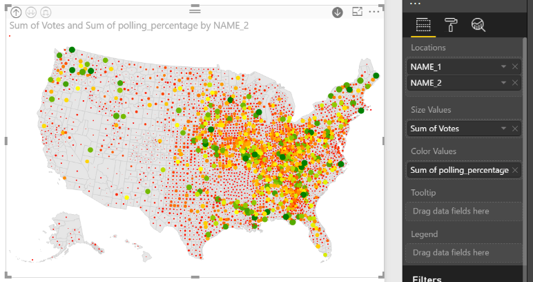
Drilldown Cartogram
If you like the power of the Drilldown Choropleth, but you prefer a bubble look similiar to our default Power BI map, the Drilldown Cartogram is a good custom visual for you to try. This map has the same custom map files and drilldown features, but displays a circle for each location with the size and color based on the values you specify.
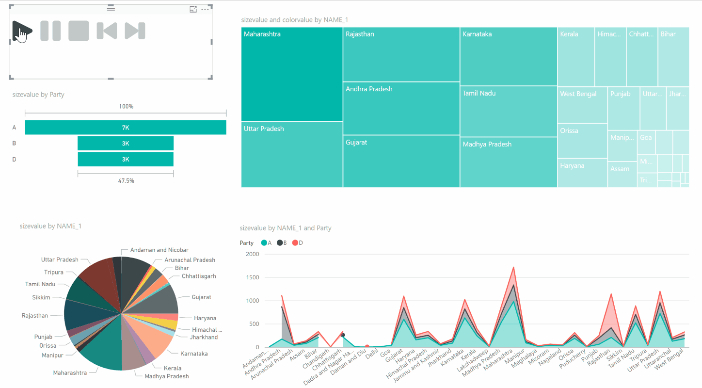
Drilldown Player
The Drilldown Player visual lets you filter or highlight your report automatically. You can add a categorical or numeric column to the visual and press play to see each value from the column applied to the rest of the report. This visual supports hiearchies as well, so you can add multiple columns to the visual to support playing through multiple fields. Using our Edit interactions feature, you can control if the player will filter or cross-highlight the other visuals on your report.
Find more details about each of these custom visuals in the following video:
These are just a few of the custom visuals released in the store this past month. Some others you might want to check out as well are:
Certified custom visuals
Custom visuals can now be certified! Certified custom visuals are custom visuals that conform to best practices of custom visuals development as defined by Microsoft and are verified by the Power BI custom visuals certification team. These range from performance to security to usability. Once a visual has been certified, it can be exported to PowerPoint and will show in subscription emails.
The following visuals have been certified so far:
There are even more visuals on their way to becoming certified, so watch out for more being announced.
Analytics and modeling
Quick measures from the community
People from the community have been submitting ideas for new quick measures (along with its DAX!) to our Quick Measures Gallery and we have integrated two of those measures into our product. You will find these two new measures under the ‘Text’ category in the Quick measures dialog.
Star rating
The star rating quick measure will visualize your data as a number of stars between a given minimum and maximum for your measure. Thank you, Chris Webb (Blog, Twitter), for suggesting this quick measure!

Concatenated list of values
This quick measure will concatenate you dimensions into a comma separated list. You can also decide how many values will be concatenated before truncating it with an “etc.” We want to give a shout out to Devin Knight (Blog, Twitter) for suggesting this measure in our quick measures gallery!

Make sure to submit any ideas you have to the gallery, and you may see your measure show up in the quick measures dialog as well!
Find more details about these quick measures in the following video:
Bidirectional cross filtering for DirectQuery is now generally available
We released bidirectional cross filtering for DirectQuery models as a preview a few months ago, and now we are making it generally available for everyone. This means that bidirectional cross filtering is generally available for both Import and DirectQuery models, including the use of bidirectional filtering for defining row level security. You can learn about bidirectional cross filtering in the whitepaper.
When using this feature, you need to consider the performance implications, and it is strongly recommended that:
- “Assume Referential Integrity” is set. Learn more about this feature in our documentation.
- Only simple aggregates are used when they would be filtered by such relationships. For example, DistinctCount or more complex measures that are not aggregateable should not be used.
Data connectivity
Snowflake connector general availability
With this month’s update, we’re declaring the Snowflake connector as Generally Available and also making it work in the Power BI Service via the On-Prem Data Gateway. Stay tuned for this month’s On-Prem Data Gateway release announcement (which should happen early next week) as you will need to use that new version in order to configure refresh or DirectQuery connections to Snowflake from the Power BI Service.

The Snowflake connector can be found under the Database category within the Get Data dialog. It allows you to create reports based on Snowflake data, either by using Import or DirectQuery modes.

We wanted to thank all of you who tried out the Preview version of this connector and shared feedback with us. We will continue making improvements to this connector in the future, based on feedback, just like we do with other features in the product.
Query editing
Add Column from Examples enhancements
This month we’ve added support for a few additional Number and Date/Time/Timezone data transformations when using “Add Column from Examples”. For a full list of supported data transformations in this feature, please check our documentation article.
That’s all for this month! We hope that you enjoy this new update and continue sending us valuable feedback about our product. Please don’t forget to vote for other features that you would like to see in the Power BI Desktop in the future.