We put out the call to you a couple of months ago to create fantastic reports for the Data Stories Gallery, and we were amazed by your submissions! Congratulations to the grand winner and runners-up from May and June.
The theme for May was data storytelling. These entries were judged by the Microsoft Data Journalism Team. Microsoft believes that data enables reporters, bloggers, broadcasters and analysts alike to tell unique and interesting stories. Data visualization is a powerful tool that can help form a narrative and present valuable insights in a compelling way, and with Microsoft Power BI, writers can emphasize messages and engage audiences through interactive and data rich stories.
The way we tell stories has changed, in part, due to the ever-growing volume and availability of data. Media outlets are tasked with providing credible, data-backed stories that enable readers to explore the personal angle of the story. This demand for interactive data stories is pervasive across beats, but a lot of journalists and media outlets don’t have the time, resources, or tools to create compelling interactive data visualizations. We hear from a lot of journalists that data stories are often a high-risk, expensive investment for newsrooms because of limited bandwidth, the lack of tools or technical expertise to create interactive graphics, and the challenge of drilling down into local or relevant stories from national or global datasets.
Microsoft has been pioneering a new, simple and scalable solution to overcome these barriers with the Microsoft Data Journalism Program and Microsoft Power BI. With Power BI publish to web, writers can publish interactive Power BI data visualizations with their stories and reach an unlimited number of readers. Since this capability was released, Microsoft has been working with journalists and media organizations to understand how to realize this opportunity. To learn more about the Microsoft Data Journalism Program, visit the website or email them with questions.
May Grand Winner:
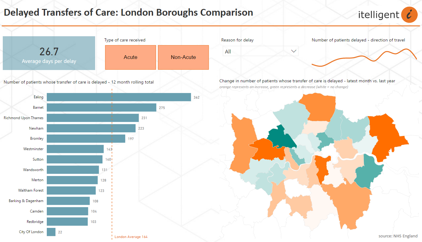
- Susie Bentley – Local Authority Performance – Delayed Transfers of Care
Susie’s report displays a very clear, simple story. There are good insights, with the ability to see national, regional, and local drill down.
June Grand Winner:
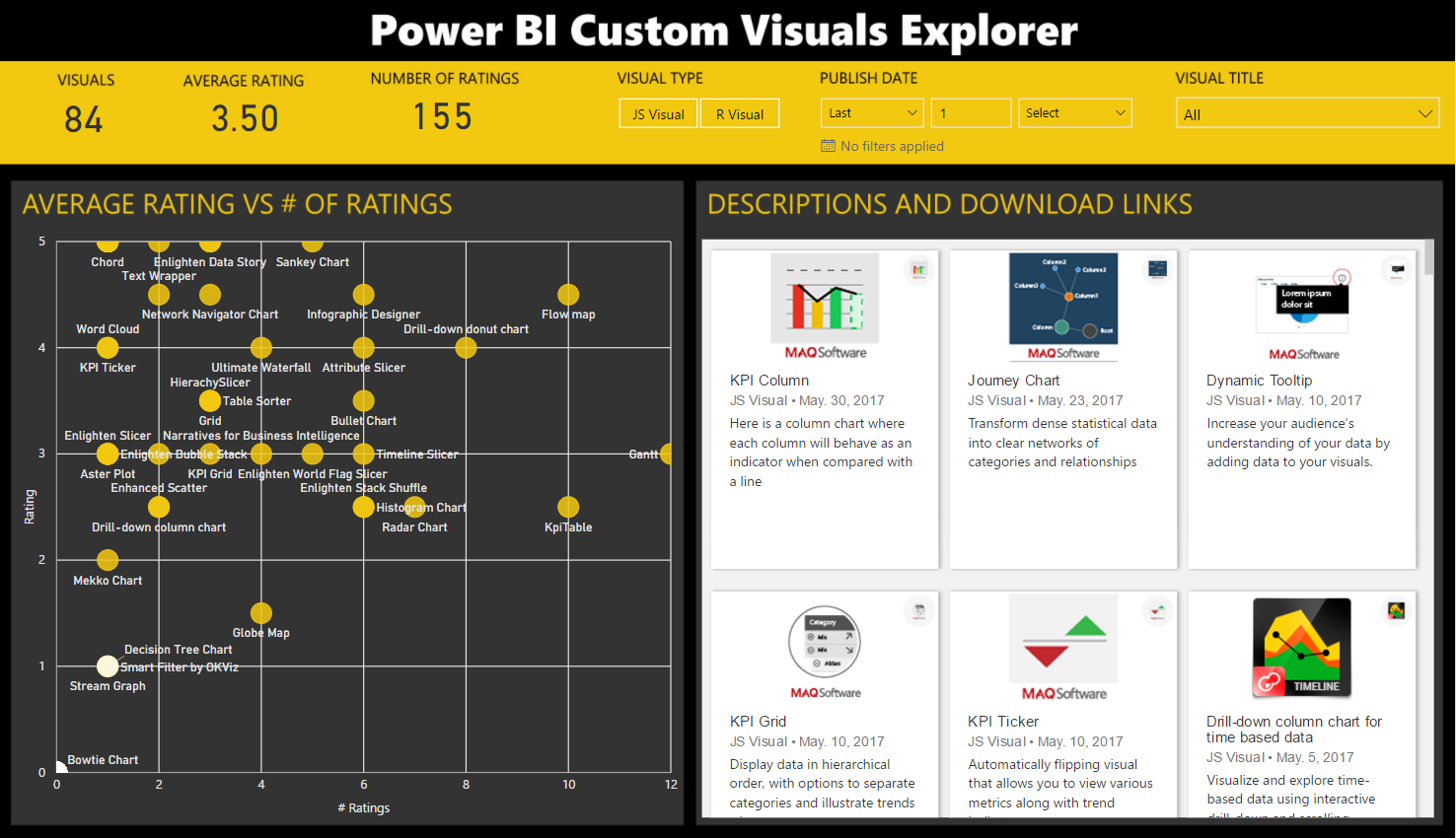
- Alex Potter – Power BI Custom Visuals Explorer
Alex’s report not only shows good design, but it’s also a very helpful way for Power BI users to find the right custom visual for their project.
Nine other reports will also be marked as Featured. Congratulations to the following reports (in no particular order):
May Featured Data Storytelling Reports
- Craig Juta – The Golf Club Story
- “Jolsby” – Executive Insights by Decisive Data
- Luthfur Rahman – Adventure Works Overview Report
- Prathy Kamasani – Indian epic historical fiction – Baahubali
June Featured Reports
- Manuel Dias – Fires Analysis – Portugal and Europe
- Pawel Jaszczynski – Global Trade Flow – Kraft Paper
- Andy Reines – Global Weather Station Network
- Taylor Dunlap – Seattle’s Construction Climate by Decisive Data
- Ketan Deshpande – Aircraft Wildlife/Bird Strikes in USA
Submit your story
Want to see your work become a Featured story? Post it to the Data Stories Gallery, and then tweet a link with the hashtags #powerbi #datastory. At the end of each month we’ll review all tweeted stories, and choose several to become featured. Featured stories will be selected for telling a compelling story, being original and creative, and effectively using Power BI.
The author of the story that we pick as the grand winner for each month will win a Power BI t-shirt and a badge of recognition for their Community profile.


