


Our August release is filled with features that address some of the top requests we’ve heard from users. The most exciting of which is our Export to PDF feature which is geared towards our #1 feature request on UserVoice, printing in Power BI Desktop. We also have an exciting update for data scientists and statisticians with our new Python integration.

Here’s the complete list of August updates:
- Print reports through Export to PDF
- Create bookmark groups
- Theming generally available
- Slicer restatement
- 3AG Systems – Column Chart with Variance
- Scatter Chart by Akvelon
- Small Multiples Line Chart
- Add Natural Language Summaries for BI
- Pivot Slicer
For a summary of the major updates, you can watch the following video:
Reporting
Print reports through Export to PDF
We’ve heard loud and clear from you that we needed an option in Power BI Desktop to easily print or email copies of your reports out to others in your company. We’ve been working on a solution to this problem for awhile now and are glad to share that with this month’s update you can now export all visible report pages to PDF. You’ll find this new option under the File menu.

Once you select Export to PDF, we will start generating the PDF. While we’re doing this, we’ll show you a dialog letting you know we are working on it, and you’ll see each non-hidden page loading in order behind it. During this process, you won’t be able to interact with the report. If you need to interact with your report again before we’ve finished you can cancel the export through the dialog.

Once the PDF has been created, it will open in your default PDF viewer, which in my case is Microsoft Edge. From there you can save it wherever you like, email it as an attachment, or print it!

Currently export to PDF is only supported in Power BI Desktop. In the Power BI service, you can still use the normal print option that is available.
Currently, we don’t support printing wallpaper color or images, only page backgrounds or images. If you have a dark wallpaper color and a transparent page color, you may want to temporarily set the page background to match the wallpaper’s color to improve readability.

Watch the following video to learn more about export to PDF:
Create bookmark groups
If you are using bookmarks extensively, you like have sets of bookmarks with different purposes. For example, you may have different bookmarks per organizational division using your report, or perhaps you have a set of bookmarks for navigation and several sets of bookmarks for different presentations.
In these cases, it’s important to clearly separate out each group of bookmarks, and this month, based on your feedback, we’ve made this much easier to do with the introduction of bookmarking grouping. Bookmark grouping lets you collect a set of bookmarks together and give it a name. Each group can be expanded and collapsed for easy viewing.

To create a bookmark group, click the first bookmark of the group and then ctrl+click the other bookmarks you want to group with it. Then select the “…” menu for any of the bookmarks to group and pick the group option.

If you decide later you don't want that group anymore, just use Ungroup to stop grouping that set of bookmarks.

When you use View to play a bookmark group, it will only include the bookmarks in that group.

Playing from a bookmark at the root level, such as Default View in this example, will still play through all bookmarks in your pane.
Watch the following video to learn more about bookmark groups:
Theming generally available
Last month we had a major update for theming that added support for the remaining visuals properties and page level background and wallpaper colors. At this point, we are happy enough with our level of theming support across report pages that we are making theming generally available. This means you can start using it without needed to enable it through the Options dialog. And for those wondering, yes, that means it will be in our next update of Power BI Desktop for Report Server!
Thank you to everyone who has given us feedback during our preview period for theming, and keep the feedback coming! We plan to continue improving the feature and finding ways to make it easier for you to quickly format your reports.
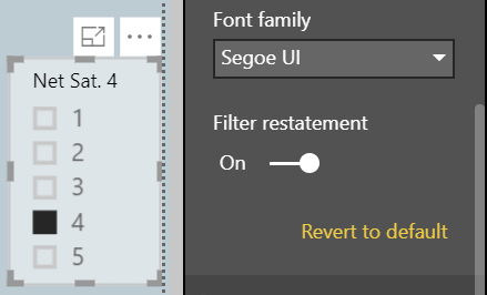
Slicer restatement
If you are using the list slicer, you can now add a restatement, similar to the restatement in the dropdown slicer, to the slicer header through an option in the Slicer header card in the formatting pane.
Analytics
Conditional formatting by values
We have a new type of conditional formatting for table and matrix this month, format by field value. Format by field value will let you use a measure or column that specifies a color, either through a hex code or name and applies that color to the background or font color.
For example, each product in my model has a color. Instead of showing the color name, I’d prefer if the cell was filled with the color instead.

With this feature all I have to do is pick to format that color by the color name. I’ll do that by opening the conditional formatting dialog for the Color column in my table.

And then in the dialog, pick to format by Field value. The dialog defaults to the color column with First for summarization. Since I’m always only going to have one color value per table row, this is exactly what I want and I just need to select okay.

If I repeat this for font color as well, the whole column will be filled with the product color, which makes it easier for me to identify with a glance which product color I’m currently looking at.

Another great use case for this is to set up a DAX calculation based on your business logic that outputs different hex codes. You can then format by that calculation without having to worry about creating a bunch of rules in the conditional formatting dialog.
For example, you could use a switch statement to create your KPI…

… pick to conditionally format by that measure…

… and see the results in your table or matrix.

Watch the following video to learn more about conditional formatting by value:
Python integration (preview)
We are excited to announce that Python, a programming language widely used by statisticians, data scientists, and data analysts, is now integrated into Power BI Desktop. Once you enable the feature in the preview settings, you can use Python to do data cleansing, analysis, and visualization.
The first integration experience we added is the ability to run Python scripts directly in Power BI Desktop to create your data model. You’ll see an option for this new connector in the Get data dialog.

After selecting this option, you’ll be able to paste in your script.

The Python integration in the Query Editor lets you perform data cleansing using Python and perform advanced data shaping and analytics in your data, including completion of missing data, predictions, and clustering, just to name a few.
Lastly, you can use Python to create new visuals on your report. Just like R visuals, the Python visuals will update with data refreshes and cross-filtering. However, the visual itself is not interactive.

Q&A improvements
Q&A in Power BI Desktop generally available
This month we are making Q&A in Power BI Desktop generally available. This means you’ll no longer need to turn on the preview feature to use Q&A for visual creation or the Q&A Explorer in your reports.
Better matching experience for Power BI Desktop and Power BI Premium
Q&A in Power BI premium capacity and in Power BI Desktop now has improved matching capabilities against data in your model.
- Values are compared word-by-word rather than the entire value at once. This allows for better matching in cases involving spelling-correction, plurals, and punctuation.
- Spelling-correction – "How much kamut wheet was sold yesterday?" will match "kamut wheat" rather than just "kaput wheat" or "kamut wheet".
- Plurals – "Which employees are sales managers?" will now match "sales manager" rather than just "sales managers" or "sale manager".
- Punctuation – "Who works for Contoso Inc?" will now match "Contoso, Inc." rather than just "Contoso Inc".
- Accent-insensitive matching is now used, allowing "Number of downloads of the latest Beyonce Knowles single" to match "Beyoncé Knowles".
- If you have plural values in your data, you can instruct Q&A to match singular values against them as well by setting the new PluralNormalization property on the column in the Linguistic Schema, allowing "Which cashier was hired last week?" to match "cashiers" in the data.
Modeling
Data categories for measures
You can now pick data categories for measures. This means you can do things like use measures to dynamically create URLs and mark the data category as a Web URL. Then when you display it in tables, you’ll be able to click on the URL that’s created based on your selection! This is especially useful if you want to link off to other Power BI reports with URL filter parameters.

Another great use case for this feature is to create DAX measures to create interesting insights such as sparklines using SVG images. If you are interested in doing this, but aren’t sure how, you should watch our Quick measures gallery in the Community, as I know some members of the community are planning on adding examples there soon.

Watch the following video to learn more about data categories for measures:
Statistical DAX functions
We’ve recently added several new functions that expand the statistical capabilities of DAX. These actually snuck into the July release, so you might have already noticed them!
- NORM.DIST
- NORM.S.DIST
- NORM.INV
- NORM.S.INV
- T.DIST
- T.DIST.RT
- T.DIST.2T
- T.INV
- T.INV.2T
These match the behaviors of their Excel counterparts, so it should be easy to migrate to if you’re used to doing these statistic operations there.
Custom visuals
3AG Systems – Column Chart with Variance
The Column Chart with Variance custom visual by 3AG Systems allows you to use multiple measures to create overlapping column charts with a variance chart positioned directly above. This visual is geared towards showing actual, forecast, planned, and previous year data.

Find this visual on AppSource.
Watch the following video to learn more about 3AG Systems – Column Chart with Variance:
Scatter Chart by Akvelon
The Scatter Chart custom visual by Akvelon allows you to view compare your different metrics with the x- and y-axes coordinates, point size, and saturation. It also supports rectangle selection for cross-highlighting other visuals on your report page. The visual also supports drilling, constant lines on both axes, and various formatting options.

You can find this visual on AppSource.
Watch the following video to learn more about the Scatter Chart by Akvelon custom visual:
Small Multiples Line Chart
The Small Multiples Line Chart by Daniel Marsh-Patrick allows you to display multiple line charts across the values of a category using the same scale and axes. This makes it a lot easier to compare the trends across all values being compared. The visual also lets you control the labels, the number of multiples per row and the background shading.

Try out this visual on AppSource.
Watch the following video to learn more about the Small Multiples Line Chart custom visual:
Add Natural Language Summaries for BI
The Add Natural Language Summaries for BI custom visual by Arria NLG allows you to add narratives for the data you are displaying in your report. The visual will generate natural languages that explains the most important insights and key drivers in your data. Using Arria NLG’s NLG Studio, you’ll be able tweak starter projects or create your own templates to be used in your reports and have the narrative update based on your report’s filter context.

Download this custom visual on AppSource. You’ll also need an Arria NLG Studio account to use this visual.
Watch the following video to learn more about the Add Natural Language Summaries for BI custom visual:
Pivot Slicer
The Pivot Slicer custom visual goes beyond the built-in slicers, letting you dynamically pivot the slicer based on any combination of categorical data types, numerical data attributes, and linked data items. Some use cases for this slicer include stacking multiple slicers in a single compact visual, exploring data rankings resulting from weighted combinations of numerical attributes, and navigating the link structure of item hierarchies and networks. Items of interest can be pinned from any view for comparison of attribute values, link weights and linked items.

Check this visual out on AppSource.
Watch the following video to learn more about the Pivot Slicer custom visual:
Data connectivity
Spark connector generally available
We’re excited to announce that the Spark connector has reached General Availability in this release.
The Spark connector can be found under the “Other” category within the Get Data dialog.

It enables you to create Import- or DirectQuery-based reports in Power BI against your data stored in Spark clusters.

Coming soon
Last month, I introduced a new section to my blog where I give you a glimpse of some of the things we are actively working on in the Power BI Desktop. Some of these features may be coming very soon, while others might still be a few months out, but we wanted to let you know they’re in the works.
This month, I wanted to share a little bit more about what our next update will be for our matrix visual: expand and collapse options for row headers. With this feature, you’ll be able to expand specific rows of your hierarchy to easily compare just a few values, without having to see all the other values expanded as well. You’ll even be able to add +’s and –‘s to your row headers to have a similar experience to what you’re used to from Pivot Tables in Excel. This feature was included in one of our demos at the Microsoft Business Application Summit, if you want to check it out.
We are also actively working on a major extension to our scatter chart visual. You’ll soon be able to use categorical data on your x-axis, including hierarchical data, to create dot plots, while still being able to take advantage of all the great formatting options we already have for our scatter charts.
That’s all for this month! We hope that you enjoy these updates and continue sending us your feedback. Please don’t forget to vote for other features that you’d like to see in the Power BI Desktop. You can also download the .pbix file I used, and if you’re looking for a similar design for your reports, I was using the Sunset layout from PowerBI.Tips.