


Happy new year to everyone! We are kicking off the new year with an update to Power BI Desktop focused on incremental improvements to popular features you are already using, including automatic date hierarchy, data label and axis formatting, and our relative date slicer. The ability to hide pages is another big update that gives you much more flexibility over how users consume your reports.

Don’t forget you can now get Power BI Desktop from the Windows Store if you’re on Windows 10!
![clip_image004[7]](https://powerbicdn.azureedge.net/mediahandler/blog/media/PowerBI/blog/003c6541-690b-4fef-aad3-28981197f13c.jpg "clip_image004[7]")
Here’s the complete list of January updates:
- Show and hide pages
- Control data label background color for Cartesian and maps visuals
- Increase area used for axis labels in charts
- Bar/column padding control
- Show dates as a hierarchy (preview)
- Add an anchor date for relative date slicer
- Top N selection in Q&A
- PowerApps
- TreeViz
- Funnel with Source by MAQ Software
- Box and Whisker chart by MAQ Software
- Agility Planning Matrix Light
- Image Grid
- Gantt Chart by MAQ Software
- Support for Azure Active Directory authentication for Azure SQL Database & Data Warehouse connectors
For a summary of the major updates, you can watch the following video:
Reporting
Show and hide pages
While creating your reports, you may have needed to hide a page or two perhaps because of in-progress work. You still wanted users to have access to other parts of the report. Hiding pages is also useful when you start using drillthrough or creating your own navigation through bookmarking, and you don’t want you users to access a page through the normal page navigation.
Starting this month, you can now hide any number of pages you want through right clicking the page name and selecting hide.

While you are editing the report, you’ll still see the pages, but they will look different to indicate they are hidden. You won’t be able to see the pages at all when you move to reading mode.

Watch the following video to learn more about hiding pages:
Control data label background color for Cartesian and maps visuals
You can now control the background color for data labels in Cartesian and map visuals. This is useful for stylistic changes and readability, especially when you have a situation where the data label is halfway over a data point. You’ll find the option under the Data labels card in the formatting pane. 
Watch the following video to learn more about data label background colors:
Increase area used for axis labels in charts
If you have a chart where the axis labels are being cut off, previously your only option would be to increase the size of your chart.

Of course, that isn’t a great option for many of you as report page space is limited, so this month we are adding a maximum size control for the axis to the formatting pane. This new slider can be used to increase the percentage of the chart used by the axis labels.

Watch the following video to learn more about axis size control:
Bar/column padding control
Another new axis formatting option we’ve added is the ability to control the inner padding between bars. You can make the inner padding up to 50% of the bar’s width.

Or all the way down to zero to get a histogram effect.

Watch the following video to learn more about padding control:
Show dates as a hierarchy (preview)
For a long time now, we’ve been automatically creating a date hierarchy for you whenever you are using our internal date table. We haven’t been showing that hierarchy in the field list though. Instead we have just created it automatically for you when you drag your data column into a visual. With this latest update you can now see the entire hierarchy in the field list. You’ll need to turn on the preview feature switch under File > Options and Settings > Options > Preview features.

This is useful not only because we are being more transparent about automatically generating this hierarchy, but because you can now use individual fields from the hierarchy in your visuals just by dragging or checking the specific level you are interested in. Previously, to do this you would have needed to put the entire hierarchy into the visual and then remove the levels you didn’t want.
Watch the following video to learn more about date hierarchies:
Add an anchor date for relative date slicer
When using the relative date slicer, you may want to start further back in time than today. This is very common whenever your data is complete until a few days later when all sales are finalized. You can now do this with the relative date slicer by setting an anchor date. Once you have an anchor date set, the slicer will be evaluated relative to that specific date. You can set it in the date range options in the formatting pane.

Watch the following video to learn more about anchor dates:
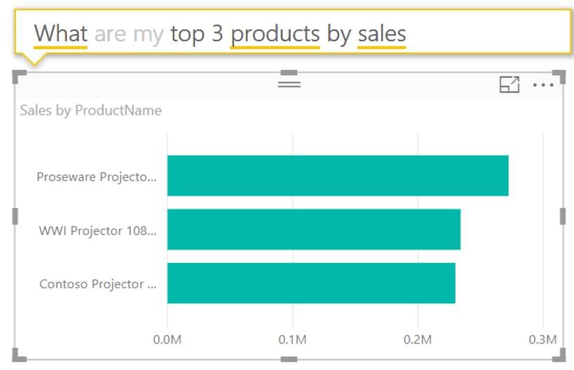
Top N selection in Q&A
After bringing Q&A to Power BI Desktop in December, we’re continuing to improve the natural language engine itself. You can now ask top-n type questions such as “What are my top 3 products by sales.”
Or “top manufacturer by NSAT”
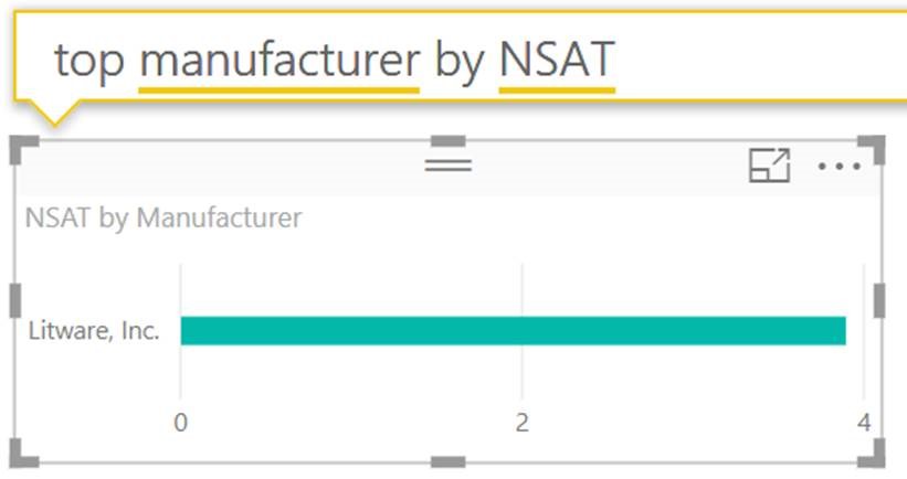
Both top and bottom work, so try it out on your data!
Analytics
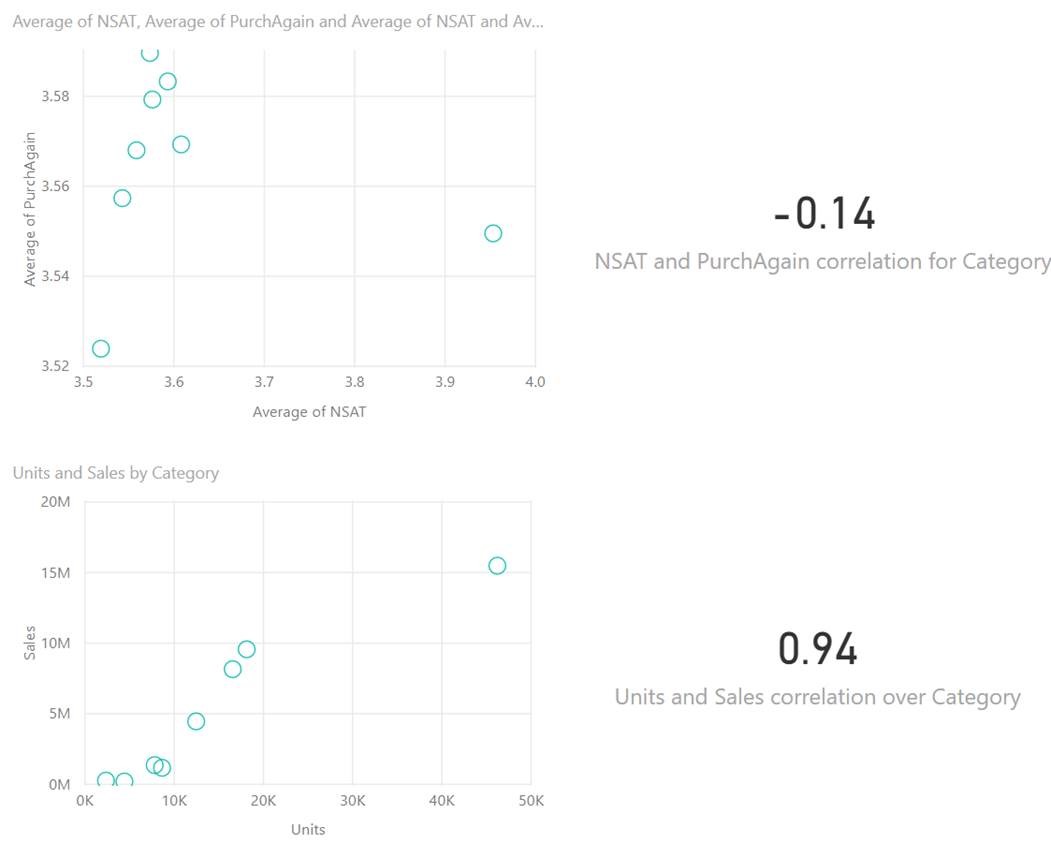
Correlation coefficient quick measure
This quick measure was suggested by Daniil Maslyuk in the quick measures gallery. It calculates the Pearson correlation coefficient between two measures within a certain category – a really common statistical measure of how related two values are.
Custom Visuals
PowerApps
With the new PowerApps custom visual, you aren’t only able to quickly find insights in your data, you can take action on it as well. PowerApps makes it easy to build automated workflows, and with the new custom visual, that experience is embedded right in your report. If you want to learn more about this visual make sure to read our dedicated blog or checking out the custom visual on AppSource.
You can also watch the following video to learn more about the PowerApps custom visual:
TreeViz
The TreeViz custom visual by AutoCont CZ a.s. lets you display your hierarchical data in a tree like structure. You can expand and collapse each level and decide how many children data points to show before grouping the smaller ones into a single child group.

You can check out this custom visual on AppSource.
Watch the following video to learn more about the TreeViz custom visual:
Funnel with Source by MAQ Software
The Funnel with Source custom visual is perfect to track any metric of interest over various stages along with the source of entry of the data point to the funnel. For example, in the case of sales journey data, this visual displays the channel through which any lead enters the funnel and then the corresponding journey through the various stages of the sales cycle. You can also filter data based on the selection of channel and on the selection of any stage of the sales journey.

You can find this visual on AppSource.
Watch the following video to learn more about the Funnel with Source custom visual:
Box and Whisker chart by MAQ Software
Box and whisker charts are most commonly used in statistical analysis to see the spread of your data. They consist of two parts—the main body called the box and the thin vertical lines coming out of the box called whiskers. The first quartile forms the bottom and the third quartile forms the top of the box. The whiskers connect the minimum and the maximum values to the box. In addition to showing median, first and third quartile, and maximum and minimum values, the Box and Whisker chart by MAQ Software is also used to depict mean, standard deviation and quartile deviation.

Make sure to check out this visual on AppSource.
Watch the following video to learn more about the Box ans Whisker chart custom visual:
Agility Planning Matrix Light
The Agility Planning Matrix Light by Managility is a matrix visual for planning and budgeting. Some benefits of this matrix visual is the ability to selectively drilldown on specific rows and to display currently applied filters on the visual itself.

Check out this custom visual on AppSource.
Watch the following video to learn more about the Agility Planning Matrix Light custom visual:
Image Grid
The Image Grid custom visual by Fredrik Hedenström is like a word cloud for images. You can display many images and choose for the size to be based on the sort order or the value of a measure. You can also decide to show them in a grid view instead with the top visual to be based on the sort order.

Get this custom visual on AppSource, and watch the following video to learn more about the Image Grid custom visual:
Gantt Chart by MAQ Software
The Gantt Chart by MAQ Software visual is used for scheduling and management of tasks. This visual shows additional details of the task by providing a grid where one can view more data related to the task and can display the hierarchy of data category. Also, it can be sorted based on any data point of the task.

You can download this custom visual on AppSource.
Watch the following video to learn more about the Image Grid custom visual:
Data connectivity
Support for Azure Active Directory authentication for Azure SQL Database & Data Warehouse connectors
One of the most frequent requests from customers using the Azure SQL Database and Data Warehouse connectors has been being able to leverage Azure Active Directory authentication in order to connect to these Azure services within Power BI.
With this month’s update for Power BI Desktop, we’re introducing a new “Microsoft Account” option within the Credentials dialog for the Azure SQL Database and Data Warehouse connectors, allowing users to authenticate using their AAD accounts.
Note that support for this new authentication type in the Power BI service will come in a few weeks. Please stay tuned to this blog for updates on this capability.

Other
Advanced language settings for the Windows store app
If you’re using the Windows store app, you can now specify the display language instead of using the default experience of the Windows display language. You can also specify the model language separate from the display language. This is useful if you are working for a global company and there are people from all over the world consuming and creating reports in languages other than the default language the report was created in.
You’ll see these new options under the Regional Settings tab in the Options dialog. Changing the application language will ignore the Windows default display language and switch to the chosen language. Changing the model language will decouple the model language from the application language for any newly created reports. (Note that this won’t affect the model language for existing reports.) Changing either of these settings requires a restart.

That’s all for this month! We hope that you enjoy these updates and continue sending us your feedback. Please don’t forget to vote for other features that you’d like to see in the Power BI Desktop.
![]()